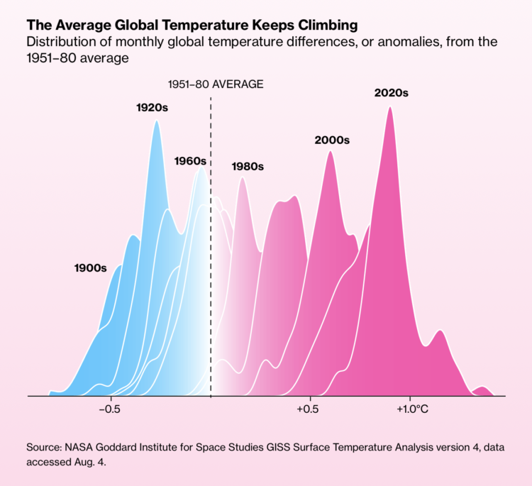
It keeps getting hotter around the world. Not every single day. But over time, there are increasingly more hot days and fewer cold days.
For Bloomberg, Zahra Hirji, Rachael Dottle and Denise Lu lean into layered density plots to show the shift and the path towards extreme climates.
They show distributions, which can be a challenge for non-data people to understand. So they take their time in the beginning to explain what the chart type shows, with a combination of color, animation, and labeling that stays consistent through the article.


 Visualize This: The FlowingData Guide to Design, Visualization, and Statistics (2nd Edition)