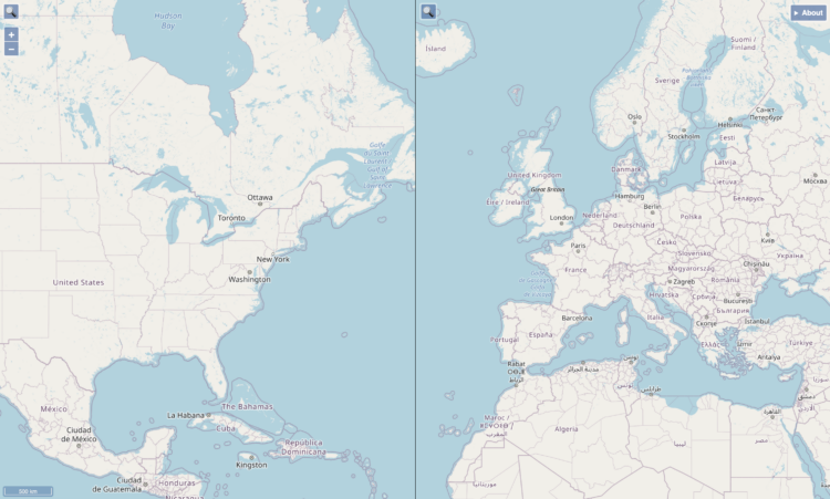
When you compare two areas on a single map, it can be a challenge to compare the actual size of them because of the trade-offs with projecting a three-dimensional space onto a two-dimensional space. Josh Horowitz made a thing that automatically rescales side-by-side maps as you pan and zoom, so that you get a more accurate comparison.
-
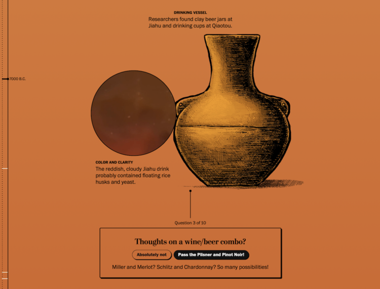
Beer dates back thousands of centuries, but it was not the beer we know today. It might have been more… chewy? More like gruel? Sounds amazing. With a fun illustrated piece, The Washington Post describes the evolution of beer, from the chunky fermented grain stuff to the clear carbonated beverage in cans.
-
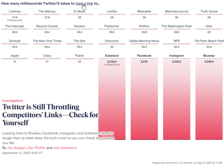
When you click a link on Twitter, you go through a Twitter shortlink first and then to the place you want to go. When you click on a link that points to one of Twitter’s competitors, by complete coincidence I am sure, there’s a delay. For The Markup, Jon Keegan, Dan Phiffer and Joel Eastwood ran the tests. You can also try it with your own URLs.
I’m into the animated opening graphic.
-
Members Only
-
Researchers at the University of Tübingen are studying crows’ abilities to understand statistical inference. For Ars Technica, Kenna Hughes-Castleberry reports:
To do this, Johnston and her team began by training two crows to peck at various images on touchscreens to earn food treats. From this simple routine of peck-then-treat, the researchers significantly raised the stakes. “We introduce the concept of probabilities, such as that not every peck to an image will result in a reward,” Johnston elaborated. “This is where the crows learn the unique pairings between the image on the screen and the likelihood of obtaining a reward.” The crows quickly learned to associate each of the images with a different reward probability.
In the experiment, the two crows had to choose between two of these images, each corresponding to a different reward probability. “Crows were tasked with learning rather abstract quantities (i.e., not whole numbers), associating them with abstract symbols, and then applying that combination of information in a reward maximizing way,” Johnston said. Over 10 days of training and 5,000 trials, the researchers found that the two crows continued to pick the higher probability of reward, showing their ability to use statistical inference.
-
Tall buildings in dense cities can trap heat and restrict air flow, which can make living in an area really hot. It’s worse when the environment as a whole is also warming. So Singapore is spending a lot to cool down their cities. For The New York Times, Pablo Robles, Josh Holder, and Jeremy White illustrate the measures Singapore has put in place.
I always appreciate the scrolly transitions from real life imagery with photos or video to the more abstract illustrations. It’s a good mechanism to keep concepts rooted in reality.
-
When looking into getting a pet, it’s important to consider life expectancy. You probably don’t want to accidentally sign up for a twenty-year commitment with an impulse adoption at the pet store. That’s a bad deal for you and the animal.
-
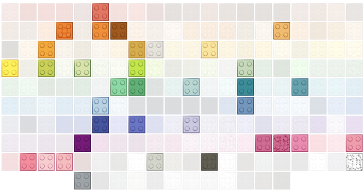
Lego started with five brick colors: red, yellow, blue, white, and clear. The selection peaked in 2004 but then surprisingly decreased to cut costs. For The Washington Post, Kati Perry shows the evolution.
-
In some states there are more kids, such as Utah, which has the youngest median age at 31 years and 4 months. In others states there are more older adults, such as Maine, which has the oldest median age at 44 and 8 months. This is based on the 2021 American Community Survey.
Of course, we can see the age breakdowns in greater detail. States aren’t uniformly young and old.
-
Members Only
-
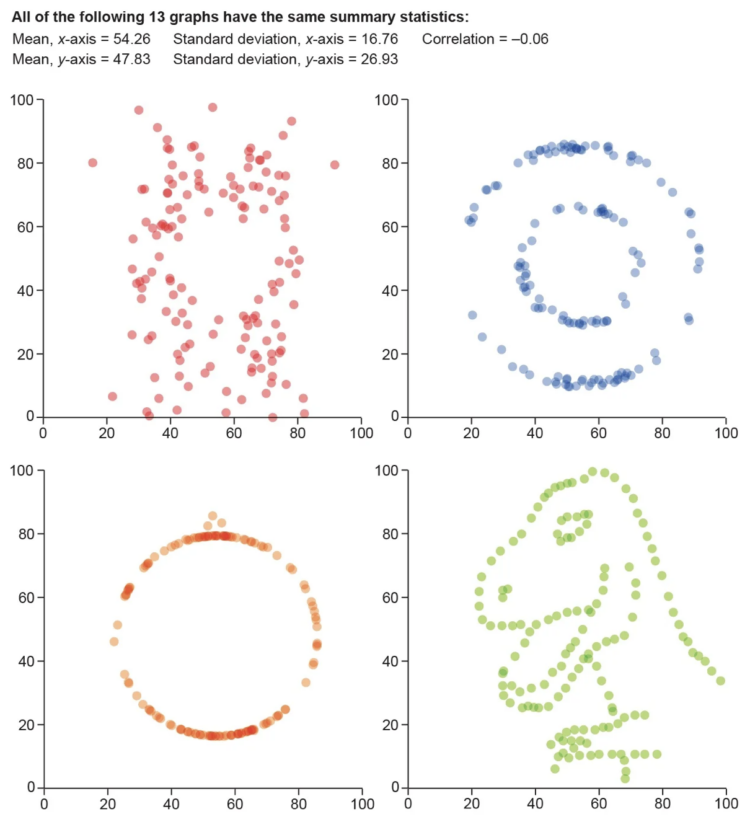
For Scientific American, Jack Murtagh describes the importance of visualization in understanding the roughness of data:
One maxim that should be etched into the walls of all scientific institutions is to visualize your data. Statistics specializes in applying objective quantitative measures to understand data, but there is no substitute for actually graphing it out and getting a look at its shape and structure with one’s own eyeballs. In 1973 statistician Francis Anscombe feared that others in his field were losing sight of the value of visualization. “Few of us escape being indoctrinated” with the notion that “numerical calculations are exact, but graphs are rough,” he wrote. To quash this myth, Anscombe devised an ingenious demonstration known as Anscombe’s quartet. Together with its wacky successor, the datasaurus dozen, nothing more dramatically communicates the primacy of visualization in data analysis.
-
In the Very Expensive Maps podcast, cartographer Evan Applegate interviews other cartographers about how they got into the field, the thoughts behind their design choices, and the more technical bits behind their process. With cartographers and chart makers sharing many of the same guides, this podcast, which is 33 episodes in, should be worth a listen.
Sidebar: When I read the title of Very Expensive Maps, I immediately thought of Justin Bieber talking about “very expensive” sounds at the 30-second mark of a NYT song breakdown. That’s probably not what Applegate was thinking, but it’s the same sentiment.
-
For their research on tattoos and choice, Bradley Ruffle and Anne Wilson provide the dataset for perusal:
Survey and experimental evidence documents discrimination against tattooed individuals in the labor market and in commercial transactions. Thus, individuals’ decision to get tattooed may reflect short-sighted time preferences. We show that, according to numerous measures, those with tattoos, especially visible ones, are more short-sighted and impulsive than the non-tattooed. Almost nothing mitigates these results, neither the motive for the tattoo, the time contemplated before getting tattooed nor the time elapsed since the last tattoo. Even the expressed intention to get a(nother) tattoo predicts increased short-sightedness and helps establish the direction of causality between tattoos and short-sightedness.
It’s a couple of hundred responses from the tattooed individuals, but maybe there’s something there. The dataset is linked towards the bottom of the page.
-
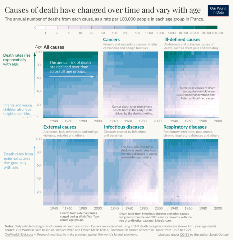
Saloni Dattani, for Our World in Data, used a set of heatmaps to show how causes of death changed by time (on the horizontal axis) and age (on the vertical axis) in France. Each panel represents a cause category.
The code is on GitHub, in case you want to make similar charts for your own country.
-
In 2020, our everyday routines shifted dramatically, but over the past few years, it’s felt like things are getting back to where they were.
Are we back? Or did our baselines move so low that any tick upwards seems like a lot? Based on data from the American Time Use Survey, we can see how our time spent has changed over the years. These charts show the range of time for a hundred of the most common activities.
-
Members Only
-
Rotten Tomatoes aggregates movie reviews to spit out a freshness score for each film. There’s a problem though. For Vulture, Lane Brown reports on the flawed system:
But despite Rotten Tomatoes’ reputed importance, it’s worth a reminder: Its math stinks. Scores are calculated by classifying each review as either positive or negative and then dividing the number of positives by the total. That’s the whole formula. Every review carries the same weight whether it runs in a major newspaper or a Substack with a dozen subscribers.
If a review straddles positive and negative, too bad. “I read some reviews of my own films where the writer might say that he doesn’t think that I pull something off, but, boy, is it interesting in the way that I don’t pull it off,” says Schrader, a former critic. “To me, that’s a good review, but it would count as negative on Rotten Tomatoes.”
Studios have of course learned how to game the system, not to mention most of the site is now owned by movie ticket seller Fandango.
-
The New York Times analyzed water levels across the country since 1920. In more recent years, the levels aren’t looking great if we want to keep growing crops. An animated map using angled lines shows the fluctuations and decline.
-
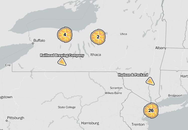
Locating the best pizza depends on where you are and what kind of pizza you’re looking for. The best-of lists that favor New York-style pizza and the east coast aren’t much good when you want Chicago-style pizza on the west coast. So The Washington Post parsed Yelp reviews to find the best pizza places for a selected style and state.
-
For The Pudding, Russell Samora pulled songs via the Spotify API and made a unique kind of clock:
Every minute, random songs are played that contain the time in the title (e.g., 6:47 or 6:47 from Central Station). If there are at least two songs with the correct am/pm (or it is absent), then the incorrect ones will be excluded.
This is the first clock in a working series of four. The second one uses time mentioned in YouTube videos.







 Visualize This: The FlowingData Guide to Design, Visualization, and Statistics
