Are we back yet?
In 2020, our everyday routines shifted dramatically, but over the past few years, it’s felt like things are getting back to where they were.
Are we back? Or did our baselines move so low that any tick upwards seems like a lot? Based on data from the American Time Use Survey, we can see how our time spent has changed over the years. The charts below show the range of time for a hundred of the most common activities.
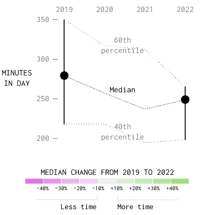
Activities are sorted by biggest increase in time spent to biggest decrease for 2022 versus 2019. The gray areas in the middle show time spent that is similar.
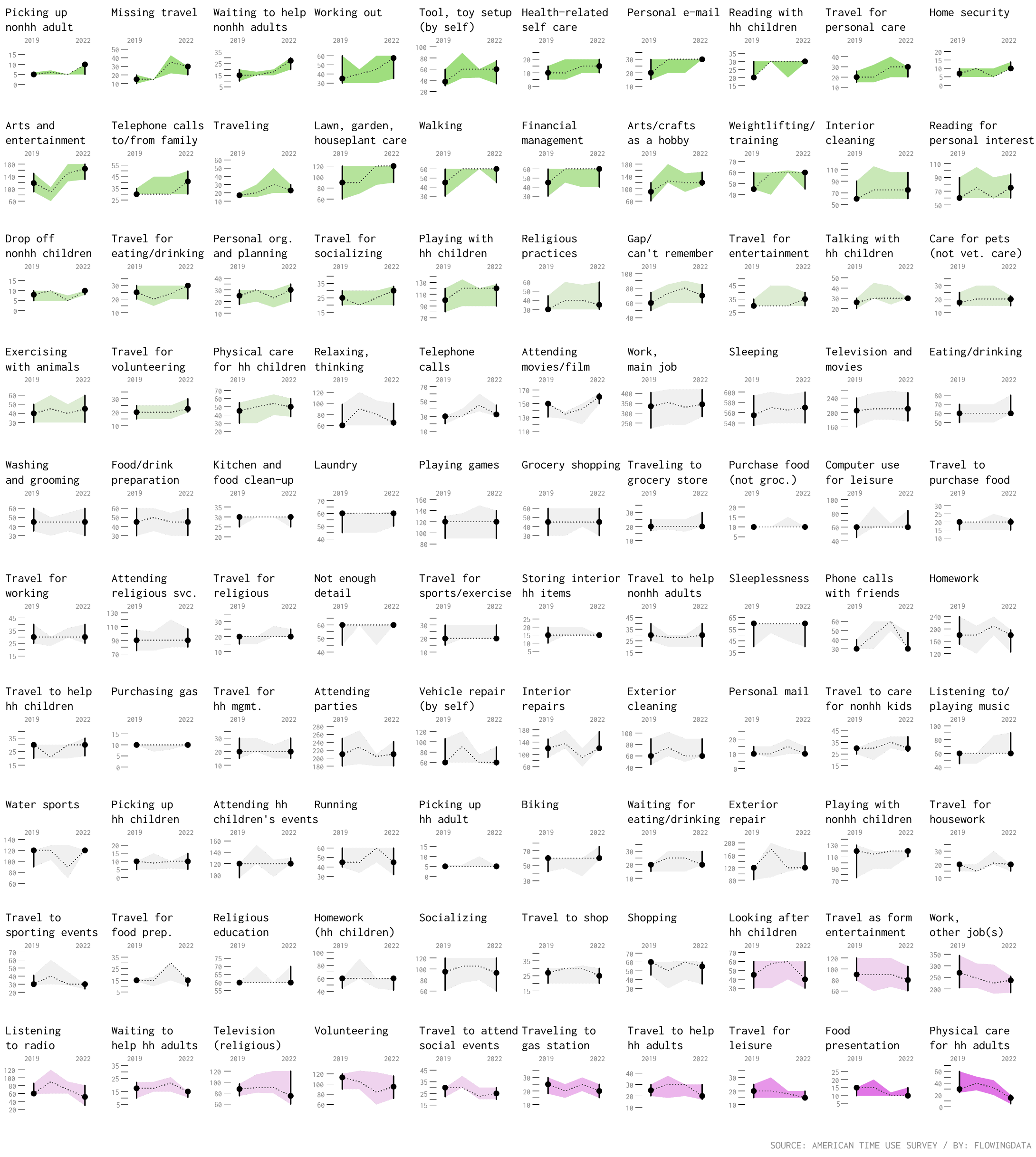
I wondered which activities grew more popular but then dropped back down? Which ones died down but then bounced back? Were there activities that became popular and then stuck around?
Bouncing Back or Staying Down
I plotted the change in 2020 versus 2019 and the change in 2022 versus 2019 to find the activities that stuck around and the ones that left. Circles are sized by how common an activity was in 2022.
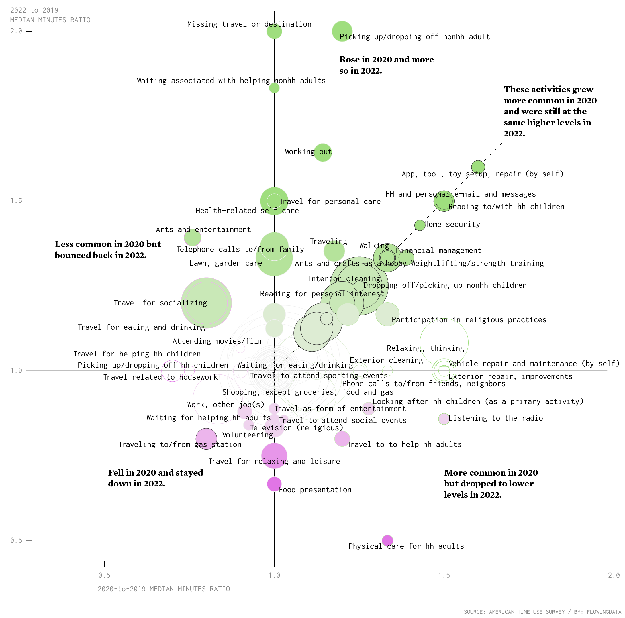
The activities in the top right quadrant — fixing things ourselves, reading to kids, and walking — are most interesting. Those are the things seem to have stuck around. For now at least.
You can also see big bounce for travel, which was down in 2020 but higher in 2022. There was a big increase for missing travel, which may or may not be related.
On the other side, there are activities like listening to the radio and food presentation that are now at a lower level than they were before.
Notes
I downloaded American Time Use Survey data via IPUMS. I analyzed the data and made the charts in R and edited in Adobe Illustrator. Median minutes are out of those who did the activity on their survey day.
Become a member. Support an independent site. Make great charts.
See What You GetFlowingData is made possible by supporting members. Since 2007, I, Nathan Yau, a real person, have been analyzing and visualizing data to help more people understand and appreciate it in their everyday lives.
If you liked this or want to make similar data things, please consider supporting this small corner of the internet. You get unlimited access to visualization courses, tutorials, and extra resources. Thanks. — Nathan
Chart Types Used


