-

Merry Christmas and happy new year! As usual, don’t forget to eat lots. That’s the only way to roll during the holidays.
-
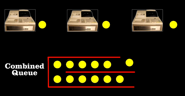
Why does it almost always seem like you’re in the slow line at the grocery store or in the driving lane with the most cars on the freeway? Bill “Engineer Guy” Hammack explains in terms of queuing theory in the video below:
Bill reveals how “queueing theory” – developed by engineers to route phone calls – can be used to find the most efficient arrangement of cashiers and check out lines. He reports on the work of Agner Erlang, a Danish engineer who, at the opening of the 20th century, helped the Copenhagen Telephone Company provide the best level of service at the lowest price.
Erlang found out how many telephone lines the company needed, given the average number of calls per hour. Similarly, you can figure out how many checkout lines you need, given the average number of customers. It turns out the best arrangement is to have a single line, and the next customer goes to the next available register. There’s less chance of blockage from a single delay.
But people don’t like doing that apparently, and so assuming random selection, ending up in the slow line comes down to simple probability.
Read More -

The Facebook Data Team had a quantitative look at status updates by age and content:
The chart on left confirms the typical stereotypes about younger and older people. Younger people express more negative emotions (including anger) and swear more. They use more pronouns referring to oneself (“I”, “my”, etc.) and talk more about school. Older people write longer updates, use more prepositions and articles, and talk more about other people, including their family.
Word categories are sorted by correlation, from greatest to least. Blue indicates positive correlations while red indicates negative.
Read More -

Antrepo wonders what it might be like if the labels on consumer products were stripped of all their flare and were to go semi-minimal and completely minimal.
Obviously some of them wouldn’t work from a practical perspective, because well, customers would have no idea what the product was, but from an information design and visualization perspective, it’s fun to think about. Strip out the extraneous until you can strip no more.
-

You’ve most likely seen a couple of views of the universe to provide a sense of scale. Main point: you’re tiny. Here’s another video. This one focuses on star sizes. it starts with our solar system and then moves up to VY Canis Majoris, the largest known star in the universe. The video was actually made last year, but still fun to watch. It’s got a few drops of dramatic music in there, too.
Read More -
For the Google Demo Slam, three animators Tu+, Namroc, and Metcalf Anything put together an animation completely in Google Docs. Three days, 450 slides, and they got the video below. A tool might be limited, but you can still get a lot done with a little bit of imagination.
Read More -
I grew up in a relatively small city where it took no more than fifteen minutes to get where I needed to go. When I went to college, the public transportation was really good, and everything was pretty close together. So when I found myself in Los Angeles for a couple of years, it was hard to swallow the hour long drive without traffic and three-hour long drive in traffic to get places. I still can’t stand it.
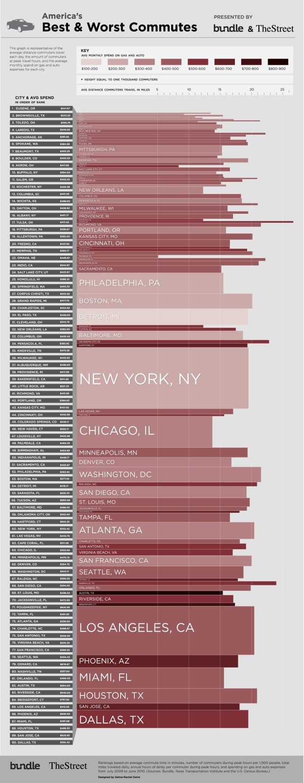
In a similar vein to their food spending graphic, Bundle, with Selma-Rachel Swire, has a look at commuting in major cities in the US. Darker reds indicate greater spending, height represents number of commuters in a city, and length indicates average distance travelled by commuters.
What’s commuting like in your neck of the woods?
[Bundle | Thanks, Mike & Lauren]
-

We’ve all seen Aaron Koblin’s Flight Patterns, so we know that there’s a certain rhythm to air traffic. GE, who has an aviation branch that designs engines, takes a more local approach to showing air traffic over the course of a day. I’m not sure how to describe it other than multi-stream video, or something like that. Just watch the video below.
Read More -

You might think that the only use for a map is to find directions to where you want to go. Or since you’re a FlowingData reader, you know they can be used for a bit more — like displaying large amounts of data. But if you think all they’re used for, then you’ve got some learning to do my friend. Learn the steps from the all-knowing MacGyver in the video below.
The best company you could have in a strange place is a map.
Words to live by. A map just might save your life several times as you run away from people shooting at you.
Read More -
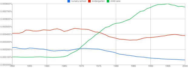
Language changes. Culture changes. And we can see some of these changes via what authors write about in books over the years. Google’s Book Ngram Viewer lets you search through this data, and shows a graph similar similar to the output of Google Trends. The above is the trends for nursery school, kindergarten, and child care:
This shows trends in three ngrams from 1950 to 2000: “nursery school” (a 2-gram or bigram), “kindergarten” (a 1-gram or unigram), and “child care” (another bigram). What the y-axis shows is this: of all the bigrams contained in our sample of books written in English and published in the United States, what percentage of them are “nursery school” or “child care”? Of all the unigrams, what percentage of them are “kindergarten”? Here, you can see that use of the phrase “child care” started to rise in the late 1960s, overtaking “nursery school” around 1970 and then “kindergarten” around 1973. It peaked shortly after 1990 and has been falling steadily since.
Find anything interesting?
Read More -
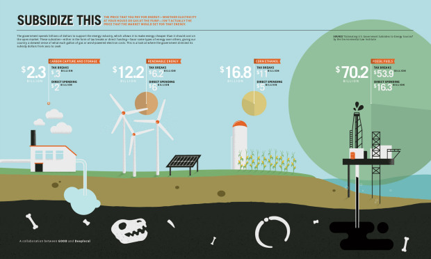
I was going to post this graphic from Good when it came out, but decided not to. I made the same mistake when I first started out. It was another case of wrongly sized bubbles. But they fixed the problem, so now we can see what a big difference it makes. Read More
-
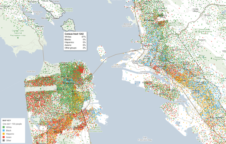
Government data technology has felt behind the times the past few years with outdated Java applets and such, which makes it tedious to look at all the data that is offerred. For example, if anyone understands the makeup of the United States, it’s gotta be the people at the Census Bureau, but the tools for public access are rough around the edges.
Luckily, we have the New York Times to move things along. Matthew Bloch, Shan Carter and Alan McLean apply their cartography skills to US Census data and let you explore a variety of demographics. It’s like a demographic buffet. There are multiple maps across four topics: race and ethnicity, income, education, and housing and families.
Read More -
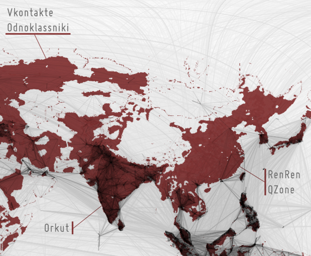
While it was fun looking at the worldwide connections on Facebook, I thought it was more interesting to look at the places where there were very few connections, where it looked pretty dark on Paul Butler’s map. Some commented that was just a product of no people in those areas. Where there’s no people, there’s obviously no Facebook. This is true in many areas, but not all them.
Read More -

William Huber, Tara Zepel, and Lev Manovich compare magazine pages of Science and Popular Science.
In the first three decades of its publication, Popular Science used very few images. In fact, if we compare Science and Popular Science in the 1880s, we discover that the latter was at first more “scientific.” While photographs and illustrations accompanied Science articles, Popular Science used only occasional graphs. Over time the two magazines reverse their visual strategies. Science banishes photographs and illustrations as they come to be considered inappropriate for proper scientific discourse. Popular Science moves in reverse direction becoming highly visual.
Above are pages from Popular Science from 1872 to 2007.
Read More -
Data visualization and all things related continued its ascent this year with projects popping up all over the place. Some were good, and a lot were not so good. More than anything, I noticed a huge wave of big infographics this year. It was amusing at first, but then it kind of got out of hand when online education and insurance sites started to game the system. Although it’s died down a lot ever since the new Digg launched.
That’s what stuck out in my mind initially as I thought about the top projects of the year. Then I went through the archives. There was a ton of great work, too. So much so that I’ve gone with the top ten data visualization projects of 2010, instead of the top five.
One of the major themes for 2010 was using data not just for analysis or business intelligence, but for telling stories. People are starting to make use of the data (especially government-related) that was released in 2009, and there was a lot more data made available this year (with plenty more to come). There were also more visualization challenges and contests than I could count.
So here are the top 10 visualization projects of the year, listed from bottom to top.
Read More -
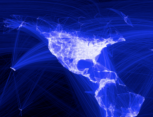
As we all know, people all over the world use Facebook to stay connected with friends and family. You meet someone. You friend him or her on Facebook to keep in touch. These friendships began within universities, but today there are friendships that connect countries. Facebook engineering intern Paul Butler visualizes these connections:
I defined weights for each pair of cities as a function of the Euclidean distance between them and the number of friends between them. Then I plotted lines between the pairs by weight, so that pairs of cities with the most friendships between them were drawn on top of the others. I used a color ramp from black to blue to white, with each line’s color depending on its weight. I also transformed some of the lines to wrap around the image, rather than spanning more than halfway around the world.
In other words, for each pair of countries with a friend in one country and a friend in the other, a line was drawn. The more friends and distance between two countries, the brighter the lines on a black-blue-white color scale. The “stronger” connections were drawn on top, so they are more visually prominent.
It might remind you of Chris Harrison’s maps that show interconnectedness via router configurations.
Read More -
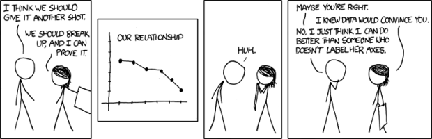
xkcd geekdom for your slow Monday afternoon. Can you imagine being with someone who doesn’t label axes? Outrageous. [xkcd]
-
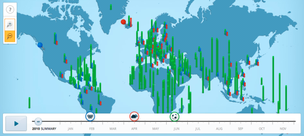
Google recaps search trends for the year in Google Zeitgeist 2010, from the World Cup and the Olympics to the earthquake in Haiti and the BP oil spill. Above is relative search volumes around the world during the ash cloud in Iceland. You can browse the interactive map, or use the timeline to watch changes over significant events during the year.
A video (below) also accompanies the interactive, showing how the physical world and digital are melding ever so nicely.
Read More -
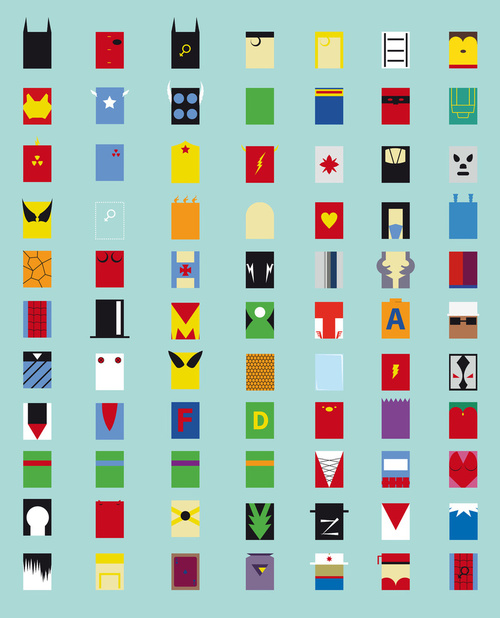
Fabian Gonzalez goes minimalistic on superheroes. I like the Teenage Mutant Ninja Turtles. I used to pretend I was Donatello, the smart inventer one. Although in retrospect I’m probably more like Raphael, the moody and irritable one. Available in print and shirt form. [Society6 via Data Pointed]

Recently for Members
Second Edition
 Visualize This: The FlowingData Guide to Design, Visualization, and Statistics (2nd Edition)
 Visualize This: The FlowingData Guide to Design, Visualization, and Statistics (2nd Edition)
New tools, refined process.
Browse by Chart Type See All →


