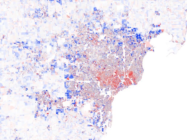
You’ve seen population changes at the state and county level, but with Census data, you can zoom in all the way to the block level. Stephen Von Worley breaks it down.
Nationwide, one feature stands out: the bumper crop of fresh suburbs that ring almost every metropolitan area. Where did all of these people come from? A zoom into the Midwest suggests the answer. The new tract developments appear to be sucking the life out the older neighborhoods, which bear the scarlet tints of waning population
Colors range from red, indicating a complete emptying of the block, to blue, indicating a double in population since 2000. Gray means no change. So as your browse through each city, you notice a lot of blue rings with red in the city centers.
Above shows the growth in Detroit. Below, the map for Las Vegas, the ring is even more obvious.

Boston is the only city you don’t see the ring pattern. Maybe some locals can chime in on why they think that is.

See the rest of the series here.
[Data Pointed | Thanks, Stephen]
 Visualize This: The FlowingData Guide to Design, Visualization, and Statistics (2nd Edition)
Boston is built-out, that’s the problem. I did a similar study in GIS in 2003 for a Boston suburb with data from the previous two Census decades (1990 and 2000) and you see the ring then. The Boston suburbs are fairly intensely anti-housing, politically. Commercial growth along the outer ring of I-95 means more people commute from further out, where housing is also affordable, meaning growth is dispersed over a broader range. You probably get a better picture of the Boston area by looking at the town-level rather than block level changes.
in addition to what previous poster Kelly says, boston suburbs are extremely wealthy so the pattern of leaving the inner city for the new cheap house in the suburbs is impossible. a lot of the midwestern cities were surrounded by farmland, which was the source of the cheap land on which developments could be built.
also, the cities that make up ‘boston’; cambridge, somerville, alston, and brookline are much more town-like then most cities and probably do not elicit the usual ‘can’t take the city anymore’ feelings that often precipitate a move to the suburbs.
Another thing about Boston is that it went through urban decline several decades before other cities–people were already leaving the older parts of the city for the Back Bay and such 150 years ago.
And, of course, as someone above mentioned, it’s really a collection of towns (even within Boston city boundaries), which changes the dynamics. (Especially when the “suburbs” are themselves 300 year old towns…)
Hey, maybe someone can point me to a better source.
I was able to find the shape files for the census blocks here:
http://www.census.gov/geo/www/tiger/tgrshp2010/release_schedule.html
And I found the population by block here:
http://www.census.gov/geo/www/2010census/centerpop2010/blkgrp/bgcenters.html
But I did not find a file with both shape and population count. Am I looking in the wrong area? or do I need to combine those?
Oh nm,
I found this link:
http://www2.census.gov/census_2010/01-Redistricting_File–PL_94-171/
it appears the data in there with the shapefiles
@BB – thanks. I might want to make use of that some time, too.
Check this link out:
http://www.wmhartnett.com/2011/04/08/block-level-2010-census-race-and-ethnicity-data-for-the-atlanta-metro-area-as-3d-maps-with-an-interactive-dekalb-county-bonus-fun-time-party-map/
He took the same data and shows it in 3D
Anyone know how to get this sort of data for some Canadian cities? Very nifty.
Canadian census?
It is available at the Census tract level I believe, but not the scale shown in these maps. Unless of course, you’re willing to pay for it.
I think it’s a bit dangerous to just divide current population by previous population. If these are newly developed neighborhoods, then the previous population would be close to zero. So any increase would appear huge.
Maybe working with difference in absolute numbers (per square mile) would be a solution, but then a big decline in a densely populated neighborhood could easily be overlooked.
Or perhaps only a 3D solution would really work to show the volumes involved properly. Or a simpler solution could be a dot density, with blue dots for positive change and red dots for negative change.