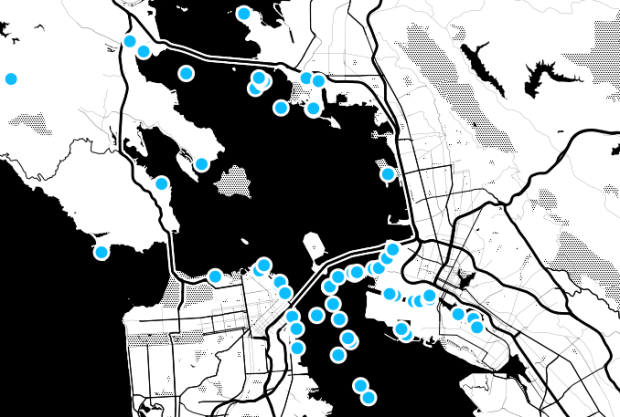
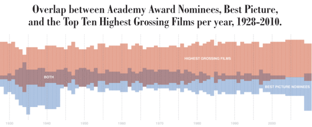
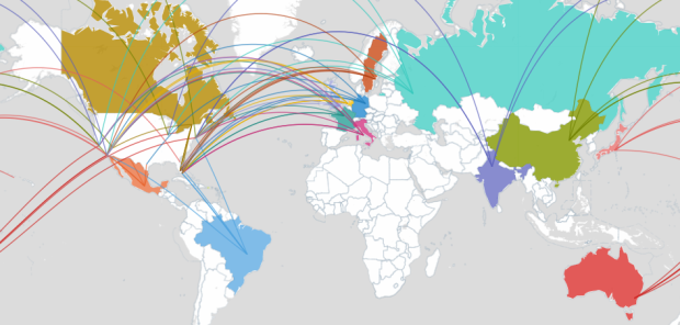
My pending thesis is on personal data collection (i.e. quantified self, personal informatics, self-surveillance, or whatever you wanna call it), so there’s a special place in my heart for projects with data about an individual, no matter who they are. It’s like taking a peek at part of someone’s journal that they’ve decided to make public.
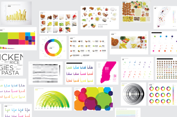
Designer and architecture student Lauren Manning has documented her life for the past two years, and for her thesis project, she visualized a subset of that data — her food consumption in 2010 — with a variety of over 40 graphics. Instead of sticking with a single, optimized view of her data, she stood back and let the data fly to see what would happen.
Read More
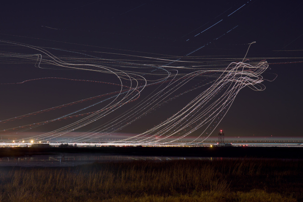
 While information graphics have been around for decades, their current form is brand new (or kind of old, if you’re counting in Internet years). Just like the Web, information and data graphics will continue to evolve in line with improving technology and growing amounts of data.
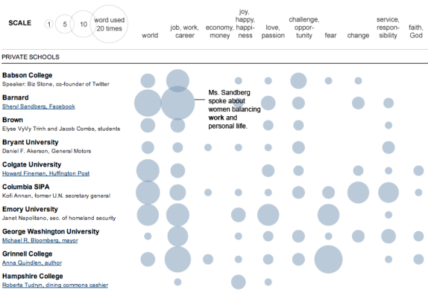

 Visualize This: The FlowingData Guide to Design, Visualization, and Statistics (2nd Edition)


