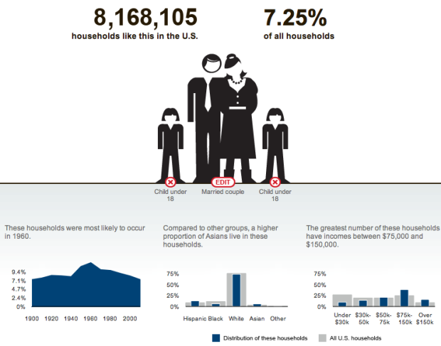
Accompanying an article on the changing family dynamic, The New York Times provides an interactive graphic that lets you see how many households in America are like yours.
You start with the primary residents in your household such as single male or married couple, and then add those who live with you, such as a parent or child. The graphic updates as you do, showing the U.S. count and percentage on top and the breakdown by time, race, and household income on the bottom. Simple and straight to the point of interest.
 Visualize This: The FlowingData Guide to Design, Visualization, and Statistics (2nd Edition)
What is the difference between a roommate and a roomer?
@Patrick – I think a roommate shares the rent with you (and co-signs the lease), whereas a roomer is someone who pays you to stay in your house.