Personal data collection can be a tough sell at times, but with the Nike+, which lets you record your runs, thousands have taken part in measuring their performance and digitally racing with others. For the most recent Nike+ campaign, interactive collective YesYesNo mapped a year’s worth of runs from the Nike+ site and invited people to plug in their own runs.
Read More
-
-
-
 Jonathan Stark, a mobile application consultant, is running an interesting social experiment with his Starbucks card:
Jonathan’s Card is an experiment in social sharing of physical goods using digital currency on mobile phones. I stumbled on the idea while doing research for a blog post about Broadcasting Mobile Currency.
Based on the similarity to the “take a penny, leave a penny” trays at convenience stores in the US, I’ve adopted a similar “get a coffee, give a coffee” terminology for Jonathan’s Card.
Simply save the picture of Jonathan’s Starbucks card onto your smartphone and use it to buy your coffee. If you like, add money to the card so that someone else can buy a coffee.
The best part is that Stark provides a simple API that returns the balance on the card every minute. When do people buy coffee? How do people give and take? Are people more likely to give when there’s a large balance or when there’s nothing left? Lots of fun things to look at.
[Jonathan’s Card via @kn0thing]
-
FlowingData’s readership continues to grow (which is great), but that also means it takes more to keep the lights on here. A big thank you to FlowingData sponsors for helping me make sure FlowingData stays up and running smoothly. Check ’em out. They help you do good stuff with data.
IDV Solutions Visual Fusion — Business intelligence software for building focused apps that unite data from virtually any data source in a visual, interactive context for better insight and understanding.
Tableau Software — Combines data exploration and visual analytics in an easy-to-use data analysis tool you can quickly master. It makes data analysis easy and fun. Customers are working 5 to 20 times faster using Tableau.
Column Five Media — Whether you are a startup that is just beginning to get the word out about your product, or a Fortune 500 company looking to be more social, they can help you create exciting visual content – and then ensure that people actually see it.
InstantAtlas — Enables information analysts and researchers to create highly-interactive online reporting solutions that combine statistics and map data to improve data visualization, enhance communication, and engage people in more informed decision making.
Want to sponsor FlowingData? Send interest to [email protected] for more details.
-
With the anonymity on the Internet and all, I know it can be a tough decision whether you should be a trolling troll or not. H. Caldwell Tanner and Rosscott Nover help you figure it all out with this comical flowchart.
[Rosscott, Inc. via Laughing Squid]
-
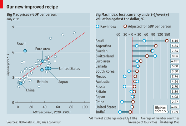
The Economist updates their Big Mac Index, which as we all know, is the most accurate way to measure the global economy:
It is based on the theory of purchasing-power parity (PPP), the notion that in the long run exchange rates should move towards the rate that would equalise the prices of a basket of goods and services around the world. At market exchange rates, a burger is 44% cheaper in China than in America. In other words, the raw Big Mac index suggests that the yuan is 44% undervalued against the dollar. But we have long warned that cheap burgers in China do not prove that the yuan is massively undervalued. Average prices should be lower in poor countries than in rich ones because labour costs are lower. The chart above shows a strong positive relationship between the dollar price of a Big Mac and GDP per person.
When adjusted for GDP, we can see where Big Macs are actually expensive: Brazil, Argentina, and Sweden. I guess there’s a premium on special sauce over there.
[The Economist via kottke]
-
A couple of weeks ago, Visually, a new infographics-based startup, launched with a warm reception among all the popular tech blogs. I didn’t post about it right away for a couple of reasons. The first is that I’ve been sick for the past couple of weeks, and it’s been hard to think in between all the nose-blowing. Seriously, this cold will not die. Secondly, I wasn’t sure how I felt about the new site (partially due to the first reason). Now that I’ve let my thoughts simmer, it’s clear that Visually has potential, but it’s way too early to tell if it will actually work.
Read More -
Census is any country is important in making major policy decisions and can affect your day-to-day, but it’s not always obvious how. Leading up to the August 9 Australia Census, the Australian Bureau of Statistics put together an interactive called Spotlight, which helps its citizens understand the data a little better.
Read More -
Paul Bourke, a research professor at the University of Western Australia, provides us a fly-through of the known universe, according to the 6dF Galaxy Survey:
The 6dF Galaxy Survey has collected more than 120,000 redshifts over the southern sky over a 5 year period from 2001 to 2005. Its goal is to map our southern view of the local universe, and use the peculiar motions of one-tenth of the survey to measure galaxy mass. It covers more than eight times the sky area of the successful 2dF Galaxy Redshift Survey.
Watch the animation in all its glory below as it moves to the edge of the data.
Read More -
Many of you now have Visualize This in your hands and have probably gone through a number of tutorials. Now it’s time to put what you’ve learned into practice. I’m fleshing out the details of a Flowing Datathon. I don’t know what it’ll be like yet — other than it’ll involve an interesting dataset over 24 hours and some prizes (and of course, fun) — but if you’d like to keep up-to-date either to get involved or watch, I’ve set up an email list.
Oh, and if you have ideas for what would make the event special awesome, feel free to leave your suggestion in the comments.
-
With the launch of Visualize This, July was a fun month. On the day of the announcement, the book broke the Amazon overall top 100, which felt crazy to me. Of course, the dust has settled, but it’s still been doing well, and I’ve been happy to hear that so many of you have found it useful. Thanks again.
In case you missed them, here are the most popular posts from this past month, based on a combination of views and comments.
- Undergraduate grade inflation
- All the countries that the US owes money to
- Flickr and Twitter mapped together – See Something or Say Something?
- Where the aliens are flying their UFOs
- If the world lived in a single city
- World map of useless stereotypes
- How tech companies are interconnected
- Sales receipt redesign
- Visualize This: Published
- Access to education where you live
-
Think about when you take a picture of something. It’s kind of like placing a spotlight on that person or object and then pressing a button for a snapshot. In the case of significant landmarks in city, thousands of spotlights are projected every year. For a student project at the Interface Design program at FH Potsdam, Sebastian Schwinkendorf and Matthias Löwe use this idea as the basis of Splendor.
Read More -
Maps aren’t just a way to see directions from point A to point B anymore. In some cases, they’re not even meant to show location. Rorschmap by James Bridle is a kaleidoscopic map that is more eye candy than anything else:
Rorschmap is cartographic navel-gazing, a reframing of the map. It will not help you find anything. We are bored with your squares and your margins. We want new shapes and new dimensions, the unicode snowmen of visual representation. †‡†, as the man said.
Enter a location and Rorschmap does the rest. Click go on the top right and the map will start to pan, which makes for a pretty animation.
[Rorschmap via Waxy]
-
Kevin Slavin, chairman and co-founder of Area/Code, describes how algorithms (processing tons and tons of data) are intertwined with our day-to-day and how they will change our future.
And the thing is is that this isn’t Google. This isn’t information. These aren’t financial stats; this is culture. And what you see here, or what you don’t really see normally, is that these are the physics of culture. And if these algorithms, like the algorithms on Wall Street, just crashed one day and went awry, how would we know, what would it look like?
Probably gloriously frightening. Watch the TED talk below.
[How algorithms shape our world | Thanks, Liam]
-
Simon Rogers, for The Guardian, outlines the new, hot trend on the block data journalism. It’s a good, quick bullet list for what it’s all about. Rogers thinks back:
Two years ago, when we launched the Datablog, all this was new. People still asked if getting stories from data was really journalism and not everyone had seen Adrian Holovaty’s riposte. But once you’ve had MPs expenses and Wikileaks, the startling thing is that no-one asks those questions anymore. Instead, they want to know, “how do we do it?”
Further down, he notes:
You can become a top coder if you want. But the bigger task is to think about the data like a journalist, rather than an analyst. What’s interesting about these numbers? What’s new? What would happen if I mashed it up with something else? Answering those questions is more important than anything else.
That is what an analyst does though. A good one at least. If you’re an analyst (or a statistician) and you’re not asking what’s interesting about the numbers, then you’re in the wrong profession. So really, if you’re a statistician, you very well could take up data journalism. Or another job with data in the title.
A natural reaction to statistics, even among some statisticians, is that once you graduate you either go into research or you work as a number-crunching monkey. If that’s your thing, go for it with gusto, but if not, there’s a lot of opportunity out there and on the way (in a variety of fields) for stat people — data journalists, information designers, data scientists, analysts, data artists, or whatever you want to call it. At the core, it’s working with data, and that’s what statisticians do best.
-
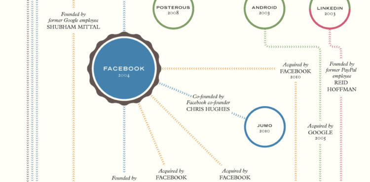
Sarah Kessler and Nick Sigler examine the interconnectedness between major tech companies. I think this might be the beginnings of a tech version of Six Degrees of Kevin Bacon.
-
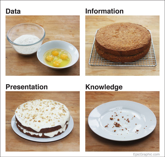
Mark Johnstone uses a cake metaphor to represent data, presentation, and what you gain. Does the metaphor work? Sound off in the comments below.
-
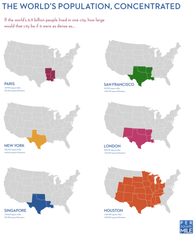
World population is estimated to be 6.9 billion people, and while that is a lot of people, it suddenly doesn’t seem like that much in these maps by Tim De Chant of Per Square Mile. Simply imagine that the world lived with the same density of a real city, and see how much area they take up. If we all lived like they do in San Francisco (space-wise), we’d take up just under 398k square miles, or rather, only four states. Same density as New York? We’d all fit in Texas.
-
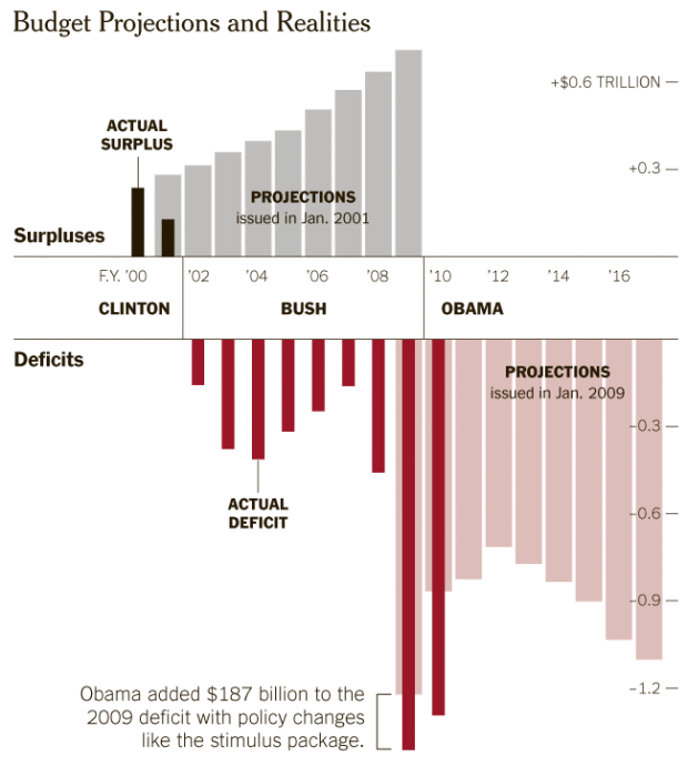
The US continues to rack up more and more debt, with a deficit in the trillions. But how did we get here? Teresa Tritch for The New York Times examines:
In 2001, President George W. Bush inherited a surplus, with projections by the Congressional Budget Office for ever-increasing surpluses, assuming continuation of the good economy and President Bill Clinton’s policies. But every year starting in 2002, the budget fell into deficit. In January 2009, just before President Obama took office, the budget office projected a $1.2 trillion deficit for 2009 and deficits in subsequent years, based on continuing Mr. Bush’s policies and the effects of recession. Mr. Obama’s policies in 2009 and 2010, including the stimulus package, added to the deficits in those years but are largely temporary.
Predicting the future is a tricky game. Even if you do have Grays Sports Almanac.
[New York Times via Waxy]
-
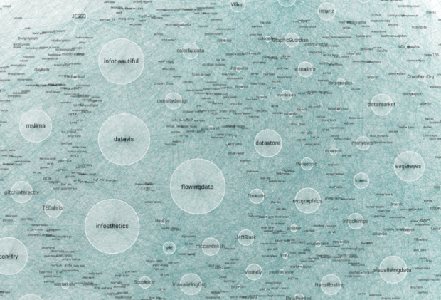
There are lots of people on Twitter who talk visualization. Moritz Stefaner had some fun with Gephi for a view of a whole lot of those people. He calls it the Vizosphere.
Read More







 Visualize This: The FlowingData Guide to Design, Visualization, and Statistics (2nd Edition)


