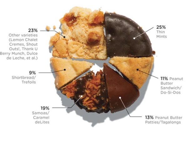
With Girl Scout cookie season around the corner, Wired pies it up with cookies showing percentage of sales. It’s all about the Caramel deLites. [Thanks, Elise]
With Girl Scout cookie season around the corner, Wired pies it up with cookies showing percentage of sales. It’s all about the Caramel deLites. [Thanks, Elise]
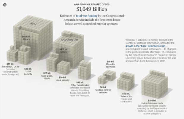
This Sunday will be 10 years since the attacks on September 11. Amanda Cox and Shan Carter of The New York Times look at the financial tally, an estimated $3.3 trillion:
Al Qaeda spent roughly half a million dollars to destroy the World Trade Center and cripple the Pentagon. What has been the cost to the United States? In a survey of estimates by The New York Times, the answer is $3.3 trillion, or about $7 million for every dollar Al Qaeda spent planning and executing the attacks. While not all of the costs have been borne by the government — and some are still to come — this total equals one-fifth of the current national debt. All figures are shown in today’s dollars.
A single cube in each stack represents $1 billion. The initial view is money spent in five categories. Click on any stack for a subcategory breakdown. Sobering.
[New York Times via @shancarter]
In college, I was one of those guys who sat in the back and doodled in my notebook. Sometimes I fell asleep. One time I fell asleep and woke up in the middle of a different class. I blame the professor. Why would you turn off the lights for a two-hour session in a big lecture hall, while reading verbatim from world’s most boring powerpoint presentation?
Anyways, we all have our seating pockets that we like to settle in. Skyrill, a two-brother design team, took it upon themselves to visualize the seating habits of their graduate student classmates in class 15.514 at MIT.
Read More
Kiva, the microfinance site, lets you give small loans to people around the world to help them get their small business up and running. This animated map shows how 620,000 funded 615,000 borrowers, from the start of Kiva in 2005 up until now. Watch in full-screen for maximum effect.
Colors indicate loan type, which confused me at first, because I thought the map was saying that specific loan types were only given out during each time of year. It’s actually cycling through the loan types though, so you can see the breakdowns as the animation plays through, and then it shows all loans at once at the end of each year.
The only thing that’s missing are some counters for the amount of money passing hands. It’s been an impressive $240 million in loans around the world with a repayment rate of almost 99 percent.
[Thanks, Andy]
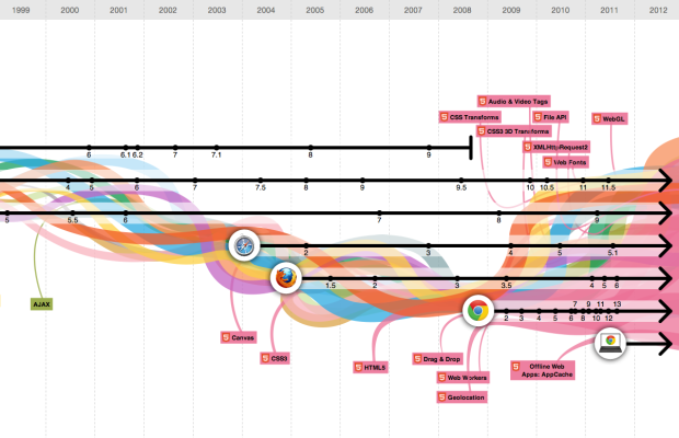
In celebration of Chrome’s third birthday, Google teamed up with Hyperakt and Vizzuality to explore the evolution of the Web:
Over time web technologies have evolved to give web developers the ability to create new generations of useful and immersive web experiences. Today’s web is a result of the ongoing efforts of an open web community that helps define these web technologies, like HTML5, CSS3 and WebGL and ensure that they’re supported in all web browsers.
The black timelines show major browser releases. As you click each browser icon, you can see how the browser window has changed for each release, which I think is the most interesting part of the interactive.
Color bands represent browser technologies such as JavaScript, HTML, and Flash, and the bands grow as new browsers integrate the technologies. The intertwining of bands is supposed to show the interaction between different technologies, but it gets fuzzy here. Does the vertical position of bands mean anything? Does shape mean anything, or is it more for show? I think it’s a little of both. More the latter. Fun to poke around memory lane either way.
[Thanks, Deroy]
I know most of you have checked out mentally for Labor Day weekend, so here’s some fodder to help you through the rest of the work day, as you dream of steak, burgers, and cold beer.
Thanks for a great month and have a nice long weekend.

In case you’re wondering whether you should be drinking in that local park (you know, the one with the horsey and swings) this weekend, Jen Cotton for Grubstreet New York offers this guide. [Thanks, Ben]
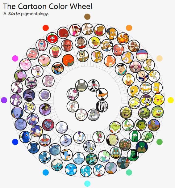
Slate places cartoon characters from past and present within the frame of a color wheel.
Why are the Smurfs blue? Why is Doug’s Beebe Bluff purple? Our aim is not to answer these existential questions. When asked why the Simpsons are yellow, Yeardley Smith (voice of Lisa) explained only that Matt Groening “thought that it would be really funny if, when people watched The Simpsons, they thought that maybe the color on their TV was off.”
Totally ridiculous. And that’s what makes it fun.
[Thanks, Dean]
Most of us have gone through the paces of algebra through calculus in high school. I remember lots of problems and fact sheets. Sol Garfunkel and David Mumford imagine a math education system that teaches skills for the real world and increases quantitative literacy:
Imagine replacing the sequence of algebra, geometry and calculus with a sequence of finance, data and basic engineering. In the finance course, students would learn the exponential function, use formulas in spreadsheets and study the budgets of people, companies and governments. In the data course, students would gather their own data sets and learn how, in fields as diverse as sports and medicine, larger samples give better estimates of averages. In the basic engineering course, students would learn the workings of engines, sound waves, TV signals and computers. Science and math were originally discovered together, and they are best learned together now.
Mostly because of the popularity of smartphones, location data is all the rage nowadays. You’re almost always connected no matter where you are. Rich location data can help provide you a new sense of place, and at the same time, this sort of data can paint an interesting picture of what’s going on in your country or around the world. Hence, Infochimps, the one-stop shop for data folk and developers, just announced their new Geo API.
Read More
We read the story about the suffering of an individual, and we’re moved. We read in the paper that millions have died over the years due to hunger, and we’re not quite as moved. This is due in part to our inability to imagine big numbers, but as David Ropeik for Psychology Today explains, the way we perceive risk also is a factor:
Paul Slovic, one of the pioneers of research into the way we perceive risk, calls this greater concern for the one than the many “a fundamental deficiency in our humanity.” As the world watches but, insufficiently moved, fails to act to prevent mass starvation or stop genocides in Congo or Kosovo or Cambodia or so many more, who would not agree with such a lament. But as heartless as it seems to care more about the one than the many, it makes perfect sense in terms of human psychology. You are a person, not a number. You don’t see digits in the mirror, you see a face. And you don’t see a crowd. You see an individual. So you and I relate more powerfully to the reality of a single person than to the numbing faceless nameless lifeless abstraction of numbers. “Statistics,” as Slovic put it in a paper titled “Psychic Numbing and Genocide”, “are human beings with the tears dried off.” This tendency to relate more emotionally to the reality of a single person than to two or more people, or to the abstraction of statistics, is especially powerful when it comes to the way we perceive risk and danger, because what might happen to a single real person, might happen to you. As the familiar adage puts it, “There but for the grace of God go I.”
[Psychology Today via @alexlundry]
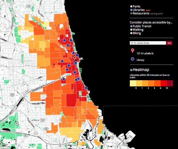
When you’re deciding on a place to live in a new place, it’s always good to know what’s in the area. After all, a house close to conveniences and things to do is usually more desirable than a house that is out of the way. InThirty, by Brian Lange of Datascope Analytics, provides some insight, starting with Chicago. Enter an address and see what libraries and parks (restaurants to come) are within 30 minutes of walking, biking, or public transit.
It’s stil fairly basic in what it does. You just get markers on the map for places that are within 30 minutes. The heat map on the layer underneath only changes as you change mode of transportation or between libraries and parks. Colors relative to your entered address could be more useful.
Still though, like with Mapnificent, I like the idea of searching for things by travel time over distance. If a couple of places are 10 miles versus 20 miles away, I don’t really care, if it takes the same amount of time to get there.
[inThirty | Thanks, Bryan]
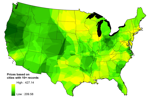
I was raised to always find the best deal whenever I bought anything. Wait for the sales, and then stock up. Drive an extra mile for the cheaper supply of gas. So thank goodness floatingsheep has mapped the price of weed across the country. The more yellow, the more expensive the weed gets and the darker the green the lower the price.
Read More
Census data can provide valuable information, but the datasets are not always the easiest to access. So you often end up spending a lot of time getting your data in order before you actually get to do anything with it. Investigative Reporters and Editors has released the next phase in their Census project to make Census 2010 more accessible via a simple interface. Easily download data in bulk as CSV or shapefiles or build it into your applications with the API.
[census.ire.org via @bryanboyer]
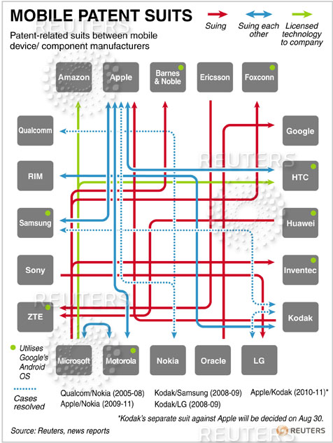
Earlier this week we saw two versions of mobile patent lawsuits. The original was tangled, whereas the interactive revision was less jumbled. Reader Josh commented that the original had an advantage over the clearer version in that it actually demonstrated the mess that is patent law. A simliar argument came up last year, too, with this confusing chart showing Obamacare.
With the patent chart, there’s clearly a way to make the data more readable. If you had a choice between the original and the remake, is it okay to choose the original if your point is that mobile patent lawsuits suck and are more confusing than they need to be?
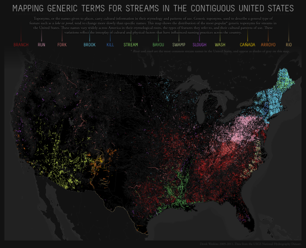
The names of places can say a lot about a geographic area. Derek Watkins maps the most common term for a stream across the country. You’ve got branches and bayous in the south, brooks and streams in the northeast, and washes and arroyos in the southwest.
Read More
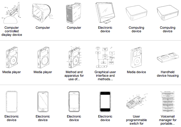
Steve Jobs stepped down as CEO of Apple yesterday, and one of the reasons we actually care is because he had a hand in so many major products that we use every day. Shan Carter and Alan McLean, for The New York Times, provide a breakdown of all 313 Apple patents that include Jobs in the group of inventors.
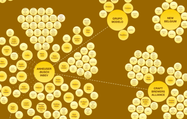
When you walk the beer aisle at the grocery store, there are lots of different brands and types, so it can be easy to think that all of those beverages come from different companies. Maybe you felt like supporting the little guy by buying that beer that looks like it came from a smaller brewery; however, you just might be buying from one of the big guys. In a follow-up to the soda structure map, Phil Howard and Ginger Ogilvie map the structure of the top 13 beer companies.
Read More
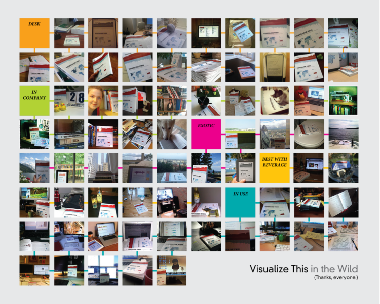
It’s been about a month since Visualize This came out, but it took a while for it to sink in. I mean, I don’t feel like, as my wife likes to put it, “a published author.” But people started tweeting pictures of the book in their hands, on their desk, and on actual boats (what??), and those pictures really made my day.
Read More
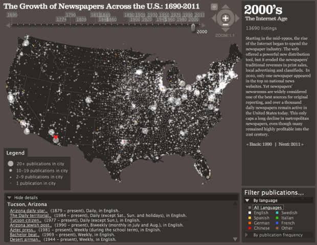
The Rural West Initiative and the Bill Lane Center for the American West explore the growth of newspapers across the United States:
With American newspapers under stress from changing economics, technology and consumer behavior, it’s easy to forget how ubiquitous and important they are in society. For this data visualization, we have taken the directory of US newspaper titles compiled by the Library of Congress’ Chronicling America project — nearly 140,000 publications in all — and plotted them over time and space.
To see the distribution of papers over the years, simply click and drag the slider on the top. Context for each decade is displayed on the right. Each circle represents papers in a city, and the larger the circle the more papers.
Catch the animated version below. They start in the east and make their way west.
Read More
 Visualize This: The FlowingData Guide to Design, Visualization, and Statistics (2nd Edition)
New tools, refined process.


