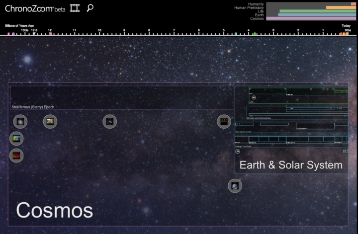
Big History is a field of study that crosses multiple disciplines such as biology, natural history, and economics to form a single timeline that starts at the beginning of time and ends in the present. It’s the history of everything, essentially. ChronoZoom, a collaboration between UC Berkeley, Moscow State University, and Microsoft Research, aims to visualize this seemingly endless timeline.
You can browse years on top, and rectangles in the main view represent different scopes such as the Cosmos and Earth and the Solar System. Click on one those rectangles, and ChronoZoom, as you might guess, zooms in on the corresponding window of time. Circles within the rectangles provide videos and explanations for significant events in history.
To get right into it though, move your mouse to the top right. There’s a thing that looks like a bar graph, which is actually navigation for the scopes. Click on Humanity and watch it go.


 Visualize This: The FlowingData Guide to Design, Visualization, and Statistics (2nd Edition)


