
The 72-year mark has arrived, and the United States Census released individual records from 1940 yesterday. So you can now, for example, see that J.D. Salinger lived at 1133 Park Avenue.
The 72-year mark has arrived, and the United States Census released individual records from 1940 yesterday. So you can now, for example, see that J.D. Salinger lived at 1133 Park Avenue.
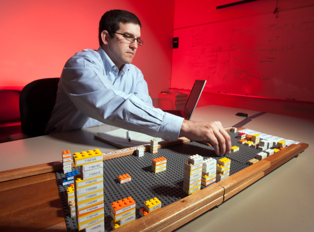
I thought this was a joke, but it appears GM really is using a “three-dimensional visualization system” called — wait for it — 3-D Visualization. It’s meant as a generalized tool to track progress of systems, and they believe it could reduce time to make system changes, leading to fewer warranty claims, by 33 percent.
3-D Visualization builds on GM’s Problem Resolution Tracking System. If a transmission case breaks on a durability test vehicle, a problem resolution report documents the problem, and its corresponding LEGO block goes on a LEGO board. The block color identifies the area on the vehicle and the block size denotes severity; the bigger the block, the bigger the problem. Each block has an identification number and date of discovery, and the board shows its progress from root cause to solution to outcome. 3-D Visualization is applicable to any process that has volume and aging.
There’s no mention of a computer link in the press release (seems like something worth noting), but it does look like there’s a cable coming out from the board. If that’s the case, I want one.
[Thanks, Daniil]
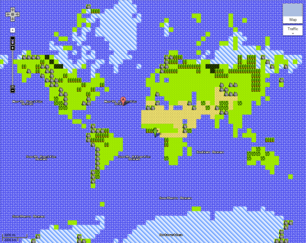
If you go to Google Maps right now, there’s an option in the top right corner for a Quest view. Click on that, and get the world in all its 8-bit NES glory. And great news: The map adventure is coming to an NES console near you. Just put in the cartridge, connect to the Internet via dial-up, and you’re off to the races. See the world like you’ve never seen it before.
Google explains in the video below.
Read More

So the Obama campaign posted this yesterday. Discuss.
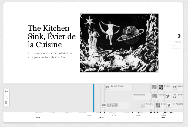
As a project of the Knight News Innovation Lab, Timeline by Verite is an open source project that lets you make and share interactive timelines. It’s simple and customizable. Plug in your own data as JSON, or use the Google Docs template for an even faster route, and you’re good to embed. It’s also easy to grab source material from sites like Vimeo, YouTube, and Flickr. Score.
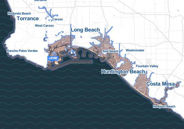
Stamen Design, in collaboration with Climate Central, shows major areas that could be affected by probable rising water levels in the not so far off future.
The context for this work is: while there are a great many papers, scientific studies, meteorological surveys and other things that fall under the rubric of things that normal people accept as true, there remains a persistent and nagging unreality to the idea that, in something like a normal human timescale, we’ll see and have to reckon with large-scale changes to the world as we know it. It’s one thing to say “the world is changing and all of us will have to deal with it.” It’s quite another to say “7.6% of the people and 9.1% of the homes may very well be underwater in Boston, and so you’ll need to start thinking about that pretty damn soon, is that cool?”
Boston, you better make friends with Kevin Costner. He is key to your survival.
Leave it to Robert Krulwich to bring us back to life in the world of personal data. In reference to Stephen Wolfram’s dive into emails, keystrokes, meetings, and phone calls:
“It’s amazing how much it’s possible to figure out by analyzing the various kinds of data I’ve kept,” Stephen Wolfram says. To which I say, “I’m looking at your data, and you know what’s amazing to me? How much of you is missing.”
This is the bit I struggle with when it comes to the whole quantified self thing. There are lot of people who collect data about themselves, and it’s all about optimization and trying to “fix” something. I’m more interested in how personal data collection relates to say, keeping a journal or scrapbooking. In this sense, it’s not about how much of your life is missing in your personal data stream. Instead it’s about how data can help you fill in the gaps.
By the way, if you’re not listening to Krulwich’s show slash podcast Radiolab, who he co-hosts with Jad Abumrad, you’re missing out on some fine storytelling.
 Visualize This: The FlowingData Guide to Design, Visualization, and Statistics (2nd Edition)
New tools, refined process.


