
Celebrating their 100th birthday, Oreo depicts moments in history with the ever popular cookie of nostalgia and milk dunking. This one showing the first step on the moon is the best. Prohibition comes in a close second. [via]
Celebrating their 100th birthday, Oreo depicts moments in history with the ever popular cookie of nostalgia and milk dunking. This one showing the first step on the moon is the best. Prohibition comes in a close second. [via]

From Gizmodo, this shows battery size in the new iPad versus that of the iPad 2. The battery in the former is 70 percent bigger than that of the latter. Something’s not right here.
[Thanks, David]
The familiar but underused layout is a good way to look at patterns over time.

At first I thought this map, by David Yanofsky for Bloomberg, was your standard county-level choropleth map of demographics. Select a self-described heritage from the first drop down and you see where all the people are by count. That’s only kind of interesting, but you often just end up highlighting big cities.
However, select a heritage from the second drop down menu to compare against the first and you get a relative scale. The above for example shows those of Chinese and Indian heritage. It’s a simple calculation that makes a big difference in usefulness.
Aaron Parecki, co-creator of location platform Geoloqi, has collected his location every few seconds for over three years. He put his data on a map.
Approximately one GPS point was recorded every 2-6 seconds when I was moving, and these images represent about 2.5 million total GPS points. Collectively, they represent a data portrait of my life: everywhere I’ve been and the places I’ve been most frequently. The map is colored by year, so you can see how my footprint changes over the years, depending on where I live.
We’ve seen projects like this a few times before (Hey, Andy, where’s your 2011 map?), but the longevity still surprises me, in a good way. (I think I’ve got this quantified self thing for the masses figured out. Don’t even bother mentioning tracking, self-improvement, or the gadgets. Just show them stuff like this and attach some sentimental value, and there you go.)
[via infosthetics]

The Iliad is an epic poem by Homer with a lot of characters and story lines going on at once. I vaguely remember reading bits and pieces in high school and getting totally lost. Santiago Ortiz explores these relationships in his latest work, which draws on the connections i.e. character sentence co-occurrences.
Read More

Jay Jacobs has some fun with roulette simulations and explores the odds of winning for different bets. Above shows a simulation of 250 spins 20,000 times. Or to put it differently, it’s like simulating the play of 20,000 people, who each took 250 spins and always bet on a single number.
I’m not sure why it doesn’t start to get red until you’re $500 in the hole, but bottom line: the longer you play, the higher probability you will lose all your money. That was my main takeaway from Probability 101 in undergrad. The rest is a blur.
Heading towards the 2012 Olympics in London, Quayola and Memo Aktenvia translate athletic movement, which in itself is often considered beautiful, to generative animations. Collectively, the piece is called Forms, which is on exhibit at the National Media Museum.
Forms is a digital artwork that responds to the human body in motion. It focuses exclusively on the mechanics of movement, using footage of world-class athletes to illustrate human movement at the extremes of perfection.
Videos of athletes were processed through custom software to create evolving abstract forms that explore the relationships between the human body and its movements through time and space.
There’s also a short Q&A with the artists on the Creators Project that’s worth a read.
[via The Creators Project]
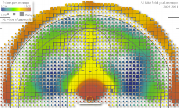
Kirk Goldsberry, an assistant professor of geography at Michigan State, applies his skills to the basketball court.
In the quest to better understand the “average” NBA shooter I have begun making composite shooting charts for each position in the league. My eventual goal is to establish a spatially informed baseline and to map every shooter in the league against an average shooter. These charts are not good for that task, but they’re interesting nonetheless. Here are composite shooting charts for each of the 5 conventional basketball positions. I combined the shooting data for every player in positional groups. There are some bizarre trends including some fascinating asymmetries.
Above shows points per field goal attempt for all NBA field goal attempts from 2006 to 2011. Red means more points and blue means fewer points, so as expected it’s orange-red outside the three-point line and dark red in the high percentage key. It starts to get interesting as Goldsberry breaks things down by player and position. Read the full paper [pdf] to really get into it.
For the record, my personal basketball scoring map would be all red. Don’t let my one-inch vertical leap or my low fantasy basketball ranking this season fool you. I can light it up.
[via Slate | Thanks, Kevin]
 Visualize This: The FlowingData Guide to Design, Visualization, and Statistics (2nd Edition)
New tools, refined process.


