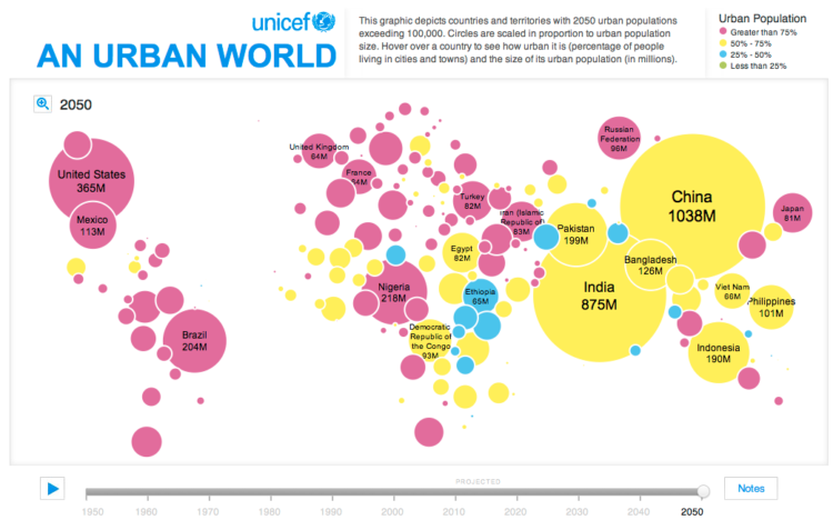
• Hi, Boing Boing readers. Welcome to FlowingData. For the new visitors, here’s the rundown (and for the old visitors, welcome back). My name is Nathan, and I’m a statistics graduate student / computer science graduate obsessed with data and visualization. Here on FlowingData I cover how statisticians, computer scientists, designers, and other experts use data to help us better understand ourselves and our surroundings.

    For more details, check out the about page and feel free to contact me if you have any questions. If you like what you see, you might want to subscribe to the feed.

    Again, thanks to David and Boing Boing for linking here, and again, thanks to Mike for making the suggestion!

  • In light of the MySpace photo breach (due to their negligence) a couple…

  • COMING MAY 29

    Pre-order on Amazon
  • I just created a new Twitter account, and it got me to thinking about all the data visualization I’ve seen for Twitter tweets. I felt like I’d seen a lot, and it turns out there are quite a few. Here they are grouped into four categories – network diagrams, maps, analytics, and abstract.

    Network Diagrams

    Twitter is a social network with friends (and strangers) linking up with each other and sharing tweets aplenty. These network diagrams attempt to show the relationships that exist among users.

    Twitter Browser

    Twitter Browser

    Twitter Social Network Analysis

    The ebiquity group did some cluster analysis and managed to group tweets by topic.

    Twitter Social Network Analysis

    Twitter Vrienden

    Twitter Vrienden

    Twitter in Red

    I’m not completely sure how to read this one. I looks like it starts from a single user and then shoots out into the network.

    Twitter in Red

    Twitter Network

    Twitter Network

    Read More

  • Wired Magazine recently did a feature on data-driven art.

    The above image is Jason Salavon’s work that shows U.S. population by county. The technically-minded readers might be thinking, “I don’t get it. What am I seeing here? I don’t even know what county has the greatest population.” I understand where you’re coming from, but hey, it’s art not a status update.
    Read More

  • I’ve dabbled quite a bit throughout my academic career. I started in computer science, then electrical engineering, and then statistics. I also considered a future in business, environmental science, civil engineering, and urban planning, but I’ve finally settled on a combination of statistics and design — data visualization.

    Here are the 4 visualizations that got me interested and left me wanting more.
    Read More

  • Area Codes by LudacrisI thought this map was amusing. As you can see, Mr. Bridges prefers those in the southeast and northeast according to his 2001 hit single, Area Codes in which he raps about all the female friends he has made.

    This is yet another example of the ubiquity of data. If you can find hoe data in Ludacris’ Area Codes, you can find data anywhere. Here’s the large version of the above map. By the way, I’m sorry if I’ve offended anyone with this hoe data. Hoe data.

    [via Strange Maps]

  • New York Talk ExchangeNew York Talk Exchange – Illustrates the global exchange of information in real time by visualizing volumes of long distance telephone and IP (Internet Protocol) data flowing between New York and cities around the world.

    A Week in LifeA Week In the Life – A data sculpture made out of cardboard representing movement and communication from a cell phone in one week to increase awareness of the German Telecommunications Data Retention Act.

    National Gruntledness IndexNational Gruntledness Index – A heat map showing where in the United States most people are, um, gruntled. Is this for real? Somehow I don’t think the entire country is pissed off.

    DanweiLooking for a Design Job in China? – Danwei is looking for a smart, skilled creator who can present raw economic data in a very visual way.

  • FacebookI started a FlowingData Facebook group a couple of weeks ago, and I guessed that about two people would join. I was slightly off, and we’re up to 92 now (plus me), which makes me happy. Thank you for making me happy you 92 people :).

    I do have one more favor to ask of you. If there’s anything you find interesting – data sets, visualization, art pieces, analyses, posts from your own blogs – please do post to our group. My hope is that FlowingData will grow into more of a community than just me on my soap box. As much as I like hearing myself talk, I like listening to what others have to say a lot more.

    If you haven’t joined the FlowingData Facebook group yet, I highly encourage it. We’re from all areas of the data world from statistics to design, computer science, to education, psychology, economics, and many others, which makes for very good conversation.

  • United Nations Data LogoFor our Humanflows project, we used the United Nations Common Database for our demographic numbers. Anyone who has used the common database knows that it’s not especially user-friendly. You have to go through a series of non-intuitive dropdown menus to get the data you want. You then have to decipher the downloaded data’s CSV format. The recently released UNdata relieves a lot of these problems.
    Read More

  • Computation+JournalismThese highlights from Journalism 3G are pretty overdue, but better late than never. Here’s what I thought was most interesting.

    Sensemaking and Information Visualization

    Naturally, my ears perked up on the second day when the sensemaking and information visualization panel began. Jeff Heer, who I’ve referred to a few times before, was the standout of the group. His presentation was for the most part on his paper – Voyagers and Voyeurs: Supporting Asynchronous Collaborative Information Visualization with Fernanda B. Viégas and Martin Wattenberg. It’s a pretty good read that covers topics like vizster and the pre-Many Eyes project sense.us.

    Vizster by Jeffrey Heer

    However, it wasn’t so much the material that was so interesting. It was the way Heer presented his material that captivated the audience. From the static visualizations to the animated ones, it was another great example of how powerful visualization can be.

    John Stasko from Georgia Tech also had some fun visualization work to show. His presentation was more of an overview of why journalists should care about visuals. As chair of last year’s InfoVis conference, he did a good job.

    Journalistic Video Games

    Fatworld by Persuasive Games

    Ian Bogost gave an interesting talk on the role of video games in journalism. The focus was mostly on his work with Persuasive Games:

    Our games influence players to take action through gameplay. Games communicate differently than other media; they not only deliver messages, but also simulate experiences. While often thought to be just a leisure activity, games can also become rhetorical tools.

    Think games are just for fun? Think again.

    One thing that Bogost said stuck with me. He said that video games are usually bad at telling stories. Many games put up a road sign for an issue but don’t really go any further than that. Persuasive Games tries to go deeper to make players think about the issues presented.

    We can say this about a lot of data visualization projects out there (you know which I’m talking about); they try to make a statement but don’t really go into the why or how we can change.

    Citizen Scientists

    Finally, there was Mark Hansen, who was actually the first speaker of the conference (and happens to be my adviser). Hansen talked about his recent work with Ben Rubin at The New York Times building and moved on to citizen science.

    Brad Stenger did a good job summarizing Hansen’s talk in his detailed recap on infosthetics, but the main point to take away — citizens certainly play an important role in data collection and reporting. Over time, as technology advances, citizen science will only play a larger role in ubiquitous journalism collecting, analyzing, and making use of data.

    Lasting Impressions

    The Journalism 3G coordinators put together a very good set of talks covering a lot of different areas. As journalism spreads outside of the conventional paper, it’s clear that collaboration between journalists and techs is vital to future success.

  • Data is absolutely vital to Google’s success; without data, Google is pretty much useless when it comes to search. Hal Varian explains on the official Google blog:

    Over the years, Google has continued to invest in making search better. Our information retrieval experts have added more than 200 additional signals to the algorithms that determine the relevance of websites to a user’s query.

    So where did those other 200 signals come from? What’s the next stage of search, and what do we need to do to find even more relevant information online?

    What an interesting question. I wonder what the answer is. Oh, here it is:

    Storing and analyzing logs of user searches is how Google’s algorithm learns to give you more useful results. Just as data availability has driven progress of search in the past, the data in our search logs will certainly be a critical component of future breakthroughs.

    Cashing In On Data

    That’s right. Without data, who knows where search could be now. AOL might still be prosperous. There’s also this funny bit about how Larry and Sergey initially tried to license their algorithm to new, already existing search engines, but no one bit, and so they made their own. You gotta respect the data!

    For more on the importance of data, you might also be interested in the ever-going series on FlowingData on why data matters.

  • Santiago, who I met at the Visualizar workshop, forwarded me his work on the visualization of del.icio.us tags and bookmarks called 6pli. Normally, I’m not a big fan of network diagrams, because I always seem to get lost in all the nodes and edges cluttering up the place. I feel differently about 6pli though.

    6pli sets itself apart with really smooth, responsive interaction and three views – elastic net 3-d, elastic net 2-d, and circle 2-d. All three views rely on a metric of tag-similarity. So the more co-tags that a single tag has with its neighbors, the closer the tags will be in proximity.

    Was that confusing? OK, it’ll be more clear with pretty pictures.

    Elastic Net 3-D

    The elastic net 3-D (pictured above) shows tags and bookmarks in a 3-dimensional view. Tags are in rectangles and bookmarks are circles. A bookmark (or circle) will be closer to another bookmark (or circle) if it has more tags in common. Similarly, if a tag is often grouped with other tags, it will appear closer to that group. Click on a tag, and a list of bookmarks show up on the right.

    The cool part is when you start playing with the 3-D network blobby. You can rotate it like a globe and the movement is controlled by spring action. The visualization’s response is immediate and really smooth with nice transitions from one view to the next, unlike this paragraph.

    Elastic Net 2-D

    Elastic Net 2D

    The 2-dimensional view is the same principle as the 3-D. The only difference is the 2-D is a projection of the 3-D view onto a flat plane. Smooth interaction still applies here.

    Circle 2-D

    Circles 2D

    Finally, the circle view arranges tags and bookmarks into their del.icio.us bundles. Each circle is divided homogeneously and the radius of the circle can me manually modified.

    One thing I would recommend for the beta release is some kind of input to type in a tag or the name of a bookmark. Right now, the starting point feels kind of random, but if I could specify where I wanted to explore, I think the viz would be that much more useful.

    Check out my 6pli del.icio.us tags viz here.

  • Clock by ToniVCI waste way too much time doing completely useless stuff when I should be working on my dissertation, reading papers, writing papers, and learning things that will bring me closer to my degree. I’m ready to stop procrastinating.

    How I Will Become More Productive

    In an attempt to work more efficiently, I am going to take up Seth’s self-experimentation offer that I found via Andrew’s post. I am going to self-experiment; I am going to collect data about myself; and I am going to find out if my two-pronged method to stop procrastination works. Here’s my plan:

    1. I will make a to-do list every night to lay out what will get done the next day
    2. I will enable the Greasemonkey script – Invisibility Cloak – which will block all the sites that I waste too much time on except during lunch and on the weekend

    How I Will Judge Improvement

    To measure my progress, I will make use of two Firefox plugins – Browser Statistics and TimeTracker. The former keeps track of the amount I’ve downloaded (in megabytes) while the latter is a timer for time spent browsing the Web.

    Luckily I’ve had these two plugins enabled for a little over a month, so at the end of this month, there will be something to compare to. From January 27 to March 2, I downloaded 23,524.73 megabytes and spent a whopping 364 hours browsing. That’s about 653 megabytes and a little over 10 hours per day. OK, that’s embarrassing.

    Join Me In This Self-experiment

    I’ll do this for one month with a midway report on March 17 and a final report on March 31. You can subscribe to the feed to stay updated, and if anyone wants to join me on this, all the better. Just leave a comment below so that we can keep track of results.

    Procrastination-free days start now.

  • I stumbled across a data table from the Social Security Administration that shows the probability of death. It’s an actuarial life table estimating the probability that you will die within one year given your age.
    Read More

  • Jonathan Harris and Sep Kamvar collaborated again in their featured piece at New York Museum of Modern Art’s Design of the Elastic Mind exhibit. Similar in flavor to their previous work, I Want You to Want Me explores the search for love and for self in the online dating world i.e. data collected from various online dating sites every few hours.
    Read More

  • David forwarded me his graphic on the modern two party system in the United States senate which essentially shows the senate’s bipartisanship over time. It made me happy to see someone in political science using R, playing around with data, and taking a stab at creating a useful graphic.

    Improving the Graphic

    While the graphic is indeed useful, I think there are some things that could make it even better. Here are thoughts that I sent to David.

    • I wasn’t immediately sure what each visual cue represented e.g. size of state abbrev. until I reached the bottom. It might be worth making the annotation more prominent either by position, size, or color or all three.
    • To me, the congress numbers don’t matter so much, but that just might be I don’t have a lot of learning on the history of American government.
    • I’m wondering if there’s some way to make the labeling of the years more concise? If you just labeled with the first year of the two-year term, would it be obvious that you’re describing a two-year term? What if you took away the alternating gray background and just made it all white and then had a bar timeline-type thing on top (and bottom)?
    • What if you tried to use a color scheme? I mean, you have the red and blue for the reps and dems (which I think is right), but the gradient for the senate counts turns very bright pink and purple which doesn’t go too well. Then there’s the cyan, yellow, and green which doesn’t seem to have any specific significance other than each color represents something. What I mean is… is there a reason you chose those colors?
    • It might be worth making the annotations bigger so that you don’t have to “zoom in” to read.
    • I think I would make the median lines a bit more prominent, but that’s just me.
    • There’s a lot of cool stuff getting represented here, and I wonder if anything might benefit as a separate graph. Would this benefit at all as a series of graphs instead of one large graphic?

    Now It’s Your Turn

    So that’s my opinion. What do you think? Judging from our FlowingData Facebook group (which I’m happy to see is growing), we have a very diverse bunch from design, statistics, computer science, and some other areas, so I’m eager to hear what the rest of you think about this visualization.

  • Visitorville screenshotFor a while now, I’ve been interested in how we can apply interaction principles of video games to visualization and exploratory data analysis (although admittedly, gaming is still a very foreign concept to me). Visitorville is an example of how the fun of video games can be applied to analytics. It looks a lot like the awesome classic SimCity (whose source code was recently released, by the way).

    VisitorVille applies video game principles to help you easily visualize and better understand your web site traffic statistics.

    It’s easy: each building represents a web page; each bus a search engine; and each animated character a real visitor to your site.

    Just paste our tracking code into your web pages, then launch VisitorVille for Windows to analyze your stats, watch your traffic in real time, provide Live Help, track your PPC campaigns in real time — and more.

    Using our unique Virtual VCR, you can even play back traffic from any day or time, at any speed.

    Learning From Video Games

    We certainly have a lot to learn from video games — interaction, user engagement, graphics, and fun. Seriously, statistical visualization could stand to have a little bit ‘o fun tossed in. At least that’s what I tell my wife when I try to convince her to buy me an Xbox 360.

    Somewhat related note — there was an interesting talk at Journalism 3G on using video games to tell stories, which I’ll be discussing some time in the near future once I get all my notes together.

    [via Water Cooler Games | Thanks, Iman]

  • Everyone knows that The New York Times produces great graphics. I bet you’re interested in how those graphics get made. What’s the process of making a graphic? What makes a good visual journalist? What’s a day in the life of a New York Times graphics editor? Now you can find out.

    From February 25 (um, yesterday) until this Friday, you can talk to The New York Times graphics director, Steve Duenes. Go ahead. I know you want to.

    Looking very dashing in that picture there, Steve.

  • Congratulations to two of my most favorite visualization / design groups – IBM Visual Communications Lab and Stamen Design – who officially now have their work featured at the Museum of Modern Art in New York. Really incredible and well deserved.

    From this past Sunday to May 12, VCL’s History Flow and Thinking Machine and Stamen’s Cabspotting are featured in Design and the Elastic Mind.

    Design and the Elastic Mind

    The exhibition will highlight examples of successful translation of disruptive innovation, examples based on ongoing research, as well as reflections on the future responsibilities of design. Of particular interest will be the exploration of the relationship between design and science and the approach to scale. The exhibition will include objects, projects, and concepts offered by teams of designers, scientists, and engineers from all over the world, ranging from the nanoscale to the cosmological scale. The objects range from nanodevices to vehicles, from appliances to interfaces, and from pragmatic solutions for everyday use to provocative ideas meant to influence our future choices.

    Read More

  • Welcome, Boing Boing readers. If you’re new to FlowingData, you might want to read the about page to find out what FlowingData is all about. Essentially, I like to cover how people from different fields — statistics, computer science, design, etc — are using data to explore ourselves and the environment around us, mainly with data visualization.

    Oftentimes, data (or information) just gets overlooked or misinterpreted. We should work on changing that, and I think that data visualization is the way to make people see.

    Feel free to take a look at the archive or some of the more popular posts listed on the sidebar, and of course, if you like what you see, you can stay updated by subscribing to the feed.

    Thanks to Boing Boing for linking here and to Mike for making the suggestion!