NPR explains how we reached a population of 7 billion. Simply put, the world is making babies faster than people are dying, and with improved medicine and agriculture, people are living longer than before. The video above demonstrates the different birth and mortality rates, where each container represents a continent.
There has been a shift in recent years:
Much of that growth has happened in Asia — in India and China. Those two countries have been among the world’s most populous for centuries. But a demographic shift is taking place as the countries have modernized and lowered their fertility rates. Now, the biggest growth is taking place in sub-Saharan Africa.
[NPR via Graphic Sociology]
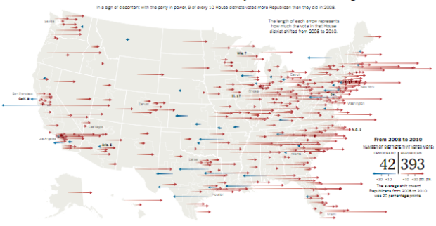
 Another month, another
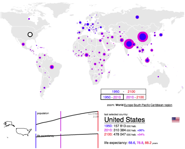


 Visualize This: The FlowingData Guide to Design, Visualization, and Statistics (2nd Edition)


