Daniel Shiffman, who you might know from his enthusiastic YouTube channel The Coding Train, updated his book The Nature of Code. The original version from 2012 focused on Processing. The new version uses p5.js, while still focusing on “understanding the mathematical principles behind our physical world.” You can find the free-to-read online version here.
-
The Pudding ran an experiment that asked people to trace a shape. They would string together the sketches to make a flipbook to see where a single line or a circle would end up. They published the results:
Every shape devolved into a scribble, which I feel is a metaphor for information on the internet.
They also ran a sidequest that tested anonymity and the tendency to draw inappropriate things online. While the results were underwhelming, I appreciate the effort to see how many times a phallic sketch appears. Four times out of several thousand.
See also the Aaron Koblin works — a collaborative Johnny Cash music video, a song by 2,008 voices, and a hundred dollar bill drawn by thousands — that inspired the flipbook project. Although nothing beats Reddit’s pixel wars in 2017.
-
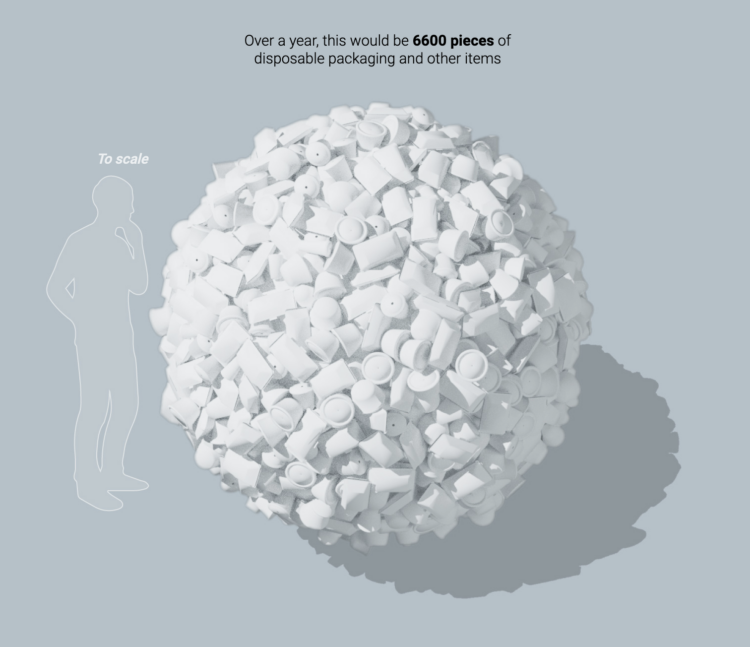
Hong Kong banned single-use plastics often used for food takeaway containers. For South China Morning Post, Kaliz Lee and Davies Christian Surya describe the ban and the scale of the waste. It’s a lot of plastic.
-
Members Only
-
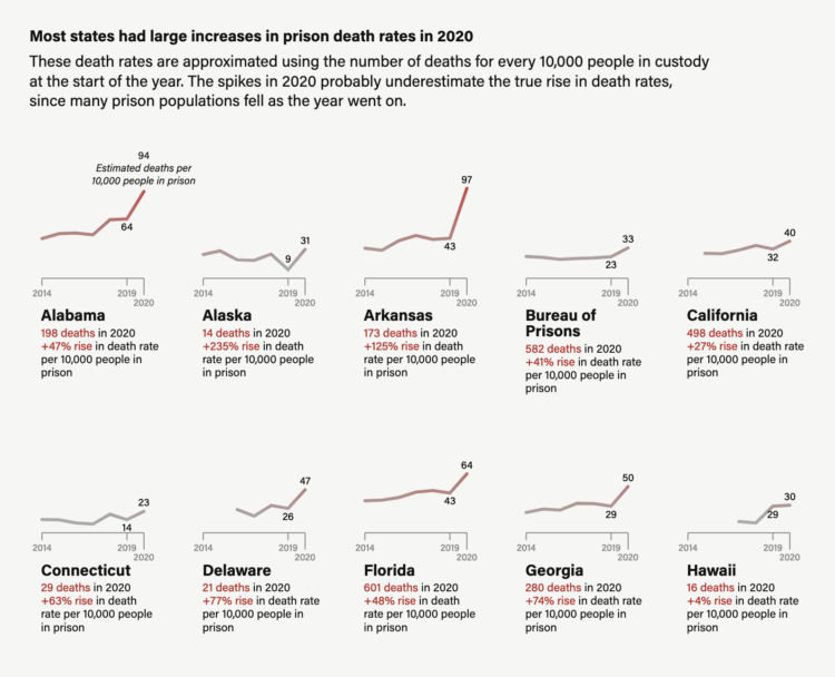
The Marshall Project highlights research on excess mortality in U.S. prisons:
The slowdown in admissions meant that prison systems reduced the number of younger people exposed to COVID, while the older people already inside were left there. That’s because incarcerated people are generally older than those likely to be sent to prison.
By the end of 2020, Bureau of Justice Statistics data shows the number of people in state prisons under 55 fell by 17%, while the 55 and older population was down by 6%.
Prison deaths spiked almost everywhere across the country, varying in magnitude from state to state.
-
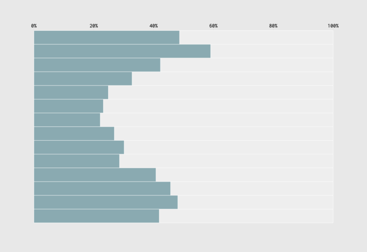
When we’re young, we tend to have fewer responsibilities, which means we can sleep and wake up later. Then work and parenting come along, and our schedules grow more structured. We can see the shift in the percentage of people who are sleeping, given their age.
-
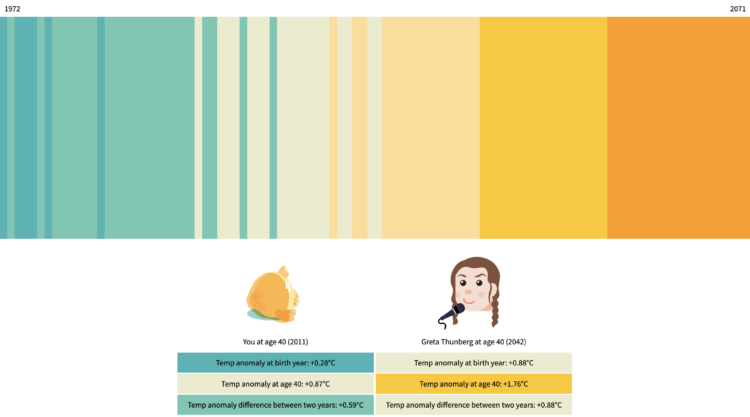
One of the challenges of understanding the weight of climate change is that it’s a slow process. You likely won’t see the full effect in your lifetime. So, for The Tardigrade, Julia Janicki and Daisy Chung placed your timeline against others to show how your future and others’ futures differ.
Projections are from the Intergovernmental Panel on Climate Change and show the timeline up until you turn 100 years old. You might recognize the visual form, which is based on Ed Hawkins’ climate stripes.
-
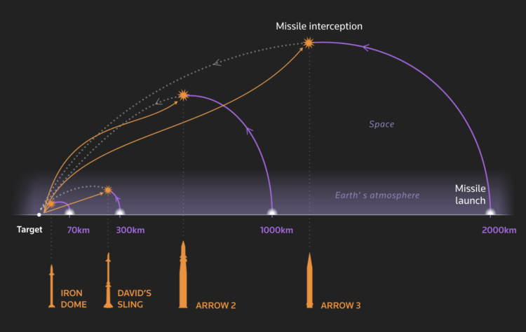
Using a series of graphics, Reuters explains Israel’s defense against rockets, also known as Iron Dome.
A key part of Iron Dome is its control system’s ability to discern what incoming targets pose a threat. If an adversary’s rocket will land harmlessly – in an unpopulated area or in the sea, for instance – it will not be intercepted. That makes it ideal for “saturation” scenarios in which an enemy tries to fire so many missiles that not all of them will be shot down, said Uzi Rubin, a senior researcher at the Jerusalem Institute for Strategy and Security.
-
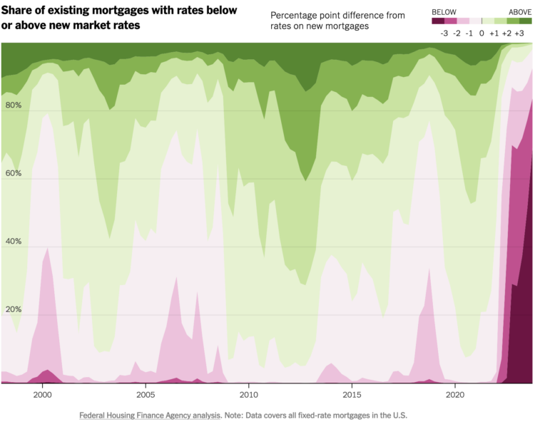
For The Upshot, Emily Badger and Francesca Paris compare the rates of existing mortgages against current rates for new loans. A stacked area chart shows the large share of existing rates that are lower, which means a lot of people aren’t so eager to move, relative to the past 20 years.
I’m in that dark maroon group. Higher mortgage rates, higher listing prices, and higher property taxes. Doesn’t seem fun.
-
Members Only
-
As I peel myself out of bed in the morning after again not going to sleep at a civilized hour, blurry-eyed, I wonder what hours others sleep. Certainly, I must be in the majority. According to the National Health Interview Survey from 2022, I am not. Two-thirds of adults get at least 7 hours of sleep.
-
How to Make a Cartogram with Packed Circles in R
There are packages to make cartograms, but in some cases you might need a more flexible solution.
-
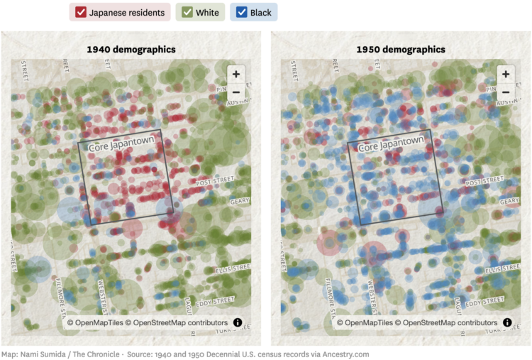
In 1942, Franklin Delano Roosevelt mandated that those of Japanese descent be sent to prison camps. Through the lens of recently released Census records, the San Francisco Chronicle examined the impact of forcing thousands of residents out of their homes.
Over nearly a year, the Chronicle collected and analyzed this data, seeking to understand just how Executive Order 9066 reshaped Japantown. For the first time, we can count the number of Japanese American residents in the neighborhood in 1940 and 1950 — an unequivocal measure of the order’s disastrous effect on the community.
-
For Bloomberg, Daniela Sirtori, Madeline Campbell, and Marie Patino do some product counting:
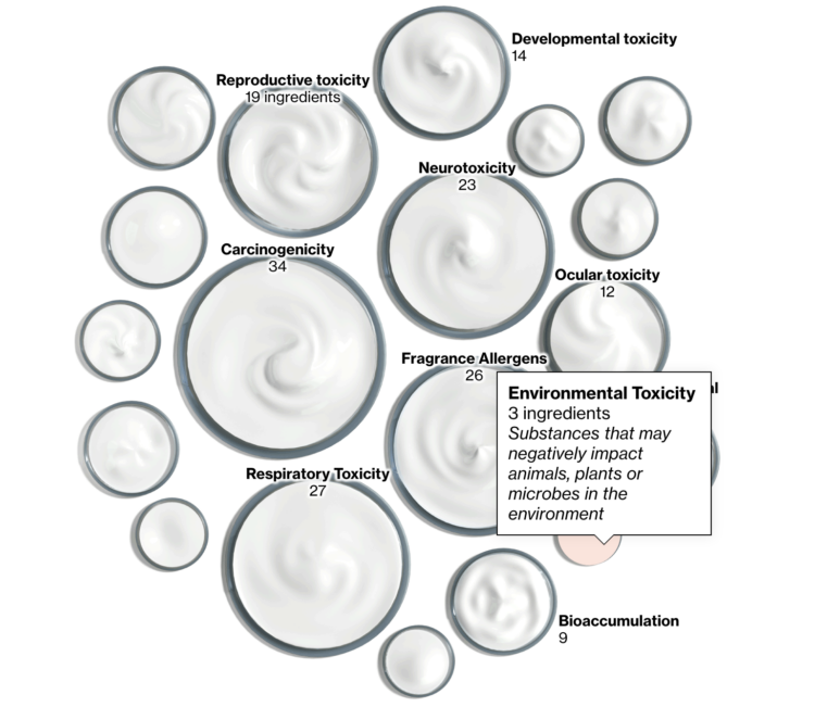
Data collected by the California Department of Public Health showed 108 potentially harmful substances listed as fragrance ingredients in everyday products ranging from face wash to conditioner, a Bloomberg analysis of database entries as of Feb. 6 found. Some of the compounds are identified as potential carcinogens by authorities such as the World Health Organization.
Scaled jars of cream are used to show ingredient categories. I like it.
-
I missed this announcement at the end of last year:
Sherwood Media, LLC has added U.K.-based Chartr Limited, a data-driven media company and newsletter publisher, to its portfolio through an acquisition by Robinhood Markets, Inc. Chartr’s visual storytelling turns complex data into easy-to-understand narratives, and will now give the tens of millions of readers of Sherwood Media the ability to better understand the finer details of important trends and the news of the day.
Offering clear and thoughtful insights into complex data is a natural extension of Sherwood’s mission to empower its readers to have the information they need to control their financial future. The acquisition of Chartr gives audiences new ways to understand and see news and market-moving trends. Readers can expect to find Chartr stories across Sherwood content, including Snacks, a daily markets and business newsletter that has one of the largest audiences in the country.
Sherwood Media is a subsidiary of Robinhood. They recently launched Sherwood News, and I saw a chart that looked familiar in format but with a different logo. It’ll be interesting to watch where this publication and relatively straightforward chart machine goes.
-
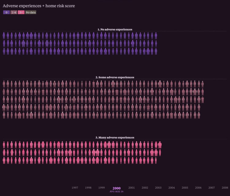
The National Longitudinal Surveys from the Bureau of Labor Statistics are unique in that they run long-term to survey the lives of individuals for decades. For The Pudding, Alvin Chang visualized survey responses to show how adversity as a teenager carries into adulthood.
Each person icon represents a respondent and the collective bar chart stacks track through the years. The icons run across the screen on each time segment and demographic shift.
There’s a video version, shown below, and while I enjoy Alvin’s dulcet voice, I prefer the scrolling version.
-
 A decade and a half ago, I wrote the first edition of Visualize This as a how-to guide to my past self. It was for someone who was familiar with visualization but was stuck on the part where it’s time to make and design charts with your own data.
 What tools should you use? How do you use them? How do you get from rough sketch to finished graphic? How do you get the visualization idea in your imagination on to a screen where others can see?
It turns out that you can read and learn a lot about visualization — the chart types, the best visual encodings, design considerations, and purpose — without actually knowing how to follow through with the advice. There’s a technical side to visualizing data that couples with the thinking side. I wrote Visualize This for the person who wants to make the coupling and follow through.
The challenge of writing a book with concrete, how-to examples that rely on software is that some of the software fades. The technology and applications shift.
Flash dies. People consume data through different screen sizes. New tools make it easier to visualize data. Tastes change. The field develops.
Visualize This, Second Edition is an update for the tools, chart types, and overall process that changed over the years. The examples are better balanced and more focused.
The new book is still a practical, easy-to-read guide intended for my past self who wanted to make all the charts for all the data. But this time around, I had a decade and a half more experience analyzing data, making charts, and thinking about process.
Visualize This, Second Edition is out in June, but you can pre-order a copy now. I hope it helps you have fun with data.
-
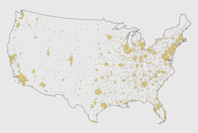
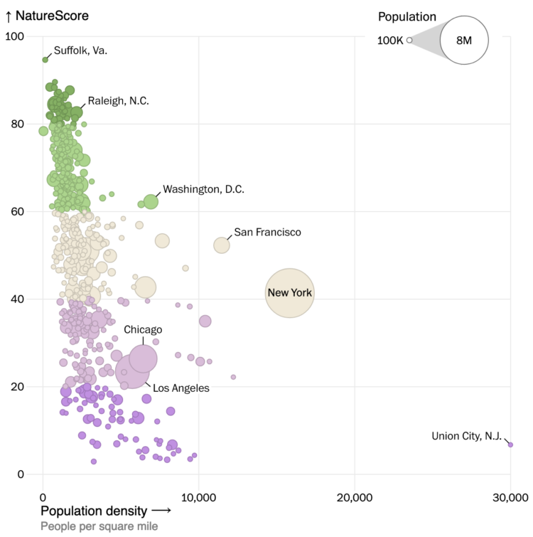
NatureQuant processes and analyzes satellite imagery to quantify people’s access to nature. They call it a NatureScore. For the Washington Post, Harry Stevens mapped and charted the scores across the United States. At first glance, the map looks a lot like population density, but the better comparison is in how cities with similar population densities look next to each other.
-
Members Only
-
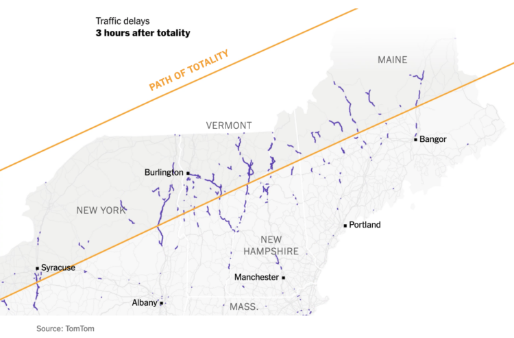
As you might expect, the path of totality brought increased activities as people tried to get in the right spots. For the New York Times, Charlie Smart mapped the movements based on activity data from Mapbox and traffic data from TomTom.



 Visualize This: The FlowingData Guide to Design, Visualization, and Statistics (2nd Edition)


