In case you’re trying to navigate from one star to another in the Star Wars galaxy, there is an official detailed map of the fictional space. It is not comprehensive, as apparently the galaxy “contains billions of stars and is home to trillions of beings” but it seems like it should at least be good enough to figure out which direction to go. (via kottke)
-
Members Only
-
For Quanta Magazine, Shalma Wegsman provides a history of Jean-Baptiste Joseph Fourier’s transform. James Cooley and John Tukey get a nod:
Any 8-by-8 image, for example, can be built from some combination of the 64 building blocks [above]. A compression algorithm can then remove high-frequency information, which corresponds to small details, without drastically changing how the image looks to the human eye. This is how JPEGs compress complex images into much smaller amounts of data.
In the 1960s, the mathematicians James Cooley and John Tukey came up with an algorithm that could perform a Fourier transform much more quickly — aptly called the fast Fourier transform. Since then, the Fourier transform has been implemented practically every time there is a signal to process. “It’s now a part of everyday life,” Greengard said.
I’ve said this before, but this would’ve been useful for me in college. The two-hour lectures on Fourier transforms, after lunch and in the dark, were brutal and I might’ve missed a slide or twenty.
-
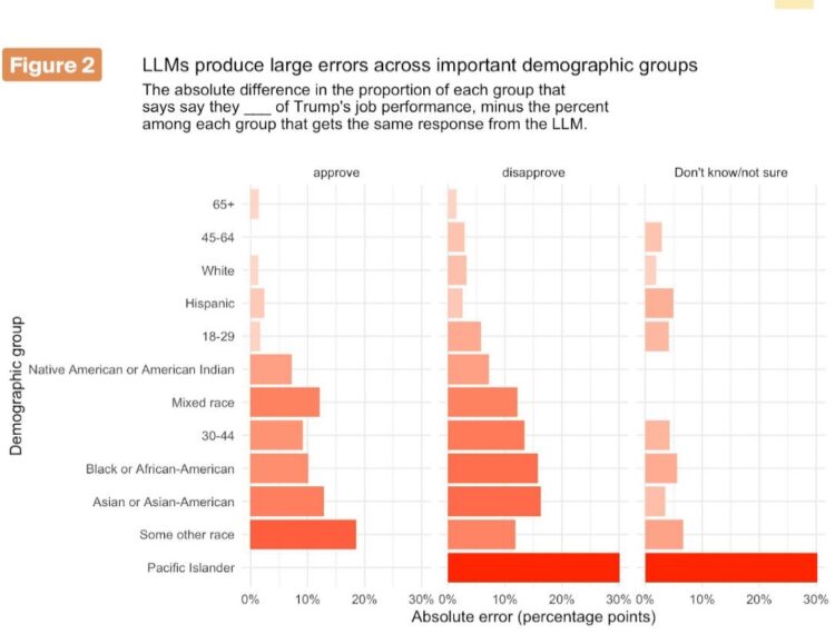
Synthetic sampling uses models to “survey” fake respondents. G. Elliott Morris and Verasight compared real polling data against the synthetic variety to find that the latter is error-prone.
We find that the AIs cannot successfully replicate real-world data. Across models, the LLMs missed real population proportions for Trump approval and the generic ballot by between 4 and 23 percentage points. Even the best model we tested overstated disapproval of Trump, and almost never produced “don’t know” responses despite ~3% of humans choosing it.
For core demographic subgroups, the average absolute subgroup error was ~8 points; errors for some key groups (e.g., Black respondents) were as large as 15 points on Trump disapproval, and smaller groups had larger errors still (30 percentage points for Pacific Islanders). This is unusable for serious analysis.
Find the white paper here.
The point of polling is to estimate reality, so the premise of synthetic sampling through mathematical models instead of through people does not make sense to me.
-
Bots have crawled the web for a long time, but the past couple years has been something different as companies release their AI crawlers to scrape as much as possible. Cloudflare broke it down by type of bot and source.
Not all crawlers are the same. Bots, automated scripts that perform tasks across the Internet, come in many forms: those considered non-threatening or “good” (such as API clients, search indexing bots like Googlebot, or health checkers) and those considered malicious or “bad” (like those used for credential stuffing, spam, or scraping content without permission). In fact, around 30% of global web traffic today, according to Cloudflare Radar data, comes from bots, and even exceeds human Internet traffic in some locations.
A new category, AI crawlers, has emerged in recent years. These bots collect data from across the web to train AI models, improving tools and experiences, but also raising issues around content rights, unauthorized use, and infrastructure overload. We aimed to confirm the growth of both search and AI crawlers, examine specific AI crawlers, and understand broader crawler usage.
Every now and then I glance at traffic sources, and AI bots seem increasingly common. I wonder if or when bot traffic outnumbers human visits.
-
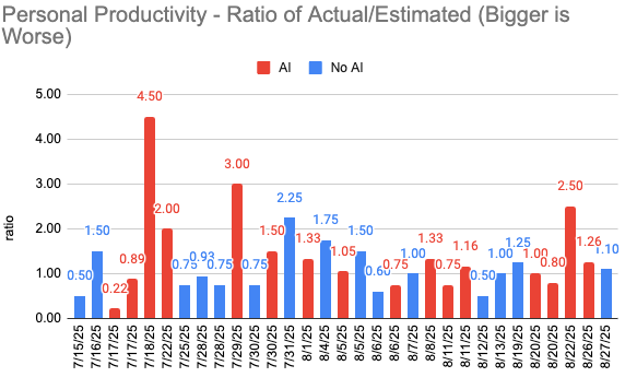
A big promise behind AI coding tools is that they will make you more productive. You will be able to code like a half-human-half-machine, leaving all full humans behind to dream of your skills. Developer Mike Judge was skeptical, so he measured his own productivity and found “that the data isn’t statistically significant at any meaningful level.”
-
The Bureau of Labor Statistics revised job counts down by almost a million:
The preliminary estimate of the Current Employment Statistics (CES) national benchmark revision to total nonfarm employment for March 2025 is -911,000 (-0.6 percent), the U.S. Bureau of Labor Statistics reported today. The annual benchmark revisions over the last 10 years have an absolute average of 0.2 percent of total nonfarm employment. In accordance with usual practice, the final benchmark revision will be issued in February 2026 with the publication of the January 2026 Employment Situation news release.
Each year, CES employment estimates are benchmarked to comprehensive counts of employment from the Quarterly Census of Employment and Wages (QCEW). These counts are derived primarily from state unemployment insurance (UI) tax records that nearly all employers are required to file with state workforce agencies.
I am sure all interested parties will consider uncertainty through estimation, as is common in statistics that require timeliness and accuracy.
-
The median salary for full-time workers in the United States was $49,500, based on estimates from the Bureau of Labor Statistics in 2024. However, salaries vary by occupation. These charts show the spread.
-
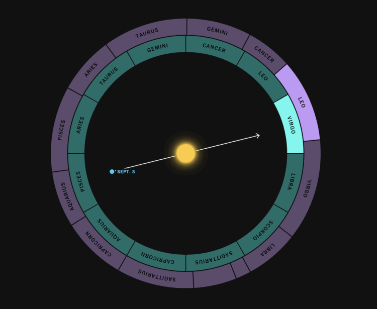
For NYT’s the Upshot, Aatish Bhatia, Francesca Paris, and Rumsey Taylor show how zodiac signs were determined by the position of constellations relative to Earth and the Sun thousands of years ago. That probably seemed like a good idea at the time, but more accurate measurements and records show that if we continued to go by the relative positions, our zodiac signs would be different.
The interactive elements and animations illustrate the shifts well. Enter your birth date to see how your sign would change, and a night sky moves to show how our perspective changes because of Earth’s wobble.
-
NPR enlisted the band Bettis And 3rd Degree to sonify rising temperatures in New Orleans. As the temperature rises from 1980 to present, listen as the music tempo speeds up.
Between 1980 and 2000, the average annual temperature in New Orleans goes up by more than a quarter of a degree, and it may not seem like much if you’re just looking at the data in a spreadsheet, but it is significant.
And between 2000 and 2015, it jumps up again, almost a full degree warmer than the first 75 years of data. This is where things really start to pick up.
Over the last decade, the temperature increase has accelerated even more, almost two degrees Fahrenheit more than the 1980s. And many climate scientists say temperatures are increasing faster.
-
The Bureau of Labor Statistics released monthly jobs data, but after the firing last month, some might be wondering how much we can trust future BLS data. For the New York Times, Ben Casselman asked economists how they’re feeling these days, who mostly said that the data can still be trusted.
In any case, Ms. Groshen and other experts said, even a commissioner with ill intentions would not be able to meddle with the data, at least not in the short run and not without anyone’s noticing. The monthly jobs report is produced on a tight schedule using a highly automated and decentralized process. Most of the data that underlies the monthly payroll figure is reported directly by companies through an electronic system that is subject to strict access limitations. The commissioner, who is the agency’s only political appointee, does not have access to the numbers until they have been made final.
“There’s not like one person in a room who can manipulate things,” said Aaron Sojourner, an economist at the W.E. Upjohn Institute for Employment Research. “There are safeguards in place.”
No sharpies allowed.
-
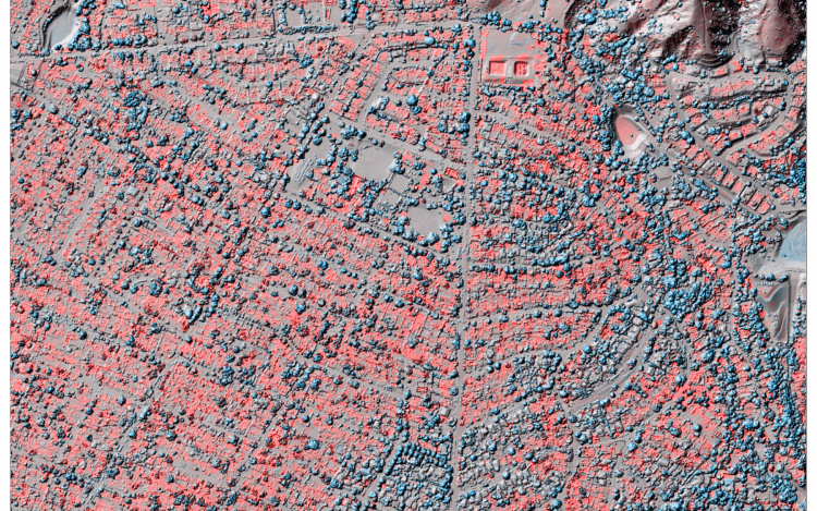
Jon Keegan of Beautiful Public Data highlights researchers who used lidar to estimate fire damage in Southern California.
“We said, what would be a useful product for people to have as quickly as possible, since we’re doing this a couple weeks after the end of the fires? And we thought trying to get as high of a resolution and as kind of as differencing as possible would be a good idea,” said Brigham. Her team cleaned and reformatted the older, lower-resolution data and then subtracted the newer data. The resulting visualizations reveal the scale of devastation in ways satellite imagery can’t match. Red shows lost elevation (like when a building burns), and blue shows a gain (such as tree growth or new construction).
-
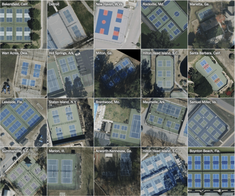
For NYT’s the Upshot, Ethan Singer found the birth of pickleball courts in aerial photographs.
By analyzing nearly 100,000 aerial photographs, we were able to identify more than 26,000 outdoor pickleball courts made in the last seven years — a majority of them at the expense of once-exclusive tennis spaces and created since the onset of the pandemic in 2020. In total, we found more than 8,000 tennis courts that had been transformed for pickleball.
Singer used computer vision to get precise coordinates of each court. Then he compared that data against old photographs to find tennis courts taken over by pickleball.
The sliding effect for before and after photographs works well here, given the contrast between a lone tennis court and a tennis court with four pickleball boundaries drawn on top.
-
Members Only
-
NYPD arrested the wrong man, because facial recognition marked a match. Maria Cramer and Kashmir Hill report for the New York Times:
Like Mr. Williams, the culprit was Black, had a thick beard and mustache, and wore his hair in braids. Physically, the two men had little else in common. Mr. Williams was not only taller, he also weighed 230 pounds. The victim said the delivery man appeared to weigh about 160 pounds. But Mr. Williams still spent more than two days in jail in April.
“In the blink of an eye, your whole life could change,” Mr. Williams said.
It’s clear that facial recognition can be useful for finding people, but without considering outside information, officers use the tool wrong. If they cannot use the tool correctly, then they should not use the tool.
-
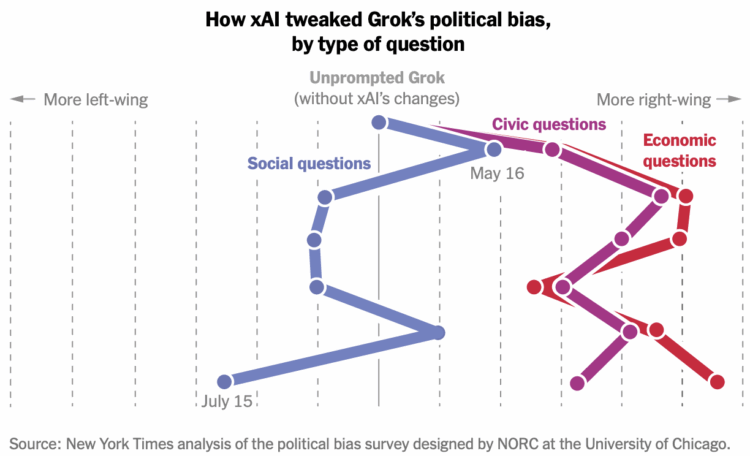
The New York Times estimated political bias in Grok’s models. They entered questions from an ideology survey and evaluated the chatbot’s answers over time.
By July 11, xAI’s updates had pushed its chatbot’s answers to the right for more than half the questions, particularly those about the government or the economy, the tests showed. Its answers to about a third of the questions — most of them about social issues like abortion and discrimination — had moved to the left, exposing the potential limits Mr. Musk faces in altering Grok’s behavior. Mr. Musk and his supporters have expressed frustration that Grok is too “woke,” something the billionaire said in a July post that he is “working on fixing.”
Musk continues to make “fixes” that align with his opinions. Not ideal.
-
A Tesla Model S, while on “Autopilot”, crashed into a parked truck, killing one and injuring another. Tesla claimed in a lawsuit that the data about the crash could not be found. So lawyers for the plaintiffs tried a different route. For the Washington Post, Trisha Thadani and Faiz Siddiqui report:
That’s when they turned to hacker greentheonly, who had a robust social media following for his work recovering data from damaged Teslas and posting his findings on X.
[…]
Inside a Starbucks near the Miami airport, the plaintiffs’ attorneys watched as greentheonly fired up his ThinkPad computer and plugged in a flash drive containing a forensic copy of the Autopilot unit’s contents. Within minutes, he found key data that was marked for deletion — along with confirmation that Tesla had received the collision snapshot within moments of the crash — proving the critical information should have actually been accessible all along.
Even if the data were corrupted or lost initially, which it seems like it wasn’t, Tesla should know their systems well enough to access the data in different ways. One would hope at least, for a company pushing for ubiquitous self-driving cars. Either that or Tesla should hire greentheonly to fix all their systems.
-
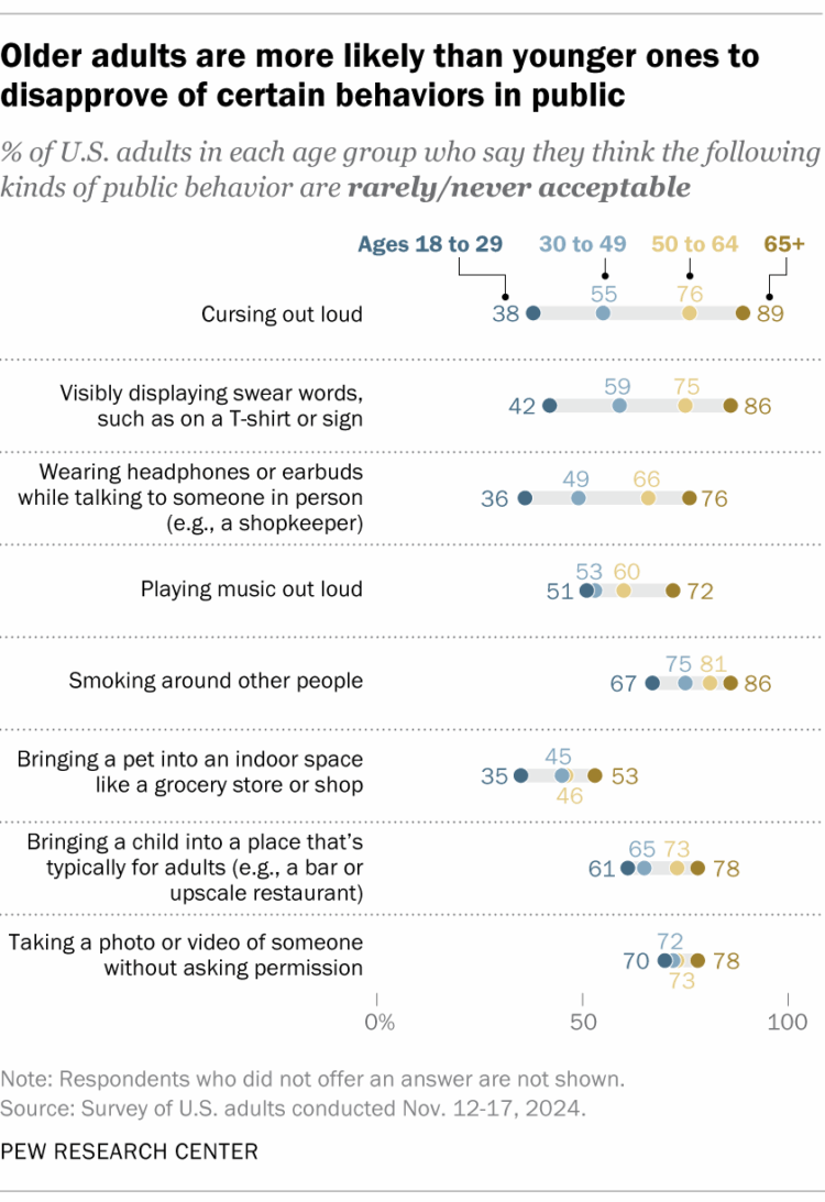
Pew Research asked U.S. adults if certain behaviors in public, such as cursing or smoking, were acceptable. The above are the results for four age groups.
For every behavior, the percentage of people who said it was rarely or never acceptable increased with age. Television and movies (and my own experiences) would tell you that sounds about right, but for some reason the clear trend surprised me. A quiz with the behaviors lets you get in on the action to see how crotchety you are.
At least we all mostly agree that taking a photo without permission is not acceptable. Now about all that public surveillance.
-
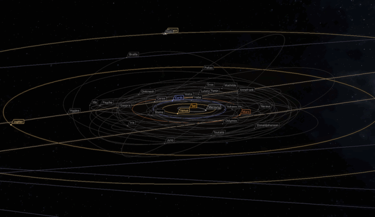
Gordon Hart put together a fun interactive atlas of space. Click on objects, pan, and zoom. It’s not comprehensive but not bad for a side project:
This was a fun side project over Winter Break 2024 to learn orbital mechanics, browser animation, serverless deployment options, and of course facts about moons, asteroids, and comets. Building for yourself is a treat that I haven’t properly enjoyed in some time. Source code is available on GitHub at @gordonhart/atlasof.space.
-
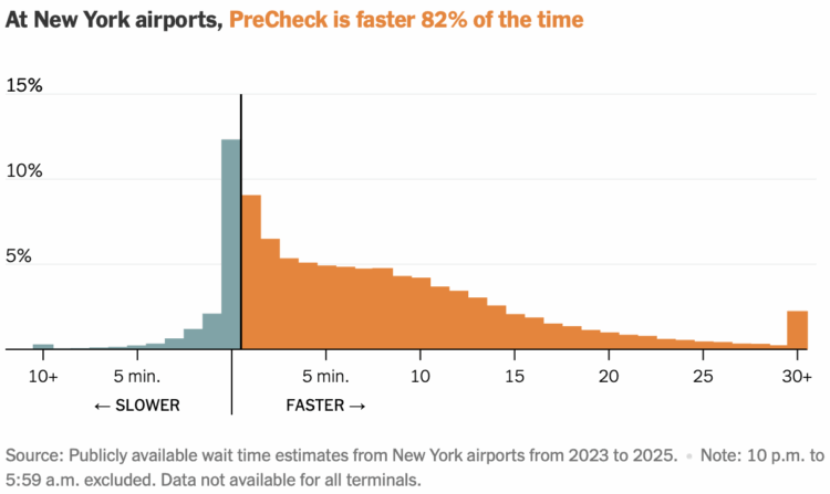
TSA PreCheck allows U.S. travelers to skip the part of airport security where you take your shoes off. For NYT’s the Upshot, Ben Blatt and Christine Chung analyzed wait times at a handful of airports to see if the program really shaves off minutes. The program seems to help most of the time, at New York airports at least.
At these airports — Kennedy, LaGuardia and Newark — PreCheck saves travelers five to 10 minutes on average, according to our analysis. But this will depend on the terminal you’re flying out of and the time of day you’re departing. Sometimes you may save over 30 minutes, sometimes none at all.
At some other major airports, the average time saved appears to be lower than in New York.
A histogram shows the distribution of wait times. The orange side on the right indicates less time waiting with PreCheck than with non-PreCheck. The blue side on the left indicates the same or more.





 Visualize This: The FlowingData Guide to Design, Visualization, and Statistics (2nd Edition)


