
This week, we talk limitations of the defaultiest of defaultiest chart types.
This week, we talk limitations of the defaultiest of defaultiest chart types.
Speaking of careless AI usage, the open-access archive for research papers, ArXiv, is updating their Code of Conduct to account for generative AI. Usage is not banned, but slop is, which results in a one-year ban. Thomas Dietterich, chair of the computer science section, posted the update on X:
Our Code of Conduct states that by signing your name as an author of a paper, each author takes full responsibility for all its contents, irrespective of how the contents were generated.
If generative AI tools generate inappropriate language, plagiarized content, biased content, errors, mistakes, incorrect references, or misleading content, and that output is included in scientific works, it is the responsibility of the author(s).
We have recently clarified our penalties for this. If a submission contains incontrovertible evidence that the authors did not check the results of LLM generation, this means we can’t trust anything in the paper.
The penalty is a 1-year ban from arXiv followed by the requirement that subsequent arXiv submissions must first be accepted at a reputable peer-reviewed venue.
Examples of incontrovertible evidence: hallucinated references, meta-comments from the LLM (“here is a 200 word summary; would you like me to make any changes?”; “the data in this table is illustrative, fill it in with the real numbers from your experiments”)
It seems like it’d be helpful to put this on the actual ArXiv site instead of just floating it out there on X.
Still, necessary, so good on them. They’ll use a detection algorithm to flag papers. It’ll be interesting to see how it holds up as mistakes continue to look less like slop.
Disney shutdown FiveThirtyEight last year, but the archive stayed online. Well, they got rid of that too. All old FiveThirtyEight links forward to ABC News. Nate Silver goes into detail about the shutdown and mismanagement of the site and brand.
It would be nice if that work could be preserved for the public record. I don’t know what plans Disney has for FiveThirtyEight, if any. But I did approach Disney a year or two ago, through my agent, about acquiring the remaining IP. I’m probably the logical high bidder, though the value is rapidly depreciating as what’s left of the site falls into disrepair. At a minimum, we’d restore the archive, with prominent links to Silver Bulletin.
We were told to basically get lost: ABC was annoyed with my critical public comments about their management of FiveThirtyEight. It apparently wasn’t a long conversation, so I don’t have a lot more color to report than that.
Hanlon’s Razor states: Never attribute to malice that which can be adequately explained by stupidity. But honestly, I don’t know which explanation is better suited to ABC. During the second half of my tenure with Disney, it felt like they were putting almost literally zero effort into any decisions involving FiveThirtyEight (other than my being featured prominently in their election night coverage).
In its heyday, FiveThirtyEight was a boon for statisticians and data folks. Normal people saw how data analysis could be applied to everyday thinking. It’s too bad Disney and ABC News could never figure it out.
Steven Rosenbaum wrote The Future of Truth, a book about AI and reality that was published this month. It has generated and misattributed quotes throughout. Benjamin Mullin reports for the New York Times:
One of the quotes is attributed to Kara Swisher, a prominent technology journalist, in a chapter about A.I. lies. “The most sophisticated A.I. language model is like a mirror,” the book says Ms. Swisher wrote. “It reflects our own morality back at us, polished and articulate, but ultimately empty behind the surface. It’s not bound by Asimov’s laws or any ethical framework — it’s bound by the patterns in its training data and the objectives set by its creators.”
When asked about the quote, Ms. Swisher said in a text message that she “never said that,” adding that it seems the quote was made up by A.I. and not Mr. Rosenbaum.
“I also sound like I have a stick up my butt, according to ChatGPT,” Ms. Swisher said.
This seems not good. Probably won’t get the book.

For the Pudding, Russell Samora, with design and illustration by Shelly Tan, analyzed the words used in similes across popular fiction. Instead of just stopping at the obvious word counts, they get into the types of words, outliers, and ironic usage. On the simile “___ as hell”:
If we want to get pedantic, the first use with the exact structure (“as _ as _”) was from the 1954 novel The Refuge:
“‘Any woman with eyes like hers gets a reputation for being as sexy as hell, old boy.’”
This makes hell pretty unique in the dataset. Most nouns earn their place by embodying something, whereas hell just became another way to say “very.”
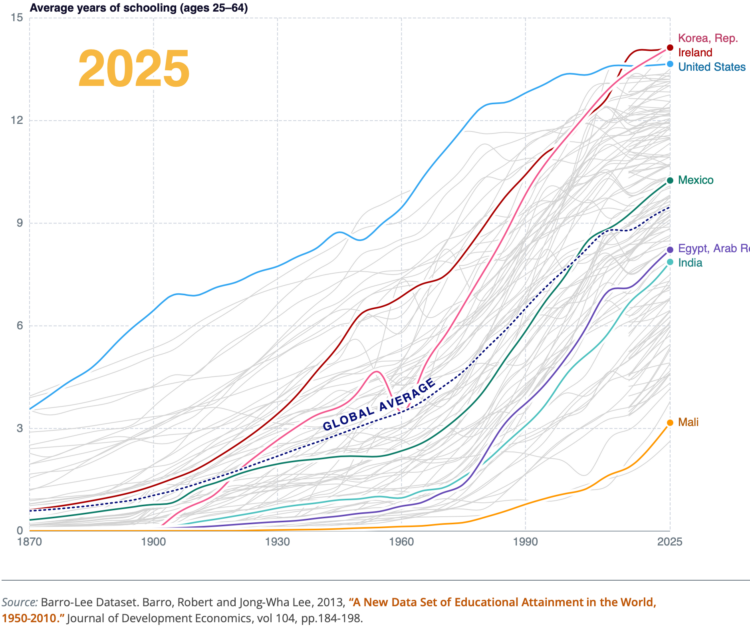
World Bank, which releases an atlas every few years, published an Atlas of Global Development for 2026.
Across the global development landscape, which countries are moving the fastest, and which are losing ground? The 2026 edition of the World Bank’s Atlas of Global Development puts progress at its center. Looking at how fast countries are moving toward better outcomes and facing different challenges, from their own individual starting points, this edition introduces a new framework to track development over the past 75 years, revealing how countries have advanced across key dimensions.
Framed as a set of stories on progress, people, prosperity, planet, infrastructure, and technology, the atlas covers a wide range of topics with a variety of charts. There’s a lot to poke at.

The Eurovision Song Contest is in its 70th year. Every year, each country submits an original song and performers vie for the top spot. Giuseppe Sollazzo plotted 1,795 songs from the past 70 years to see how themes and lyrics have changed.
Love has always been the dominant theme, but empowerment and resilience has the momentum and might take over soon.
Denice W. Ross and Christopher Steven Marcum, from the University of California at Berkeley, produced a field guide for federal data.
The purpose of this guide is to provide a more complete context for federal data users and stakeholders that will inspire them to consider a broader range of data types in their research and advocacy; we also hope it will also inform national dialogues about the future of federal data.
The Guide is organized into eight primary categories of federal data, each representing distinct collection methods, policy frameworks, and use cases.
Useful. Although maybe go without the generated illustrations.

For the Washington Post, Jeremy B. Merrill and Leslie Shapiro visualized users who won and lost money on Polymarket. The odds aren’t great.
A lot of users aren’t that good at predicting the future.
They’re losing money at roughly the same rate as online gamblers betting on sports and other real-life events at traditionally sportsbooks, according to the U.K. gambling regulator’s analysis of 2024 data.
This is based on research by Akey et al.
There was a small percentage of big winners, but of those, many appeared to be professionals placing thousands or even millions of bets in an automated way. Then there are those who probably have insider knowledge.
Maybe put your cash in a savings account. If you’re really after favorable odds, stick it under the mattress. It just won’t be as fun as losing money incrementally.

This week, we refresh an old chart with new data, interaction, and improved design.

Science profiled Hany Farid, a researcher in digital forensics at the University of California, Berkeley.
An interesting guide in the middle shows how simple geometry can expose a fake image. For example, in the generated image above, the lines connecting the figure to the reflection of the figure should converge at the same point. The lines are off, so the image is fake.
This lesson should be useful for about a week. Maybe a month? It seems that in the not too distant future, we won’t be able to find things that are off with just our eyes. So I’m glad there are people like Farid aiming to make it more difficult to fake reality.

The U.S. Bureau of Labor Statistics published cost estimates for April 2026. If you’ve bought anything over the past month, you’ve likely noticed a rise. For the Washington Post, Rachel Lerman and Federica Cocco charted the rising cost of groceries this year, before and after the war with Iran.
Prices were already going up because of tariffs (remember those?), but the war is pushing costs up harder. Soon, we will pay for goods with cherry tomatoes.

The percentage of U.S. men in the workforce has been declining for decades, with a sharper shift the past few years. For the Washington Post, Lauren Kaori Gurley and Federica Cocco report.
“It’s not all retirement and education. … There are guys just dropping off the planet. They’re not looking after their kids. They’re not in school. They’re not in the labor force,” said Betsey Stevenson, a professor of economics at the University of Michigan. “Across the board when we look at men, we see challenges that they face that leave too many men disconnected.”
Since 2006, the percentage is down six percentage points, which is maybe a bit less than you would think after looking at the line chart above. The reasons of course are multifaceted, but if I were to guess, I’d say more women in workforce has and will continue to change dynamics at work and at home.

Raymond Zhong and Harry Stevens, for the New York Times, go with a sketch aesthetic to describe the effects of El Niño. Some areas are wetter and others are drier. Although it’s still difficult to forecast the full range geographically and the magnitude of the effects. Because wind.

For the New York Times, Agnes Chang and Pablo Robles illustrate the journey from the Strait of Hormuz to the gas tank. The oil starts in a tanker, waiting to move through the strait, and the journey begins as you scroll. There are transfers, checkpoints, and changes in transportation.
I like the transfers where there’s a stop and you get taken through the various steps. Even if the strait opened right now, it would still take a month for travel, processing, and more travel.

Some jobs tend towards higher divorce rates and some lower.
For Bloomberg, Tanaz Meghjani, Dhruv Mehrotra, and Surya Mattu report sharing of private data.
TikTok’s filtering on the Washington exchange relied on preset keyword lists to identify sensitive categories prohibited under their policies — including race, religion, sexual orientation, political affiliation, union membership and criminal record. The filter hides terms such as “Asian,” “Black,” “Muslim” and “Jewish,” plus US political references like “Democrat,” “Republican,” “MAGA” and “Antifa.” Any terms missing from the preset list were not filtered.
“It’s a flawed and brittle process for filtering unwanted information,” said Zach Edwards, an independent cybersecurity expert who has spent years auditing advertising technology developed by US tech giants.
It seems like the sharing is unintentional yet careless, which is par for the course these days. The honor system might not be enough to keep this internet thing usable long-term.

For the Public Domain Review, Hunter Dukes and Adam Green visit Antoni Jażwiński’s Polish System, which charts space and time in a grid layout.
The Polish System — which almost anticipates Piet Mondrian’s abstract checkerboards and the wider modernist fascination with grid figures — coupled chronology to the map-making traditions of geography. In Jażwiński’s original chart, each main 10×10 box is a century and the rows separate decades. Within a century box, each individual square is a year, each color a nation (with shading for different monarchs or governments), and symbols can stand for marriages, wars, treaties, and other types of events. Should one become proficient with this system, they can peer down on the history of the world, summarized on a surface not much larger than a chessboard.
Not quite a calendar. Not quite a unit chart.

Beef prices keep going up a noticeable amount in grocery stores. For Bloomberg, Ilena Peng, Denise Lu, and Stephanie Davidson charted how increasing costs in the supply chain feed into the dollar amount that we see at the end.
To demonstrate with relatable units, they follow the timeline of a single calf as it moves from ranch, to stocker, feedyard, meatpacker, grocer, and consumer. Illustrations provide a visual anchor through the process.
Chicken overtook beef in 2004. It doesn’t seem like that’s going to let up any time soon.
 Visualize This: The FlowingData Guide to Design, Visualization, and Statistics (2nd Edition)
New tools, refined process.


