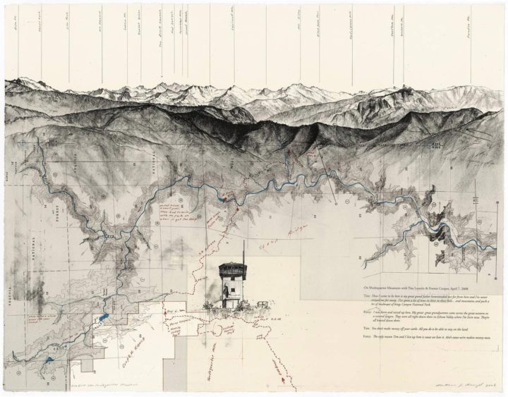
Artist Matthew Rangel hikes cross-country and through the mountains, exploring and drawing along the way. He then mixes his drawings with maps and photos from history for unique results and perspective.
My location drawings of large expanses throughout my journey serve to reinforce our land-based visual codes by the activity of transcribing the land through yet another system of careful measurements. This practice deepens my personal connection with the land, lending a sense of embodied awareness of its natural and/or unnatural characteristics. I allow the process of discovery from gathering extensive research to play out in the final compositions, where maps I have gathered are combined with my location drawings to set the stage to depict personal encounters and experiences that re-present the land through a framework that speaks of the constructs humans place on the land which, in turn, inform our experience.
[via Socks]

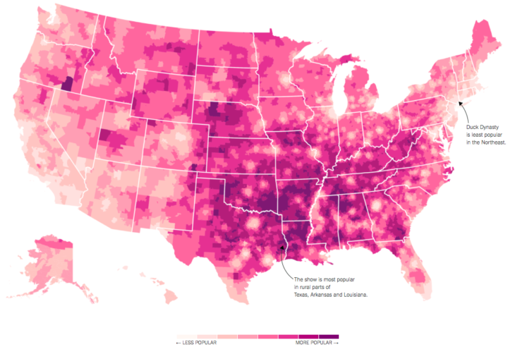
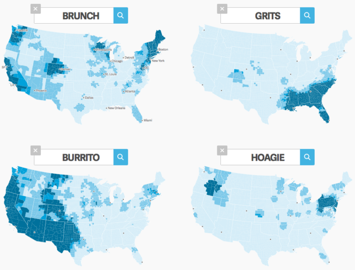
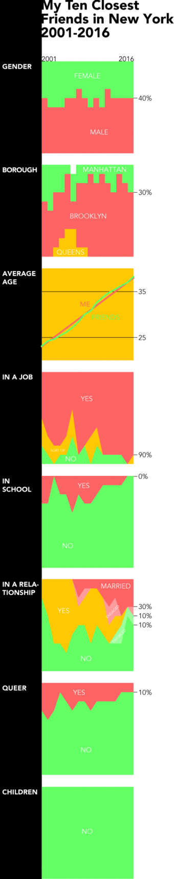 We tend to think of demographics on a large scale. Countries, counties, and cities. Then we look at trends over time for thousands or millions of people. But it can be equally, if not more, interesting to look at the same trends at a personal level. This is what Dorothy Gambrell did.
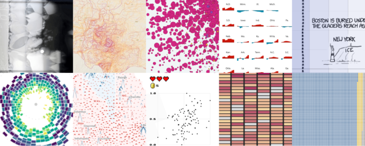
 Visualize This: The FlowingData Guide to Design, Visualization, and Statistics (2nd Edition)


