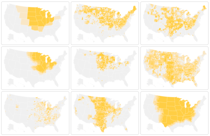
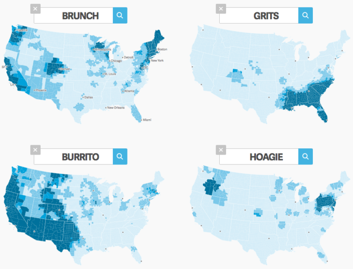
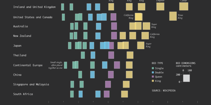
By definition, heartland is some central place of importance of a country. But ask people where to find America’s heartland, and the actual boundaries of this so-called area grows fuzzy. The Upshot asks its readers the same question with a multiple-choice poll.
First, it gets you to think about your concept of the heartland. Second, it provides a baseline to compare against others. Third, it goes into more detail for each option. And by the end, well, you still don’t quite know where the heartland is, but at least you learn something.
I have a feeling we’ll see this story format more this year.
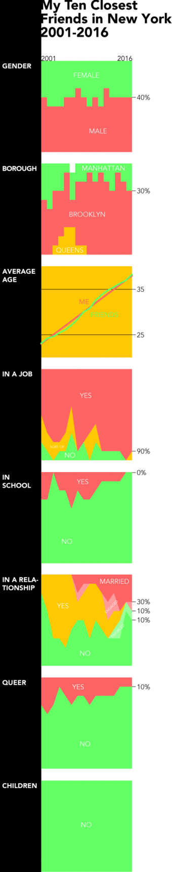 We tend to think of demographics on a large scale. Countries, counties, and cities. Then we look at trends over time for thousands or millions of people. But it can be equally, if not more, interesting to look at the same trends at a personal level. This is what Dorothy Gambrell did.


 Visualize This: The FlowingData Guide to Design, Visualization, and Statistics (2nd Edition)


