Spring is in the air in a lot of places, and that means it’s time to dig up the bicycle from winter hibernation and have a ride. Not much beats the satisfaction of a casual ride in perfect weather. A gentle breeze kisses your face. The sun shines on you but it’s not too hot.
But then you realize you’re on a road without a bike lane and there’s heavy traffic. A semi truck rushes past you and you feel the weight of air almost blow you off your bike. Shoot. If only there was a map that you looked at beforehand that showed you the safe places to ride.
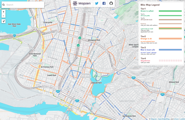
Oh wait, there’s this bike riding map from Mapzen that colors roads by three tiers of safety. Score.


 Visualize This: The FlowingData Guide to Design, Visualization, and Statistics (2nd Edition)


