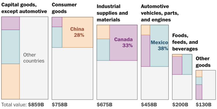
In a collaboration between NHPR and the Pudding, Jason Moon and Russell Samora break down the allegations by time and category. The descriptions of child abuse are hard to read and listen to, but the data provides a granular and affecting view into what happened at the YDC in New Hampshire.
-
A few years removed from applying to colleges, I wondered what admission rates are like these days. The United States Department of Education had the data. Here are rates for about 1,400 institutions that award at least a bachelor’s degree and have at least 500 undergraduates.
-
You’ve probably noticed that the weather forecast can change a lot for predictions many days out. The amount of fluctuation changes depending on where you live. For the Washington Post, Niko Kommenda and Harry Stevens discuss why that is (hint: oceans) with a map and a searchable chart to see your city.
Estimates were compiled by the Meteorological Development Laboratory using data from the National Digital Forecast Database.
-
Speaking of Conservatives losing, Andre Tartar and Demetrios Pogkas for Bloomberg show the other end with party gains.
Angled arrows have become a staple to visualize net differences for regions on a map, but I think this is the first time I’ve seen the shaft of the arrow double as a stacked bar. Colors represent party gains. The head color represents the winner.
-
For the New York Times, Josh Holder and Lauren Leatherby show how the Conservatives lost the election from multiple angles: lost seats, historical vote share, shift of support to Reform, an easy win by Labour, and an age breakdown. It looks bad for Conservatives any way you cut the data.
-
Andrei Kashcha visualized major software packages as galaxies that you can fly through.
Every dot here is a package. Position of a package is determined by force based graph layout algorithm and usually clusters together packages that depend on each other.
Some packages are connected by lines. It means one package depend on another. Image above shows only very close connections. We can also see all connections, but the image becomes obscure by amount of connections.
There’s a galaxy for the R codebase.
-
Trevor Rainbolt is really good at geolocating a place given a single frame from Google Streetview. He used to only stream from his desk, but he’s exploring the physical world now. For the New York Times, Tomas Weber profiles Rainbolt’s expanded point of view.
Rainbolt’s most banal moments are now served with little tinctures of epiphany and recognition. It turns out that touching Thai grass for the first time is infinitely more thrilling if you’ve obsessed over its texture and hue on your computer: It’s the excitement of a face-to-face meeting with a longtime correspondent, a first date with an old crush. Rainbolt has used the internet’s cartography to turn up the world’s intensity, fusing the virtual with the real to make both more pleasurable. “Depression can’t be real if there’s mountains,” he said last July, in a video announcing that he would soon be summiting Mount Kilimanjaro. His route: a trail that a Google Street View camera ascended 10 years earlier.
The data informs the journey.
See also: Address is Approximate, a stop motion adventure.
-
Last week marked 17 years running this small corner of the internet on data visualization. Thank you to FlowingData members, past and present. Thanks for reading. This site doesn’t exist without any of you.
It doesn’t feel like it’s been that long, but it’s also hard to remember when I wasn’t working on FlowingData.
While writing the second edition of Visualize This, I was reminded of how visualization changed over the years. Different tools, different devices, and different datasets. I think about data and visualization differently after more years of making charts.
The scope of visualization is different. It has expanded for the better, beyond quick analysis.
The internet is different. To end FlowingData’s second anniversary, I thanked readers for sending me links via Twitter, Digg, and del.icio.us, which are far from their original forms these days.
Still, working on this site is fun for me. I still enjoy exploring data. Maybe more so than when I was getting started. I still get a kick out of how people creatively process data. I still thank the internet gods that I get do this.
Thanks again.
On to the next year.
-
In a different take on showing the scale of very tiny things, Epic Spaceman starts at human size and shrinks down ten times every 21 seconds.
-
The ages of American presidential candidates are old when compared to the ages of world leaders. Some of that is related to the age of the populations the leaders serve but not a lot. For the Washington Post, Ruby Mellen, Kevin Crowe, and Artur Galocha charted the gaps for all countries.
-
It’s impossible to know the exact number of Covid deaths worldwide, because consistent records aren’t kept by everyone and everywhere. So researchers have to estimate. Howtown explains the various estimation methods in the video below.
-
Members Only
-
Christopher Wolfram explains his “unnecessarily detailed analysis” of the spelling game from the New York Times:
By this analysis, I argue that puzzle difficulty should be judged by the difficulty of the hardest word which the player must guess in order to reach Genius. The score required to reach Genius equals 70% of the total number of points available, so we can calculate puzzle difficulty by the 30% quantile of the difficulties of solution words weighted by their scores. (It’s the 30% quantile instead of the 70% quantile because lower word difficulty corresponds to harder words.) This measure has the advantage that it is a bit like taking the “average” of the solution word difficulties, but it also takes into account the score threshold for Genius. Let’s call this measure the puzzle difficulty.
-
There’s more than one way to spell yogurt, and the common spelling changes depending on where you live. However, the English version of Wikipedia serves people around the world. Which spelling do you use?
-
A global map of climate change can make a few degrees of rising temperature seem trivial. It just doesn’t look like that much. So, for the Pudding, Derek Taylor used forecasts from a study by Hylke Beck and team that used climate zones. Cities are placed in one of four zones to start and you can see where the end up.
According to Beck’s estimates, Moscow might be the only city left (from the included cities) in the cold zone in 2070. That seems concerning.
-
For WP’s Department of Data, Daniel Wolfe analyzed baby name data with Laura Wattenberg. But instead of zeroing in on trends for full names, they looked at the letters that names end with.
Then a funny thing happened: Names started giving way to sounds. Jason begot Mason, Jackson, Grayson, Carson and a whole family of other “-son” names that together make up a major 21st-century trend for baby boys.
Always up for baby name data.
-
State Farm won’t be renewing about 30,000 policies because of high wildfire and earthquake risk. For San Francisco Chronicle, Megan Fan Munce reports:
The decision affects homeowners policies, rental insurance and other property insurance. The company will not send official notices until July, but some customers have been notified by their State Farm agents that they will be among the 30,000. Recent filings with the California Department of Insurance show where these nonrenewals will be concentrated. State Farm accounts for 8.7% of all home insurance policies in California, according to the latest data, which is from 2022.
I was perusing home prices, as one does during idle times late at night, and saw an area with surprisingly low prices. It makes sense now.
-
Members Only
-
For Wired, Dhruv Mehrotra and Tim Marchman provide evidence that Perplexity, an AI-based company currently valued at a billion dollars, appears to be slurping up whatever they can get their hands on:
It also appears probable that in some cases—and despite a graphical representation in its user interface that shows the chatbot “reading” specific source material before giving a reply to a prompt—Perplexity is summarizing not actual news articles but reconstructions of what they say based on URLs and traces of them left in search engines like extracts and metadata, offering summaries purporting to be based on direct access to the relevant text.
The magic trick that’s made Perplexity worth 10 figures, in other words, appears to be that it’s both doing what it says it isn’t and not doing what it says it is.
-
Neven Mrgan describes what it was like to get an AI-generated email from a friend:
I knew that I didn’t want an algorithm to design layouts and draw illustrations “so I don’t have to,” but prior to this email, I never even pondered whether I wanted AI to call me up on behalf of people in my life. It had simply not occurred to me—and now that it has occurred to me, I definitely do not want small talk and relationships outsourced to server farms. This stuff shouldn’t feel hard or taxing; it’s what our presence here on Earth is mostly made up of. The effort, the clumsiness, and the time invested are where humanity is stored.
I got an alert for a link to FlowingData, and it was for a sloppy AI-generated site. The site covered a hodgepodge of topics with generated titles, text, and cover images. It looked like a news site on the surface but stripped of all meaning once you tried to read.
One of the “articles” was a “summary” of something I wrote. It felt lazy and offensive, which sounds familiar to what Mrgan felt about his friend’s “email.”