With Numberphile, Lisa Goldberg discusses her research with Alon Daks and Nishant Desai at the University of California, Berkeley on the hot hand in basketball. When a player is hitting shots, is he more likely to hit the next one? The experiment results suggest that the hot hand is actually just randomness.
That said, there are other points of view on this topic.
As a statistician, I don’t think the hot hand exists mathematically, but as a sports fan, I’m more than happy to ride the wave of excitement.


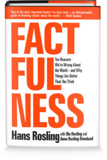 Hans Rosling was able to build excitement around data like no other. Truth and progress was his rally cry. Before he died, he was working on a book with his Gapminder co-founders Anna Rosling Rönnlund and Ola Rosling. The book,
 Visualize This: The FlowingData Guide to Design, Visualization, and Statistics (2nd Edition)


