• Membership
  • Newsletter
  • Projects
  • Learning
  • About
  • Member Login
  • Family displacements through urban renewal

    December 27, 2017

    Topic

    Maps  /  family, urban

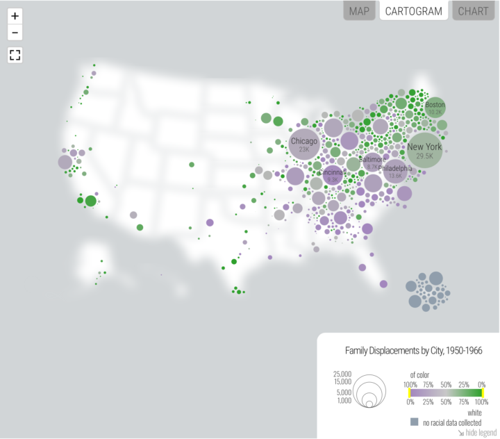
    Hundreds of thousands of families were displaced in the 1950s under “urban renewal” programs. The families were disproportionately minorities. Renewing Inequality, from a research group at the University of Richmond’s Digital Scholarship Lab, revisits the topic and how it reflects in the present.

    Renewing Inequality presents a newly comprehensive vantage point on mid-twentieth-century America: the expanding role of the federal government in the public and private redevelopment of cities and the perpetuation of racial and spatial inequalities. It offers the most comprehensive and unified set of national and local data on the federal Urban Renewal program, a World War II-era urban policy that fundamentally reshaped large and small cities well into the 1970s.

    Many of the people displaced never receive promised compensation or fair market value for their property, which is kind of messed up.

    Learn.

  • Alternatives to the rainbow color scale

    December 26, 2017

    Topic

    Design  /  color, rainbow

    Oh. It’s that time of year already. Time to hate on the rainbow color scale, which is still prevalent but equally less useful than alternatives. Matt Hall provides (scientific!) reasons for looking to scales that don’t include the full spectrum and some solutions.

    We know what kind of colourmaps are good for interpretation: those that increase linearly and monotonically in brightness, with no jumps or stripes of luminance. I’ve linked to lots of places where you can read about these — see the end of the post. You already know one perceptual colourmap: the humble Greyscale. But there are lots of others, so let’s start with one of them.

  • Q&A with Di Cook

    December 22, 2017

    Topic

    Statistics  /  Di Cook, teaching

    Statistics professor Di Cook was one of the first people I ever talked to about visualization. She has a short Q&A over at StatsChat.

    I spent a few years doing that [a research assistant] and then realised I’d really like to make art, because some of the research-assistant work I was doing was computer graphics for data online. It fed into my art instincts from teenage years, so I spent some time as an artist before finding a graduate programme in statistics in the US that focused on data visualisation.

  • Introduction to regular expressions

    December 22, 2017

    Topic

    Coding  /  regular expression

    If you want to analyze bodies of text, it’s a good to know how to use regular expressions. That way you can programmatically extract complex text patterns instead of marking and encoding items manually. Thomas Nield for O’Reilly provides an introduction:

    Many data science, analyst, and technology professionals have encountered regular expressions at some point. This esoteric, miniature language is used for matching complex text patterns, and looks mysterious and intimidating at first. However, regular expressions (also called “regex”) are a powerful tool that only require a small time investment to learn. They are almost ubiquitously supported wherever there is data.

    Nield says it isn’t a steep learning curve, which I agree with, but I would suggest not trying to learn every part of the syntax. Learn it piecewise, and it’ll seem like less of a jumble of brackets, periods, and question marks.

    See also the RegExr. It’s an interactive tool that lets you paste a body of text and then enter regular expressions to see what matches your given pattern in real-time.

  • Ed Sheeran’s creative process explained with music visualization

    December 21, 2017

    Topic

    Data Art  /  Ed Sheeran, music, New York Times

    The New York Times is back at it in explaining the creative process. A couple of years ago they explained the making of a Justin Bieber song. This time they talked to Ed Sheeran and his collaborators about the making of their hit song Shape of You. The musicians talk and the visualization serves as a backdrop.

    [arve url=”https://www.youtube.com/watch?v=ZpMNJbt3QDE” /]

  • How machines learn

    December 20, 2017

    Topic

    Statistics  /  algorithm, explainer, machine learning

    Hearing about machine learning and algorithms a lot recently and not sure what that means? CGP Grey explains:

    [arve url=”https://www.youtube.com/watch?v=R9OHn5ZF4Uo” /]

  • Cards Against Humanity’s public poll results

    December 20, 2017

    Topic

    Statistics  /  Cards Against Humanity, polling, public

    For the past few months, Cards Against Humanity polled the American public to ask important questions such as whether or not it is okay to pee in the shower.

    To conduct our polls in a scientifically rigorous manner, we’ve partnered with Survey Sampling International — a professional research firm — to contact a nationally representative sample of the American public. For the first three polls, we interrupted people’s dinners on both their cell phones and landlines, and a total of about 3,000 adults didn’t hang up immediately. We examined the data for statistically significant correlations, and boy did we find some stuff.

    The poll is in the context of political leanings, which leads to some interesting cross-sections.

    Maybe the best part though is that CAH will continue to poll for a full year, and you can download the data, which I am sure makes for a fun class project. They are also asking social scientists for question suggestions that would otherwise go unasked by more traditionally funded public polling.

  • Tax calculator that considers where you live

    December 19, 2017

    Topic

    Infographics  /  taxes, Washington Post

    Here’s a different look at tax cuts and increases from Reuben Fischer-Baum for The Washington Post. As Fischer-Baum points out, keep in mind that these are just estimates and they calculations vary:

    Analyses that use data from real taxpayers as their starting point – like the calculator put together by the New York Times – produce lower estimates. Other calculators like the one put together by the Wall Street Journal produce similar results to ours. For example, a household in D.C. filing jointly with two kids under 17, earning a total of $150,000 and itemizing $20,000 gets a tax cut of $3,796 in our analysis. Roughly equivalent inputs to the New York Times calculator produces an estimated range of a $1,020 to $3,280 cut, while the Wall Street Journal calculator – which is based on the less generous House bill – produces a cut of $3,230.

  • How your taxes will change

    December 19, 2017

    Topic

    Statistical Visualization  /  taxes, Upshot

    I’m pretty sure this is all that most people want to know. The Upshot provides a tax calculator that considers the Republican tax bill and the variation of taxes between households that earn similar incomes. Punch in some information like income range and marital status, and you get a range of tax cuts or increases for households similar to yours.

  • Rumsey Collection with a data visualization subject tag

    December 18, 2017

    Topic

    Statistical Visualization  /  David Rumsey, vintage

    The David Rumsey Map Collection, known for its many browsable historical maps, now has a “data visualization” subject tag. This means you can now quickly access over 1,000 charts that date back centuries. I’m not sure how long the browser has had the filter available, but I’m glad it does. [via @srendgen]

  • Multivariate map collection

    December 18, 2017

    Topic

    Maps  /  collection, Jim Vallandingham, multivariate

    I heard you like maps. Jim Vallandingham put together a collection of maps that show multiple variables, for inspiration and perusal.

  • Disney-Fox market share

    December 15, 2017

    Topic

    Statistical Visualization  /  Disney, Fox, Quartz

    Disney is set to buy 21st Century Fox for $52.4 billion. I honestly don’t have the mental capacity or imagination to comprehend such a large sum, much less figure out how such a deal works. At least Youyou Zhou, reporting for Quartz, provides breakdowns of market share for the two companies, which makes things a bit more understandable. If the deal goes through, Disney is going to be (an even bigger) behemoth.

  • R data structures for Excel users

    December 15, 2017

    Topic

    Coding  /  Excel, R

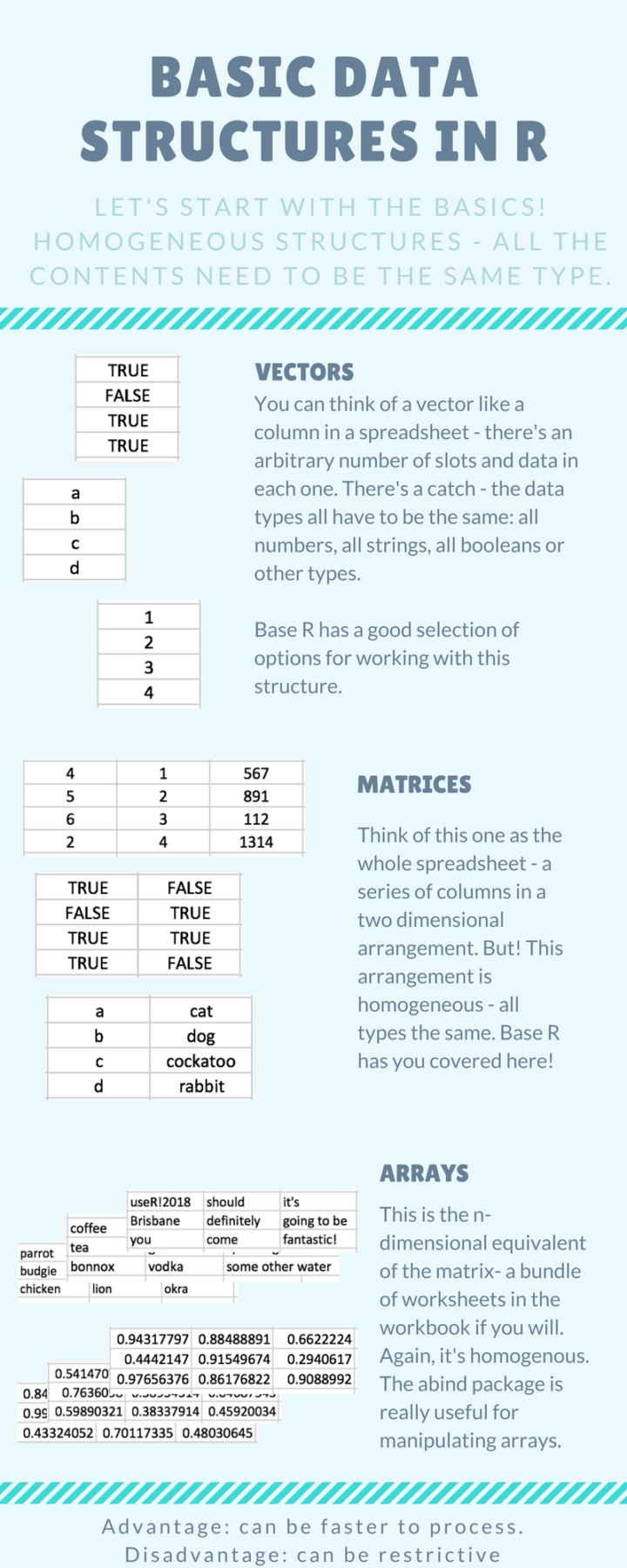
    Introducing yourself to R as an Excel user can be tricky, especially when you don’t have much programming experience. It requires that you switch from one mental model of the data that exists in an interactive spreadsheet to one that exists in vectors and lists. Steph de Silva provides a translation of these data structures for Excel users.

  • Tracking ballet dancer movements

    December 15, 2017

    Topic

    Data Art  /  ballet, rotoscope

    Research group Euphrates experimented with lines and a ballet dancer’s movements in Ballet Rotoscope:

    [arve url=”https://www.youtube.com/watch?v=yzJk6ww3LD0″ /]

    By the way, rotoscoping is an old technique used by animators to capture movement. Pictures or video are taken and lines are traced for use in different contexts. [via @Rainmaker1973]

  • Regulations.

    December 14, 2017

    Topic

    Miscellaneous  /  paper, physical

    Doug Mills, reporting for The New York Times:

    Echoing his days as a real estate developer with the flair of a groundbreaking, Mr. Trump used an oversize pair of scissors to cut a ribbon his staff had set up in front of two piles of paper, representing government regulations in 1960 (20,000 pages, he said), and today — a pile that was about six feet tall (said to be 185,000 pages).

    Interpret as you like.

  • Harassment in the Statistics field

    December 14, 2017

    Topic

    Statistics  /  harassment

    Statistician Kristian Lum described her experiences with harassment as a graduate student at stat conferences. She held back on talking about it for many of the same reasons others have, but then there was a shift and she began warning colleagues.

    I started doing this because I heard that S (for the second time to my knowledge) had taken advantage of a junior person who had had too much to drink. This time, his act had been witnessed first-hand by several professors at the conference. Since then, I have heard one professor who witnessed the incident openly lament that he’ll have to find a way to delicately advise his female students on “how not to get raped by S” so as not to lose promising students.

    What the hell? Unacceptable.

  • 12 Days of ChaRt-mas

    December 14, 2017

    Topic

    Chart Everything  /  Christmas, R

    As everyone has already checked out for the rest of the year, I’m going to mess around with R to the tune of The Twelve Days of Christmas and maybe throw down a few tips. You’re welcome.
    Read More

  • Alabama voter demographics

    December 12, 2017

    Topic

    Statistical Visualization  /  demographics, election, Washington Post

    Democrat Doug Jones won in the senate race against Republican Roy More last night. The Washington Post provides how different demographic groups voted, based on a poll “conducted by Edison Research for the National Election Pool, The Washington Post and other media organizations.”

  • Data visualization for analysis and understanding complex problems

    December 12, 2017

    Topic

    Visualization  /  analysis, Enrico Bertini, research

    Enrico Bertini, a professor at New York University, delves into the less flashy but equally important branch of visualization: analysis. Much of what Enrico describes applies to the other branches too, so it’s worth the full read:

    One aspect of data visualization I have been discovering over the years is that when we talk about data visualization we often think that the choice of which graphical representation to use is the most important one to make. However, deciding what to visualize is often equally, if not more, important, than deciding how to visualize it. Take this simple example. Sometime a graph provides better answers to a question when the information is expressed in terms of percentages than absolute values. I think it would be extremely helpful if we could better understand and characterize the role data transformation plays in visualization. My impression is that we tend to overemphasize graphical perception when content is what really makes a difference in many cases.

    Getting to that what often requires iteration between the analysis and presentation facets of visualization. I spend about the same time on the analysis side as on presentation, and that’s only because I’m more fluent with my analysis tools. I don’t have to spend a lot of time reading documentation. The amount of production during the analysis phase is definitely much higher.

  • Worries over the 2020 Census

    December 12, 2017

    Topic

    Statistics  /  accuracy, census, New York Times

    Michael Wines, reporting for The New York Times:

    “The politicization of the census would erode what is already fragile trust and confidence in the integrity of the count,” said Vanita Gupta, the president of the Leadership Conference on Civil and Human Rights, which has worked for years on census issues.

    The Trump administration’s heated rhetoric on immigration, race and the trustworthiness of government is fueling fears that minorities, legal and undocumented immigrants and others — from asylum-seekers to victims of the opioid crisis — will be even harder to locate and count. The 2010 census actually overcounted non-Hispanic whites by 0.8 percent and undercounted African-Americans by 2.1 percent and Hispanics by 1.5 percent.

    For context, the overcount and undercount numbers aren’t statistically different from that of the 2000 Census. The Census has always had to account for some groups reporting more than others.

    But much of this comes from a general distrust of government — more so among some than others — and that trust level isn’t exactly on the rise these days. With that, in tandem with an administration not above swaying the numbers, the upcoming census could get messy. As the census approaches, I hope everyone assumes their right to be counted in this country.

  • Page 150 of 392
  • <
  • 1
  • ...
  • 147
  • 148
  • 149
  • 150
  • 151
  • 152
  • ...
  • 392
  • >

Analyze, visualize, and communicate data usefully, beyond the defaults.

Become a member →

Recently for Members

May 8, 2025
When the data is not what it seems

May 1, 2025
Finding the Right Charts

April 24, 2025
Visualization Tools, Datasets, and Resources – April 2025 Roundup

April 17, 2025
Breaking Out of Chart Software Defaults

April 15, 2025
Line Chart with Decorative Neon Accents

Browse by Chart Type See All →

Cartogram Streamgraph Baseline Chart Dot Map Sankey Diagram Area Chart Calendar Spike Map Moving Bubbles

Browse By Topic

  • Visualization

    Seeing data

  • Maps

    Seeing geographic data

  • Infographics

    Explaining data

  • Networks

    Connecting data

  • Statistics

    Analyzing data

  • Software

    Working with data

  • Sources

    Getting data

  • Design

    Making data readable

Get the Book

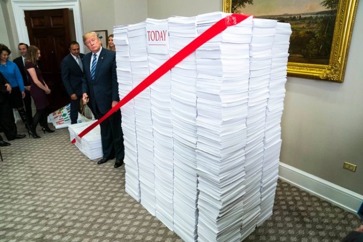
Visualize This: The FlowingData Guide to Design, Visualization, and Statistics

Available now.

Order: Amazon / Bookshop

Made by FlowingData

  • The Process

  • Data Underload

  • Chart Everything

  • Guides

  • Books

  • Shop

  • About
  • Contact
  • Newsletter
  • LinkedIn
  • Instagram
  • Bluesky
  • RSS
Copyright © 2007-Present FlowingData. All rights reserved.