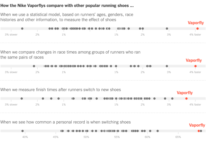
Mikhail Popov, a data scientist at the Wikimedia Foundation, led a workshop on visualization literacy recently. A short guide from that workshop is now freely available online.
-
Every year, we look at the medal counts of each country. Who’s winning? It depends on how much value you place on each medal. Do you only count the golds and disregard silver and bronze? Do you just treat all medals the same? Josh Katz for The Upshot lets you test all the possibilities with this interactive.
Apply different values to each medal type by mousing over the x-y coordinate plane and see how the country rankings shift.
-
Every time we book a flight, a Passenger Name Record is generated and saved by an outdated system, which links to private travel data. Paz Pena, Leil-Zahra Mortada and Rose Regina Lawrence for the Tactical Technology Collective outline that data and describe the consequences of the system failing to keep data private.
But although the PNR system was originally designed to facilitate the sharing of information rather than the protection of it, in the current digital environment and with the cyber-threats facing our data online, this system needs to be updated to keep up with the existing risks. PNRs are information-rich files are not only of interest for governments; they are also valuable to third parties – whether corporations or adversaries. Potential uses of the data could include anything from marketing research to hacks aimed at obtaining our personal information for financial scams or even doxxing or inflicting harm on activists.
Maybe be more careful next time you post your travel pictures online.
-
Mikaela Shiffrin won her first gold medal in PyeongChang with a fraction of a second lead. In events where athletes race side-by-side, it’s easier to see how close such a lead is. But with alpine skiing, it feels more like a race against a clock. So to capture some of the dramatics of the former, Derek Watkins and Denise Lu for The New York Times imagined the results had all skiers raced down at the same time.
It reminds of The Times’ coverage of Usain Bolt in the 2012 Summer Olympics.
-
This is fun. It’s a fantasy map generator with the following rules:
Project goal is a procedurally generated map for my Medieval Dynasty simulator. Map should be interactive, scalable, fast and plausible. There should be enought space to place at least 500 manors within 7 regions. The imagined area is about 200.000 km2.
Just click and there’s a new map generated on the fly.
Martin O’Leary’s generator is still my favorite, but I think there is plenty of room in the world for procedurally generated fantasy maps.
-
[arve url=”https://www.youtube.com/watch?v=spUNpyF58BY” /]
One of my least favorite electrical engineering courses in college was on signals and communications. I remember there being a lot of Fourier Transforms. I also remember falling asleep a lot, because it was a two-hour lecture with the lights turned off. Maybe if the demos were more visual like this, I would’ve stayed awake. (Probably not.)
-
When you have input to send Congress, you have a number of communication options available to you: phone, email, social media, etc. Many of the bigger issues have dedicated sites that help automate some of the process, which of course leads to a large volume of input that lands in a congressperson’s voicemail, inbox, and notifications tab. Where does it all go?
The OpenGov Foundation looked into it and produced the From Voicemails to Votes report. The flowchart above is part of the report. Full version here.
-
If you’re looking for some data to play with, FiveThirtyEight just made it easier to download their data and code. They’ve been on GitHub, I think from the beginning, but this data page is even more straightforward and to the point.
-
Well this is awesome. The New York Times highlighted four olympians with a mix of video and graphics: figure skater Nathan Chen, alpine ski racer Mikaela Shiffrin, snowboarder Chloe Kim, and snowboarder Anna Gasser. These are fun to watch, and it’s so fascinating to hear from the individuals who strive to be the best.
Also, I am glad that graphics editors (and us) can take a break from other matters for a bit.
-
You know those graphics that use icons of people to represent units or counts of people? The Wee People font by Alberto Cairo and Scott Klein makes it easier to use such icons on the web. Just add the CSS file and you’re ready to go.
-
After living expenses, where does the money go, and how does it change when you have more cash available?
-
Well this is awesome. The Winter Olympics start this Friday, and The New York Times published this piece using augmented reality. Point your phone’s camera somewhere flat in your room, and you see four olympians in a still action shot. Walk around them, walk up to them, and see the details.
My four-year-old got a kick out of it.
For the last Winter Olympics, The Times aimed to make the extreme scales that athletes compete on more relatable. So it’s interesting to see them go the other direction, zooming in close to individuals.
I’m looking forward to the 2022 Winter Olympics when I get to experience the events through the athletes themselves and then pick the tricks that they do Choose-Your-Own-Adventure style.
-
Professional tennis player Roger Federer won his 20th Grand Slam title recently. He’s in year 20 of his career, and over time, he rose, he dominated, he declined, and he came back. Schweizer Radio and Fernsehen visualized Federer’s achievements over the years and compared him to other tennis stars in the process.
It reminds me of the Serena Williams piece by The Los Angeles Times a while back. This one is more refined though. I especially like the updating time series line that stays with you as you scroll. It shows where you are contextually, and provides progression for different parts of Federer’s career.
-
The Wallace–Bolyai–Gerwien theorem says that if you have two polygons of equal area, you can cut one into pieces, and then place them back together to form the second piece. Dima Smirnov and Zivvy Epstein made an interactive to demonstrate. Draw two shapes and watch the magic happen.
-
Odds are if you’re reading this, you know what statistics is already, but if not (or you want to explain to someone else), Crash Course just started a series to explain the basics. Watch below.
[arve url=”https://www.youtube.com/watch?v=sxQaBpKfDRk” /]
-
FiveThirtyEight asks, “There’s a lot of complaining about gerrymandering, but what should districts look like?” Looking for an answer, they imagined redistricting with different goals in mind, such as gerrymandering favoring Republicans or Democrats, promoting competitive elections, and maximizing majority-minority.
Check out the possibilities for the nation or zoom in to a specific state. The latter provides a further breakdown by district and then race. So yeah, if you’re into this stuff, set aside some time to poke at this one.
-
Musician Kaki King’s daughter suffers from a condition (Idiopathic Thrombocytopenic Purpura) where her body attacks her own platelets, which leads to spontaneous bruising and burst blood vessels. In coping with the stress as a parent who can only do so much for her suffering child, King collaborated with information designer Giorgia Lupi.
The result: a mix of personal data collection, reflection, music, and data art entitled Bruises — The Data We Don’t See.
Read More -
How I Made That: Animated Square Pie Chart
Also known as waffle charts. Using animated transitions between values, you can allow for comparisons between categories.
-