Visualizing the Uncertainty in Data
Data is a representation of real life. It’s an abstraction, and it’s impossible to encapsulate everything in a spreadsheet, which leads to uncertainty in the numbers.
How well does a sample represent a full population? How likely is it that a dataset represents the truth? How much do you trust the numbers?
Statistics is a game where you figure out these uncertainties and make estimated judgements based on your calculations. But standard errors, confidence intervals, and likelihoods often lose their visual space in data graphics, which leads to judgements based on simplified summaries expressed as means, medians, or extremes.
That’s no good. You miss out on the interesting stuff. The important stuff. So here are some visualization options for the uncertainties in your data, each with its pros, cons, and examples.
Ranges
Let’s start with the traditional visualization approach, which at the least is to show a range or confidence interval. A point in the middle represents a mean or median, and a bar or line shows other possible values or coverage.
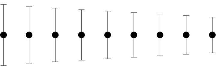
Pros
Lines or bars represent a range of values, so you can see that a mean or median represents only part of an estimate. The range is especially useful when you compare multiple estimates, because you can see overlap between categories. You don’t get this from means.
Cons
If you have a full distribution of values, you don’t get to see all of the details in the data. Also, a lot of people don’t understand the concept of confidence intervals or what standard error bars are, so you need to explain clearly with annotation.
Examples
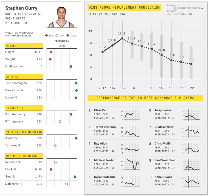
FiveThirtyEight often does a good job at valuing uncertainty in their work. In their basketball player ratings and projections, they show range with light gray bars behind a black dot to represent possible player impact over time.
See also: the classic box-and-whisker plot, salary percentiles by industry and my attempt at animating potential values. And of course, how can one forget the jittering gauge.
Distributions
Show the spread of possible values with a histogram or a variant of it. You might see something a median would never show.
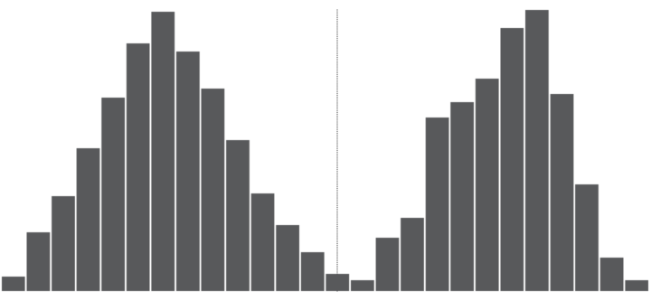
Pros
By showing the variation in a sample, you or a reader can make a more educated judgement about whether a sample is trustworthy. It is oddly skewed? Are there multiple peaks? Or is it an expected bell curve?
Cons
Again, many people don’t understand distributions, so you need to explain what’s going on. Sometimes variation is just noise, or the details might obscure the forest for the trees.
Examples
There’s a ton of variance when people experience a “first” in their relationship lives, so instead of just average ages, I used distributions.
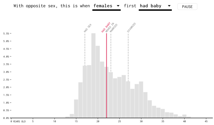
See also: How people spend their time visualized with parallel coordinates.
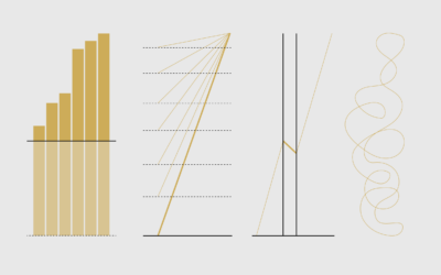
Multiple Outcomes
When it comes to projections and forecasts, it is helpful to see various outcomes to see what might happen. Key word: might.
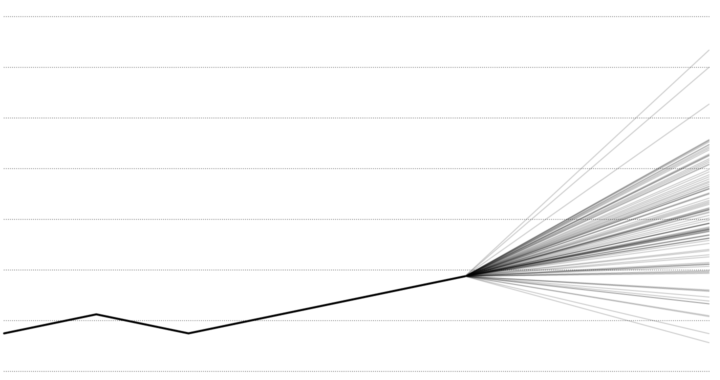
Pros
Uncertainty is displayed more explicitly. People can see that there is no set path, and instead they see a bunch of possible paths.
Cons
If there’s too much noise or there are too many possibilities, the chart might not provide anything of use. But that might be a problem with the forecasting more than the chart choice.
Examples
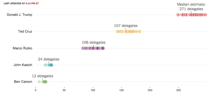
To show simulation uncertainty for the election, The Upshot displayed multiple delegate outcomes at the same time using various models.
See also: Hurricane tracking and the fan chart for time series data, and bootstrap density curves.
Simulations
Similar to showing multiple outcomes, seeing various results occur one-by-one to build up an overall picture provides intuition for the fuzziness of predictions.
Pros
When data appears all at once or in aggregate, it can be a challenge for many to interpret results and link it back to what the data actually represents. By showing simulations, you get a sense of build-up and a link with individual outcomes.
Cons
Too much weight might be placed on individual outcomes which obscures the overall picture.
Examples
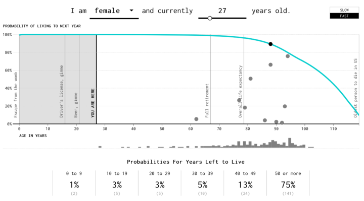
The Social Security Administration puts out life expectancy and probabilities of death at any given age. I used that to simulate how many years you might have left to live.
See also: how you will die, the day of 1,000 Americans, and Parable of the Polygons.
Obscurity
The more uncertain an estimate is, the more difficult it is to see, becoming less visually prominent compared to more certain estimates. You can achieve this effect a number of ways, such as with transparency, color scale, or blurriness.

Pros
The metaphor makes sense. If you’re less certain about an estimate, make it less visually prominent. The data that’s less up in the air gets more attention as a result.
Cons
How is fuzziness or obscurity perceived? Are various levels actually interpreted or is it a bivariate thing? This requires more research.
Examples
I haven’t seen this done much, but the wind prediction map by Moritz Stefaner comes to mind.
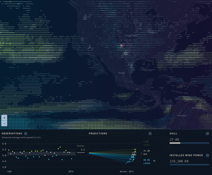
Lines represent wind predictions, and opacity represents the strength of the predictions.
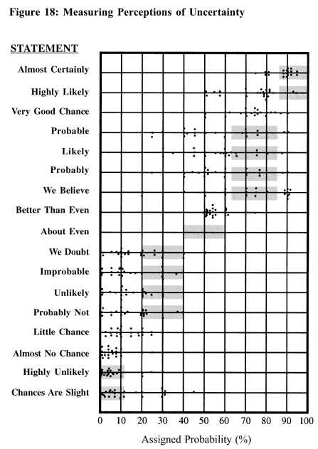
Words
Maybe visualization isn’t what you’re looking for at all. After all, you don’t have to visualize everything. You can add uncertainty to your writing by avoiding absolutes when you describe numbers. Treat estimates as such when you use them, and account for the uncertainty in the numbers.
Become a member. Support an independent site. Get extra visualization goodness.
See What You Get