Relationships: The First Time…

When do people usually have sex for the first time in their lives? When do people move in with a significant other? When do they get married? The answers are usually in the form of a single value: an average or a median. Then naturally, you compare your own experiences to those averages. “I guess I grew up quickly” or “I guess I’m behind”, and the feeling you get matches the response.
It’s this weird feeling you get from not being average. Not “normal”.
But eventually in life, you realize that you have your own timeline. You are not average. In fact, a lot of the time it’s more normal to not be average.
For example, the average age that Americans first have sex is 17 years. However, many have sex earlier and many later. The average only describes the rough middle of the age range. The same goes for other relationship milestones. There’s a spread. There’s a distribution.
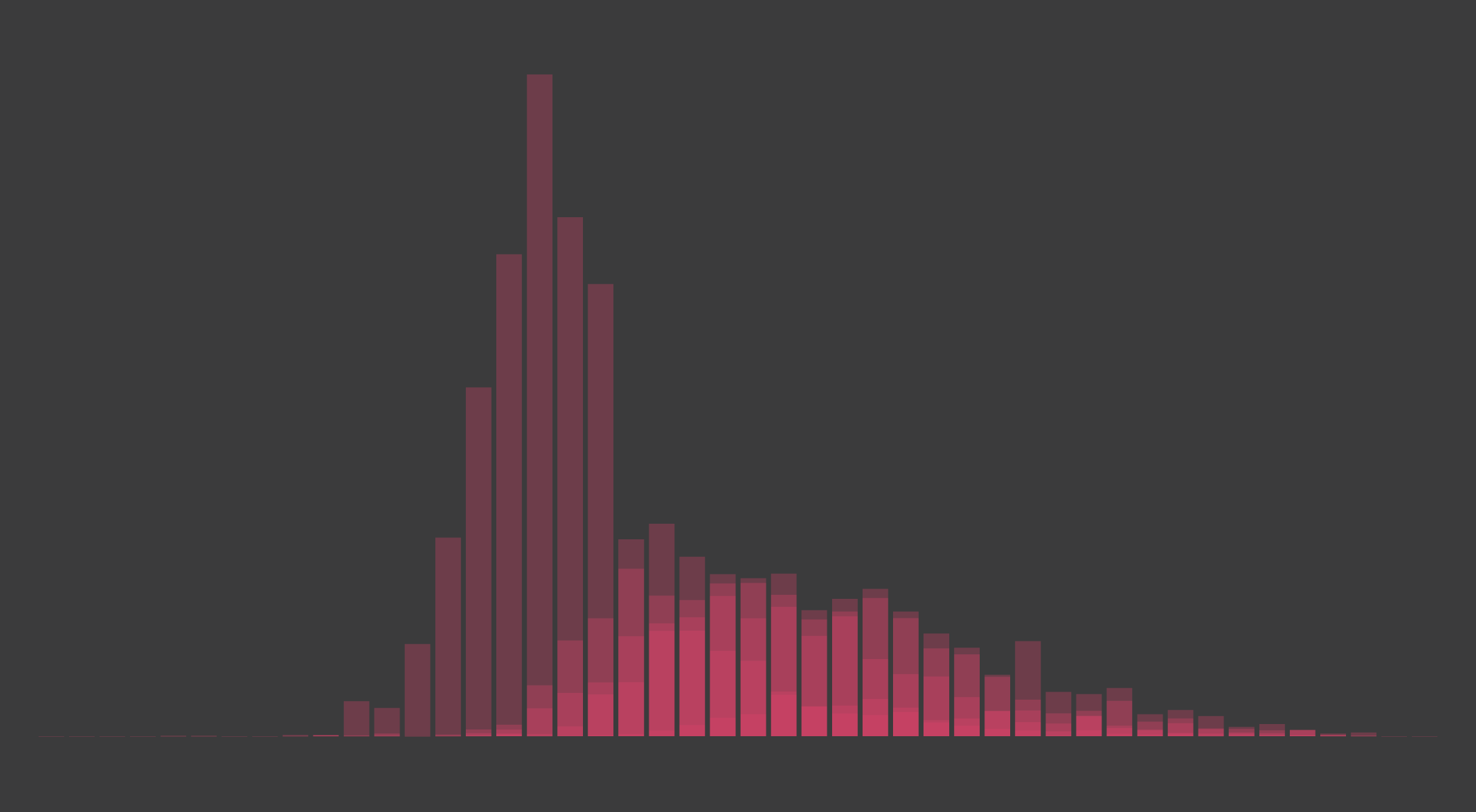
You can see these distributions through data from the National Survey of Family Growth by the Centers for Disease Control and Prevention. With the public use data files from 2013-15, I tabulated when Americans first had sex, when they first moved in with someone, when they married, when they had a baby, and when they divorced.
The shifting age markers represent median ages. The bars show the percentage of people at the respective ages experienced their firsts.
The survey only samples from 15- to 45-year-olds, so it’s not quite a representative sample of the entire population, but it provides a good sense of time. And not including divorce, you see the occurrences of the milestones taper off towards the younger and older ages.
My main point — that average (or median) doesn’t mean normal — makes itself especially obvious. Only the people who fall into a single gray bar match the median. Then there’s everyone else. The normal ones.
Become a member. Support an independent site. Make great charts.
See What You GetFlowingData is made possible by supporting members. Since 2007, I, Nathan Yau, a real person, have been analyzing and visualizing data to help more people understand and appreciate it in their everyday lives.
If you liked this or want to make similar data things, please consider supporting this small corner of the internet. You get unlimited access to visualization courses, tutorials, and extra resources. Thanks. — Nathan


