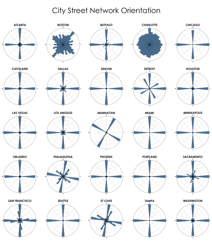
Using OpenStreetMap data, Geoff Boeing charted the orientation distributions of major cities:
Each of the cities above is represented by a polar histogram (aka rose diagram) depicting how its streets orient. Each bar’s direction represents the compass bearings of the streets (in that histogram bin) and its length represents the relative frequency of streets with those bearings.
So you can easily spot the gridded street networks, and then there’s Boston and Charlotte that are a bit nutty. Check out Boeing’s other chart for orientation of major non-US cities.
See also Stephen Von Worley’s color-coded maps and Seth Kadish’s charts from 2014 that showed the same thing but used Census data instead of OpenStreetMap.
 Visualize This: The FlowingData Guide to Design, Visualization, and Statistics (2nd Edition)