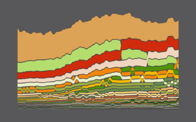
Immigration in the United States visualized as rings of tree trunk

Jul 5, 2018

Pedro M. Cruz, John Wihbey, Avni Ghael and Felipe Shibuya from Northeastern University used a tree metaphor to represent a couple centuries of immigration in the United States:

Like countries, trees can be hundreds, even thousands, of years old. Cells grow slowly, and the pattern of growth influences the shape of the trunk. Just as these cells leave an informational mark in the tree, so too do incoming immigrants contribute to the country’s shape.

Feels real.

Become a member. Support an independent site. Make great charts.

See What You Get

Learn to Visualize Data See All →

How to Make a Multi-line Step Chart in R

For the times your data represents immediate changes in value.

The Baseline and Working with Time Series in R

A big part of statistics is comparisons, and perhaps more importantly, to figure out what to compare things to. Perspective changes with the baseline.

How to Make a Spiral Chart in R

Using a spiral might not be the best way to encode data. But here’s how to do it anyway. Just in case.

How to Make Frequency Trails in Excel

Also known as ridgelines, use the method to create a compact visualization where you can easily identify major patterns and outliers.

Favorites

Who is Older and Younger than You

Here’s a chart to show you how long you have until you start to feel your age.

The Best Data Visualization Projects of 2011

I almost didn’t make a best-of list this year, but …

Causes of Death

There are many ways to die. Cancer. Infection. Mental. External. This is how different groups of people died over the past 10 years, visualized by age.

Where People Run in Major Cities

There are many exercise apps that allow you to keep …