When Straight Americans Lost Their Virginity
As you age, you hit significant events in your life. One of the main ones — losing your virginity — tends to be on a lot of people’s minds, especially once you get into the teens and 20s. Make it into your 40s, and you get movies made about you.
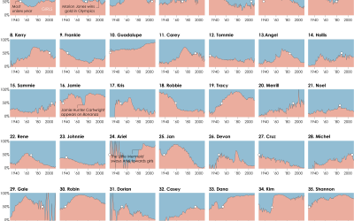
Once again turning to data from the National Survey of Family Growth by the Centers for Disease Control and Prevention, we can see when Americans generally hit the milestone.
More specifically, the chart below is based on estimates from the 2013-15 public use data files. Each bar represents the percentage of respondents of a given age who either had sex or did not. Keep in mind that the data only covers straight sex (as the focus of the survey is on reproduction), so it’s likely the upward trend is a bit steeper when you consider those who have only had intercourse with the same sex.
As you would expect, a higher percentage of young people did not have sex, and as you look at later years, close to 100 percent of people have had sex by then. I thought the rise for the percentage of people who had sex would be more gradual, but I guess once legal adulthood arrives, it’s off to the races.
 Relationships: The First Time…
Relationship goals.
Notes
- You might notice the data is a bit noisy rather than a smooth curve towards 100 percent. This is because I only looked at people at a given age and calculated the value instead of figuring out the cumulative. For whatever reason, my brain kept farting when I tried to do this.
- The data is limited. The chart only covers the age range, because the survey is only interviews 15- to 45-year-olds. Also, the survey currently does not cover same-sex intercourse. Hopefully that changes in the coming years.
Become a member. Support an independent site. Get extra visualization goodness.
See What You Get