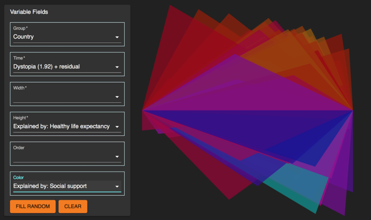
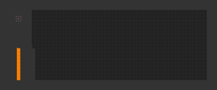
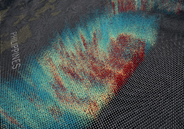
• Membership
  • Newsletter
  • Projects
  • Learning
  • About
  • Member Login
  • Data Underload  /  3-D printing, basketball, R

    Data, R, and a 3-D Printer

    We almost always look at data through a screen. It’s quick and good for exploration. So is there value in making data physical? I played around with a 3-D printer to find out.

    Read More
  • Visualization for an audience

    April 30, 2018

    Topic

    Design  /  audience, Jonathan Corum

    Jonathan Corum, the Science graphics editor at The New York Times, talks about his experiences communicating scientific research to the public. Much of visualization design is about figuring out the audience and making graphics for that audience, so Corum uses a lot of examples that start from technical research papers and finish with a more focused result.

  • All the buildings in Manhattan in 3-D map

    April 27, 2018

    Topic

    Maps  /  3-d, buildings, New York

    Taylor Baldwin mapped all of the buildings in Manhattan using a 3-D layout. Rotate, zoom, and pan, and be sure to mess around with the parameters in the control panel for different looks. Also make sure you try it in Chrome, because it’ll probably send your computer fan whirling.

  • Is the hot hand in basketball real?

    April 26, 2018

    Topic

    Statistics  /  basketball, hot hand, Numberphile

    [arve url=”https://www.youtube.com/watch?v=bPZFQ6i759g” /]

    With Numberphile, Lisa Goldberg discusses her research with Alon Daks and Nishant Desai at the University of California, Berkeley on the hot hand in basketball. When a player is hitting shots, is he more likely to hit the next one? The experiment results suggest that the hot hand is actually just randomness.

    That said, there are other points of view on this topic.

    As a statistician, I don’t think the hot hand exists mathematically, but as a sports fan, I’m more than happy to ride the wave of excitement.

  • Get all caught up with The Avengers using this timeline

    April 26, 2018

    Topic

    Infographics  /  Avengers, timeline, Washington Post

    It’s been a decade since the first Iron Man movie, and some 30 superhero characters later, we arrive at a two-parter Avengers finale. But maybe you lost track of everything that happened leading up to this point. Sonia Rao and Shelly Tan for the Washington Post got you covered with a filterable timeline. Focus on specific stories, characters, and franchises. Select “block spoilers” in case you still plan to watch something.

    I used to watch all of the Marvel movies, but then I had kids. I’ve seen one in five years. So this is right up my alley.

  • Building a robot boyfriend

    April 25, 2018

    Topic

    Statistics  /  artificial intelligence, ethics, love, robot

    When it comes to robots and love, the concept typically deteriorates to subservient tools to satisfy male fantasies. Creative technologist Fei Lu aims for a more complex relationship with Gabriel2052:

    Creating Gabriel2052 is obviously technically challenging, but it’s ultimately a process within my control. He will become something—someone—I can form a lifelong bond with. Through bringing Gabriel2052 to life, I am investigating and confronting the ways in which technology and society create both harmful and uplifting narratives; the ones we’ve become complicit in during our search for love and understanding from others, and the world at large.

    So instead of a robot that is purely there to serve, Lu explores a robot that’s a bit closer to human and driven by her emotional needs (and an ex-boyfriend’s text messages) — because inevitably, our relationship with robots will impact our relationships with real people.

  • Waiting Game, through the steps of asylum seekers

    April 24, 2018

    Topic

    Infographics  /  asylum, game, ProPublica

    Sisi Wei for ProPublica and Nick Fortugno of Playmatics made a game to provide a feeling of what it’s like for someone who needs escape from their home.

    Based on the real case files of five asylum seekers from five countries and interviews with the medical and legal professionals who evaluate and represent them, The Waiting Game is an experimental news game that lets you walk in the shoes of an asylum seeker, from the moment they choose to come to the United States to the final decision in the cases before an immigration judge.

    Take your time with this one, and use your headphones.

    In the game format, I felt more engrossed in the individual stories than I think if it were a linear profile story.

  • Knitters and the neural network-trained machine

    April 23, 2018

    Topic

    Statistics  /  knitting, neural network

    Janelle Shane, who likes to play with output from neural networks, teamed up with knitters in a discussion forum to produce abstract designs. Shane generates the knitting patterns, and the knitters bring the computer output to life. She calls the project SkyKnit.

    The neural network produces slightly flawed instructions, but the knitters can figure things out:

    Knitters are very good at debugging patterns, as it turns out. Not only are there a lot of knitters who are coders, but debugging is such a regular part of knitting that the complicated math becomes second nature. Notation is not always consistent, some patterns need to be adjusted for size, and some simply have mistakes. The knitters were used to taking these problems in stride. When working with one of SkyKnit’s patterns, GloriaHanlon wrote, “I’m trying not to fudge too much, basically working on the principle that the pattern was written by an elderly relative who doesn’t speak much English.”

    Love the meeting between people and computer. [via The Atlantic]

  • Here’s what you get when you cross dinosaurs and flowers with deep learning

    April 20, 2018

    Topic

    Statistics  /  dinosaurs, flowers, neural network

    Neural networks have shown usefulness with a number of things, but here is an especially practical use case. Chris Rodley used neural networks to create a hybrid of a dinosaur book and a flower book. The world may never be the same again.

  • Umpire strike zone changes to finish games earlier

    April 19, 2018

    Topic

    Infographics  /  baseball, FiveThirtyEight, sports, work

    When watching baseball on television, we get the benefit of seeing whether a pitch entered the strike zone or not. Umpires go by eye, and intentional or not, they tend towards finishing a game over extra innings. Michael Lopez, Brian Mills, and Gus Wezerek for FiveThirtyEight:

    The left panel shows the comparative rate of strike calls when, in the bottom of an inning in extras, the batting team is positioned to win — defined as having a runner on base in a tie game — relative to those rates in situations when there’s no runner on base in a tie game. When the home team has a baserunner, umps call more balls, thus setting up more favorable counts for home-team hitters, creating more trouble for the pitcher, and giving the home team more chances to end the game.

    I doubt the shift is on purpose, but it’s interesting to see the calls go that way regardless. Also, from a non baseball-viewer, why isn’t there any replay in baseball yet?

  • Abstract: The Art of Design, with Christoph Niemann

    April 18, 2018

    Topic

    Design  /  Christoph Niemann, illustration

    [arve url=”https://www.youtube.com/watch?v=DYaq2sWTWAA” /]

    Abstract: The Art of Design kept popping up on my Netflix recommendations list for the past several months. I ignored it though, because I’m tired of the heavy-handed design shows talking about how design is life and life is design, etc. Also, I probably spend more time flipping through what I can watch than actually watching anything.

    In any case, for some reason I hit play and was happy to see the first episode with Christoph Niemann. Niemann is known for his whimsical, visual storytelling, and his process was fun to watch. Recommended.

    And if Netflix isn’t your jam, this talk by Niemann is also good:

    [arve url=”https://www.youtube.com/watch?v=dG-ZXiYtLy8″ /]

  • Guides  /  comparison, contrast, difference

    Visualizing Differences

    Focus on finding or displaying contrasting points, and some visual methods are more helpful than others. A guide.

    Read More
  • Shapes we make, seen from the sky

    April 16, 2018

    Topic

    Data Art  /  geometry, Google, satellite

    Look from the above at the shapes and geometry we use for cities, blocks, roads, fields, and the like, and you start to get the repeating patterns. Páraic McGloughlin and Pearse McGloughlin highlight these patterns and their connectedness in Arena by stringing together Google Earth images.

    [arve url=”https://vimeo.com/259989412″ /]

  • Algorithms drawn as IKEA furniture instructions

    April 16, 2018

    Topic

    Infographics  /  algorithm, humor, IKEA

    Learning algorithm steps can be a challenge when viewed only through code or words. So Sándor P. Fekete, Sebastian Morr, and Sebastian Stiller put together IDEA. The collection of illustrations describes common programming algorithms, such as Quicksort, in the style of IKEA furniture assembly instructions. Allen wrench not required. [via kottke]

  • Hans Rosling wrote a book on Factfulness

    April 13, 2018

    Topic

    Statistics  /  book, facts, Hans Rosling, world

    Hans Rosling was able to build excitement around data like no other. Truth and progress was his rally cry. Before he died, he was working on a book with his Gapminder co-founders Anna Rosling Rönnlund and Ola Rosling. The book, Factfulness: Ten Reasons We’re Wrong About the World—and Why Things Are Better Than You Think, is out now. Ordered and looking forward to it.

  • Visualization color picker, based on perception research

    April 12, 2018

    Topic

    Apps  /  color, perception

    The colors you choose to visualize data can completely shift what you convey to a reader. With an ominous color palette, a graphic meant to be light and fun comes off the wrong way. Or the other way around. You wouldn’t use Comic Sans for your résumé (right…?), so choose colors that fit the topic. Viz Palette, made by Elijah Meeks and Susie Lu, aims to make the choosing part easier.

    It’s still up to you to figure out the right overall scheme, but Viz Palette takes care of the stuff in between, such as designing for color blindness and perceptually evenly-spaced shades. It also includes a “color report” that points out shades that might look the same in various situations.

    While there are many color-picking tools (I typically stick to four.), they are often too simple, overly-complicated, or research-centric. This one seems to strike a good balance for practicality.

  • Strictly statistical approach

    April 11, 2018

    Topic

    Statistics  /  humor, SMBC

    This comic from Saturday Morning Breakfast Cereal speaks to me.

    You can quantify all the things to look at said things more objectively. However, there are always other things that cannot be quantified and in real life, they are often intertwined with the numeric portion of the data. Split apart the quantitative and qualitative, and you end up making all decisions based on stab percentage.

  • Maps show spring arriving earlier

    April 11, 2018

    Topic

    Maps  /  first leaf, global warming, NASA

    From Joshua Stevens at the NASA Earth Observatory:

    But over the longer term, climate change is causing spring to begin earlier and earlier across the United States. These maps reveal just how much earlier spring is arriving in National Parks across the country. The data were published in 2016 by ecologists from the National Park Service, working in collaboration with colleagues at other agencies and institutions.

    Griddy.

    Limited to only national parks, the view still provides a good idea. For a model-based view at higher granularity, check out the USA National Phenology Network.

  • The Moon in 4k resolution

    April 10, 2018

    Topic

    Maps  /  high resolution, moon, NASA, space

    Based on data gathered by the Lunar Reconnaissance Orbiter, NASA pieced together this high-resolution tour of the moon. At the two-minute mark they zoom in on a boulder in the middle of a 100-million-year-old crater, and it blew my mind.

    [arve url=”https://youtu.be/nr5Pj6GQL2o” /]

  • Datasets for teaching data science

    April 9, 2018

    Topic

    Data Sources  /  R, teaching

    Rafael Irizarry introduces the dslabs package for real-life datasets to teach data science:

    [I] try to avoid using widely used toy examples, such as the mtcars dataset, when I teach data science. However, my experience has been that finding examples that are both realistic, interesting, and appropriate for beginners is not easy. After a few years of teaching I have collected a few datasets that I think fit this criteria. To facilitate their use in introductory classes, I include them in the dslabs package.

  • Page 144 of 391
  • <
  • 1
  • ...
  • 141
  • 142
  • 143
  • 144
  • 145
  • 146
  • ...
  • 391
  • >

Analyze, visualize, and communicate data usefully, beyond the defaults.

Become a member →

Recently for Members

May 8, 2025
When the data is not what it seems

May 1, 2025
Finding the Right Charts

April 24, 2025
Visualization Tools, Datasets, and Resources – April 2025 Roundup

April 17, 2025
Breaking Out of Chart Software Defaults

April 15, 2025
Line Chart with Decorative Neon Accents

Browse by Chart Type See All →

Dot Plot Gantt Chart Dot Density Map Frequency Trails Bar Chart Race Parallel Sets Unit Chart Parallel Coordinates Square Pie Chart Bar Chart

Browse By Topic

  • Visualization

    Seeing data

  • Maps

    Seeing geographic data

  • Infographics

    Explaining data

  • Networks

    Connecting data

  • Statistics

    Analyzing data

  • Software

    Working with data

  • Sources

    Getting data

  • Design

    Making data readable

Get the Book

Visualize This: The FlowingData Guide to Design, Visualization, and Statistics

Available now.

Order: Amazon / Bookshop

Made by FlowingData

  • The Process

  • Data Underload

  • Chart Everything

  • Guides

  • Books

  • Shop

  • About
  • Contact
  • Newsletter
  • LinkedIn
  • Instagram
  • Bluesky
  • RSS
Copyright © 2007-Present FlowingData. All rights reserved.