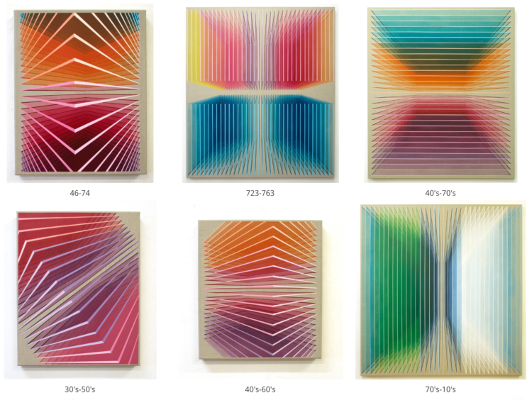
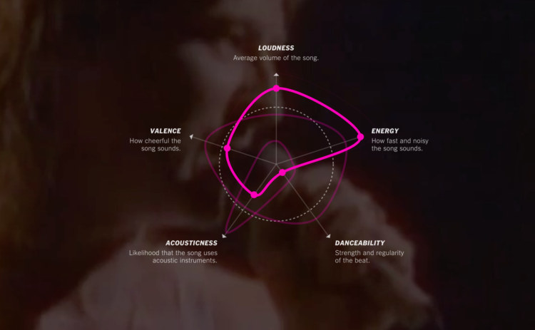
• Membership
  • Newsletter
  • Projects
  • Learning
  • About
  • Member Login
  • Army ant bridge-buliding algorithm

    March 19, 2018

    Topic

    Statistics  /  ants, independence

    Army ants function without a leader and yet accomplish very organized-looking things, such as building bridges across gaps:

    [arve url=”https://www.youtube.com/watch?v=sgDgYqEXN54″ /]

    Researchers from the Swarm Lab believe they can break down the bridge-building process into a simple, two-rule system. Rule 1: If fellow ants are walking over you, stay put. Rule 2: If the number of ants walking over you isn’t higher than some rate, get moving again.

    Full paper here (pdf).

  • Machine learning to estimate when bus and bike lanes blocked

    March 16, 2018

    Topic

    Statistics  /  bike lane, machine learning

    Frustrated with vehicles blocking bus and bike lanes, Alex Bell applied some statistical methods to estimate the extent.

    Sarah Maslin Nir for The New York Times:

    Now Mr. Bell is trying another tack — the 30-year-old computer scientist who lives in Harlem has created a prototype of a machine-learning algorithm that studies footage from a traffic camera and tracks precisely how often bike lanes are obstructed by delivery trucks, parked cars and waiting cabs, among other scofflaws. It is a piece of data that transportation advocates said is missing in the largely anecdotal discussion of how well the city’s bus and bike lanes do or do not work.

  • Bot or Not: A Twitter user classifier

    March 15, 2018

    Topic

    Statistics  /  bot, machine learning, Twitter

    Michael W. Kearney implemented a classifier for Twitter bots. It’s called botornot:

    Uses machine learning to classify Twitter accounts as bots or not bots. The default model is 93.53% accurate when classifying bots and 95.32% accurate when classifying non-bots. The fast model is 91.78% accurate when classifying bots and 92.61% accurate when classifying non-bots.

    Overall, the default model is correct 93.8% of the time.

    Overall, the fast model is correct 91.9% of the time.

    You can enter Twitter accounts to see what the model projects here. It’s barebones, and I’m not sure what the curve represents, but it’s fun to poke at.

  • Needle of uncertainty

    March 14, 2018

    Topic

    Statistics  /  needle, uncertainty, Upshot

    The Upshot has used a needle to show shifts in their live election forecasts, because many readers don’t understand probability. Nate Cohn and Josh Katz:

    This was evident before the result of the 2016 election, and as a result we tried something new: a jitter, where the needle quivered to reflect the uncertainty around the forecast. Although many readers disliked it, the jitter reflected an earnest attempt to give tangible meaning to abstract probabilities. Nonetheless, we turned the jitter off for all of our 2017 forecasts.

    Tonight, readers will have the option to turn the jitter off. We expect that some readers will opt to do so, but remember this: Switching it off only hides the uncertainty — it doesn’t make it go away.

    Read the whole thing for why the needle, what the needle means, and how The Upshot is using it.

    As much as I hated what the needle showed me the first time I saw it, I’ve grown to appreciate the uncertainty it represents.

  • Using data to help end malnutrition

    March 13, 2018

    Topic

    Statistics  /  gaps, hunger

    Kofi Annan for Nature on the importance of data in ending poverty and hunger:

    Such fine-grained insight brings tremendous responsibility to act. It shows governments, international agencies and donors exactly where to direct resources and support. The Sustainable Development Goals — which UN member states endorsed when the Millennium Development Goals expired in 2015 — include the first targets for reducing stunting and wasting. The data indicate that no African country is currently on track to reach all the targets associated with ending hunger, achieving food security and improving nutrition.

    This shows how crucial it is to invest in data. Data gaps undermine our ability to target resources, develop policies and track accountability. Without good data, we’re flying blind. If you can’t see it, you can’t solve it.

  • One-way tickets out for homeless people

    March 12, 2018

    Topic

    Statistical Visualization  /  Guardian, homeless

    Many cities provide free bus tickets for homeless people who want to relocate. The Guardian compiled data from sixteen cities to show where thousands of people bussed to over a six-year period.

    The data from these cities has been compiled to build the first comprehensive picture of America’s homeless relocation programs. Over the past six years, the period for which our data is most complete, we are able to track where more than 20,000 homeless people have been sent to and from within the mainland US.

    Lots of maps and charts in this one, mixed with individual narratives.

  • Outlier detection in R

    March 9, 2018

    Topic

    Software  /  outlier, R

    Speaking of outliers, it’s not always obvious when and why a data point is an outlier. The Overview of Outliers package in R by Antony Unwin lets you compare methods.

    Articles on outlier methods use a mixture of theory and practice. Theory is all very well, but outliers are outliers because they don’t follow theory. Practice involves testing methods on data, sometimes with data simulated based on theory, better with `real’ datasets. A method can be considered successful if it finds the outliers we all agree on, but do we all agree on which cases are outliers?

    See also Unwin’s talk from 2017 for more about the thinking behind the package.

  • What a neural network sees

    March 8, 2018

    Topic

    Statistics  /  Google, neural network

    Neural networks can feel like a black box, because, well, for most people they are. Supply input and a computer spits out results. The trouble with not understanding what goes on under the hood is that it’s hard to improve on what we know. It’s also a problem when someone uses the tech for malicious purposes, as people are prone to do.

    So, folks from Google Brain break down the structures of what makes these things work.

  • Guides  /  outlier

    Visualizing Outliers

    Step 1: Figure out why the outlier exists in the first place. Step 2: Choose from these visualization options to show the outlier.

    Read More
  • Lottery hacking, winning millions

    March 6, 2018

    Topic

    Statistics  /  lottery

    I always love a good lottery hacking story. Jason Fagone for The Huffington Post chronicles the winnings of Gerald and Marge Selbee, a retired couple from a small town in Michigan. It is a story of probabilities, expected values, and arduously buying a lot of tickets to maximize profits.

    That’s when it hit him. Right there, in the numbers on the page, he noticed a flaw—a strange and surprising pattern, like the cereal-box code, written into the fundamental machinery of the game. A loophole that would eventually make Jerry and Marge millionaires, spark an investigation by a Boston Globe Spotlight reporter, unleash a statewide political scandal and expose more than a few hypocrisies at the heart of America’s favorite form of legalized gambling.

    I think it’s every statistician’s fantasy to crack open a lottery’s flaw using the numbers. No? Just me? Okay, whatever.

    The most interesting part though is that the loophole didn’t seem to be that obscure. Selbee just needed a bit of knowledge about big numbers, a pencil, and a napkin to crunch on. Are there more games out there like this? Do I need to start playing the lottery?

    See also the statistician who cracked a scratch lottery code and the other statistician who won the lottery four times.

  • Chart Everything  /  census, counting

    Making the Count

    As 2020 approaches, let’s aim for higher accuracy and less uncertainty.

    Read More
  • Sentence gradients to see the space between two sentences

    March 2, 2018

    Topic

    Statistics  /  neural network, sentence

    In a project he calls Sentence Space, Robin Sloan implemented a neural network so that you can enter two sentences and get a gradient of the sentences in between.

    I’d never even bothered to imagine an interpolation between sentences before encountering the idea in a recent academic paper. But as soon as I did, I found it captivating, both for the thing itself—a sentence… gradient?—and for the larger artifact it suggested: a dense cloud of sentences, all related; a space you might navigate and explore.

    The project is open source on GitHub if you want to have at it.

  • Predictive policing algorithms used secretly in New Orleans

    March 1, 2018

    Topic

    Statistics  /  Palantir, police, prediction, privacy, Verge

    Speaking of surveillance cities, Ali Winston for The Verge reports on the relationship between Palantir and New Orleans Police Department. They used predictive policing, which is loaded with social and statistical considerations, under the guise of philanthropy. Palantir gained access to personal records:

    In January 2013, New Orleans would also allow Palantir to use its law enforcement account for LexisNexis’ Accurint product, which is comprised of millions of searchable public records, court filings, licenses, addresses, phone numbers, and social media data. The firm also got free access to city criminal and non-criminal data in order to train its software for crime forecasting. Neither the residents of New Orleans nor key city council members whose job it is to oversee the use of municipal data were aware of Palantir’s access to reams of their data.

    False positives. Over-policing. Bias from the source data driving the algorithms. This isn’t stuff you just mess around with.

  • Smart surveilled city

    March 1, 2018

    Topic

    Statistics  /  privacy, smart city

    Smart home. Smart city. They have a positive ring to it, as if the place or thing will know what we want right when we need it and adjust accordingly. It’s all very grand. That’s assuming the new technologies are all used for good things.

    Geoff Manaugh for The Atlantic considers what might happen when the sensors and new data streams are used against individuals:

    As the city becomes a forensic tool for recording its residents, an obvious question looms: How might people opt out of the smart city? What does privacy even mean, for example, when body temperature is now subject to capture at thermal screening stations, when whispered conversations can be isolated by audio algorithms, or even when the unique seismic imprint of a gait can reveal who has just entered a room? Does the modern city need a privacy bill of rights for shielding people, and their data, from ubiquitous capture?

    Yes.

  • All the astronauts and their spaceflights

    February 28, 2018

    Topic

    Infographics  /  astronauts, National Geographic, space

    556 people have gone to space. In an article on their changed perspectives, Jason Treat for National Geographic shows when these select few went on their travels.

  • How to Make Unit Charts with Icon Images in R

    Make the unit chart less abstract with icons that represent the data, or use this in place of a bar chart.

  • Traveling birds on a thousand-mile journey

    February 27, 2018

    Topic

    Maps  /  birds, migration

    Birds migrate to areas more hospitable, but where do they go? It depends on the bird. It depends on the time of year. It depends on other various factors. Drawing from several data sources, National Geographic maps how birds migrate thousands of miles. View it on your desktop of maximum animated pleasure.

  • Speeding increases energy in a crash proportional to the square

    February 26, 2018

    Topic

    Statistics  /  Numberphile, speeding, traffic

    A car moving at 70 miles per hour has to stop suddenly. Another car going 100 miles per hour also has to stop suddenly. Your intuition might say that the former requires 30% less energy to stop, but the energy required is actually proportional to the square of the velocity. Ben Sparks for Numberphile explains:

    [arve url=”https://www.youtube.com/watch?time_continue=364&v=i3D7XYQExt0″ /]

    Okay. Now what are the energy gains and losses for the guy trying to speed by weaving in and out of slow traffic?

  • Page 146 of 391
  • <
  • 1
  • ...
  • 143
  • 144
  • 145
  • 146
  • 147
  • 148
  • ...
  • 391
  • >

Analyze, visualize, and communicate data usefully, beyond the defaults.

Become a member →

Recently for Members

May 8, 2025
When the data is not what it seems

May 1, 2025
Finding the Right Charts

April 24, 2025
Visualization Tools, Datasets, and Resources – April 2025 Roundup

April 17, 2025
Breaking Out of Chart Software Defaults

April 15, 2025
Line Chart with Decorative Neon Accents

Browse by Chart Type See All →

Mosaic Plot Area Chart Barcode Chart Choropleth Map Word Cloud Parallel Coordinates Slope Chart Frequency Trails Beeswarm Alluvial Diagram

Browse By Topic

  • Visualization

    Seeing data

  • Maps

    Seeing geographic data

  • Infographics

    Explaining data

  • Networks

    Connecting data

  • Statistics

    Analyzing data

  • Software

    Working with data

  • Sources

    Getting data

  • Design

    Making data readable

Get the Book

Visualize This: The FlowingData Guide to Design, Visualization, and Statistics

Available now.

Order: Amazon / Bookshop

Made by FlowingData

  • The Process

  • Data Underload

  • Chart Everything

  • Guides

  • Books

  • Shop

  • About
  • Contact
  • Newsletter
  • LinkedIn
  • Instagram
  • Bluesky
  • RSS
Copyright © 2007-Present FlowingData. All rights reserved.