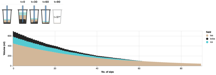
I feel like I was supposed to know what blockchain is a while ago, but I’ve only had a hand-wavy explanation on hand. And it wasn’t a very good one. Reuters provides a clear and concise visual explanation of how blockchain works. Now I can explain it to friends and family whenever there’s a Bitcoin spike or dip, or I can at least point them to this explainer.
-
Oh. So that’s why I was always placed in right field that one year.
Little League Analytics ⚾️ pic.twitter.com/THf5FyqRF7
— PetrosAndMoneyShow (@PetrosAndMoney) June 14, 2018
-
Benjamin Schmidt, an assistant professor of history at Northeastern University, explored the space between words and drew the paths to get from one word to another. The above, for example, is the path between Seinfeld and Breaking Bad. Using Google News as the corpus, the steps:
- Take any two words. I used “duck” and “soup” for my testing.
- Find a word that is, in cosine distance, between the two words: that is, that is closer to both of them than either is to each other. Select for one as close to the midpoint as possible.* With “duck” and “soup,” that word turns out to be “chicken”: it’s a bird, but it’s also something that frequently shows up in the same context as soup.
- Repeat the process to find words between “duck” and “chicken.” That, in this corpus, turns out to be “quail.” The vector here seems to be similar to the one above–quail is food relatively more often than duck, but less overwhelmingly than chicken.
- Continue subdividing each path until no more intermediaries exist. For example, “turkey” works as a point between “quail” and “chicken”; but nothing intermediates between turkey and quail, or between turkey and chicken.
Schmidt’s results actually make a lot of sense.
See also: the Google arts experiment that motivated this one.
-
This is quite the scatterplot from Claire Cain Miller and Kevin Quealy for The Upshot. The vertical axis represents by how much girls or boys are better in standardized tests; the horizontal axis represents wealth; each bubble represents a school district; and yellow represents English test scores, and blue represents math test scores.
The result: a non-trend up top and a widening gap at the bottom.
-
In a spin on the view of ancient Earth and the shift of the continents, Ian Webster made a globe where you can enter a location and see what was in that spot millions of years ago. Not all addresses were working for me at the time, so you might want to try a major city if it’s doing the same for you. [via kottke]
-
How I Made That: National Dot Density Map
Mapping one dot per person, it’s all about putting the pieces together.
-
Every day you wish you could convert a picture of your family or a group of friends into a LEGO palette. Well wish no more. Ryan Timpe wrote a package that lets you input an image in R and get back a LEGO-ized version of it, along with an optimized, money-saving brick list.
Dreams come true. Don’t let anyone tell you otherwise.
-
The health meter in video games wasn’t always so commonplace. It took time, iterations, and various incarnations before it converged to what we know now. Ahoy describes the history:
[arve url=”https://www.youtube.com/watch?v=B8HT8aUb5q4″ /]
-
Thousands of homicides. Some cases result in an arrest. Many end up unsolved. The Washington Post mapped areas in major cities to show the contrast between the two types of homicide cases.
The data looks noisy at first, but when you compare cities like Baltimore with low arrest rates against cities like Atlanta with high arrest rates, you start to wonder.
-
Facebook took the biggest hit in the past three years. Snapchat and Instagram got more likes.
-
How the schedules between remote and non-remote workers differ during workdays.
-
xkcd. Sometimes sports statistics are far-fetched.
-
Slowly becoming the person who charts the past century of natural disaster events, Lazaro Gamio for Axios uses a pictogram to depict all known volcano eruptions since 1883. The vertical position represents elevation, color represents number of eruptions since 1883, and the shape represents volcano type.
I wonder if you get anything out of looking at eruptions over time. This view is more compendium than pattern revealer. You can grab the data from the Global Volcanism Program to check it out yourself.
-
The ink-drawn map of Hundred Acre Wood by Winnie-the-Pooh illustrator E. H. Shepard dates back to 1929. I’m headed straight for Eeyore’s gloomy place, which is rather boggy and sad. The drawing is up for auction, in case you’re interested in dropping a couple hundred thousand dollars. [via BBC]
-
Artist Marcus Lyon imagines worlds where there are so many people that the only thing left to do is to make gigantic places to fit everyone. The patterns repeat themselves over and over, and it’s no longer about the individual exploring an entire place. [via kottke]
-
By Raymond Loewy, this chart from 1934 shows the shifts in design of the car, telephone, and clock, among other things. I assume someone is already working on updating this one to the present. [via @michaelbierut]
-
This is what happens when there is a lull during the basketball playoff season. Chris Herring, for FiveThirtyEight, goes into full detail of the relatively high number of times Kevin Durant’s shoe falls off during games:
All told, an extensive video analysis of Durant’s games from the past three regular seasons and postseasons reveals that the four-time scoring champ has come out of his shoe at least 31 times since the beginning of the 2015-16 campaign. That number, compiled against 20 different NBA teams, equates to losing a sneaker roughly every eight games or so — a mind-bogglingly high figure considering that Durant has had his own signature Nike shoe, designed to fit the unique contours of his feet, dating back to 2008.
“His shoe comes off more than anyone I’ve ever seen,” says teammate Draymond Green.
The question, of course, is why.
I’m so here for this.
-
Emily Robinson gives advice on applying for a data science job (that you can likely generalize for most tech jobs). For example:
If you have a GitHub, pin the repos you want people to see and add READMEs that explain what the project is. I also strongly recommend creating a blog to write about data science, whether it’s projects you’ve worked on, an explanation of a machine learning method, or a summary of a conference you attended.
This is especially true for visualization-heavy jobs. It doesn’t have to be GitHub. You just need a place where others can see your collection of work, so that they can see if it aligns with what they’re looking for. Plus it lets you show off your best stuff.
And this:
Rather than applying to every type of data science job you find, think about where you want to specialize. A distinction I’ve found helpful when thinking of my own career and looking at jobs is the Type A vs. Type B data scientist. “A” stands for analysis: type A data scientists have strong statistics skill and the ability to work with messy data and communicate results. “B” stands for build: type B data scientists have very strong coding skills, maybe have a background in software engineering, and focus on putting machine learning models, such as recommendation systems, into production.
I’ve never formally interviewed for a data science job, and the last job I interviewed for was back in college I think. So I’m one of the worst people to ask about this stuff, but this seems like good advice.
-
Popular songs on the Billboard charts always tended to sound similar, but these days they’re sounding even more similar. Andrew Thompson and Matt Daniels for The Pudding make the case:
From 2010-2014, the top ten producers (by number of hits) wrote about 40% of songs that achieved #1 – #5 ranking on the Billboard Hot 100. In the late-80s, the top ten producers were credited with half as many hits, about 19%.
In other words, more songs have been produced by fewer and fewer topline songwriters, who oversee the combinations of all the separately created sounds. Take a less personal production process and execute that process by a shrinking number of people and everything starts to sound more or less the same.
-
Visualization is often described in the context of speed and efficiency. Get the most insight for the least amount of ink or pixels. Elijah Meeks argues that visualization goes far beyond this point of view:
This breakneck pace is a real data visualization constraint. It’s not a myth that charts are often deployed in rooms full of people who only have a short time to comprehend them (or not) and make a decision. Automatic views into datasources are a critical aspect of exploratory data analysis and health checks. The fast mode of data visualization is real and important, but when we let it become our only view into what data visualization is, we limit ourselves in planning for how to build, support and design data visualization. We limit not only data visualization creators but also data visualization readers.
In the three-parter, Meeks tries to make the fuzzy aspects of visualization — meaning, insight, impact, etc. — more concrete.
See also:
- Visualization spectrum
- Ben Fry on visualization and data literacy
- Eric Rodenbeck on what visualization is for
- Book genres for visualization
- Information Visualization Manifesto
- Fast Thinking and Slow Thinking Visualisation
Note the dates on all of them. We’ll figure out this visualization thing one of these days.