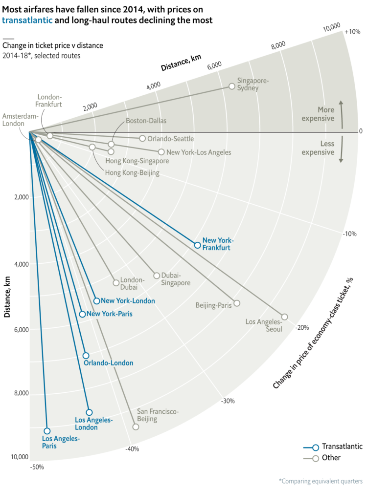
• Membership
  • Newsletter
  • Projects
  • Learning
  • About
  • Member Login
  • Searching for education deserts

    July 30, 2018

    Topic

    Maps  /  desert, education

    The Chronicle of Higher Education looked for education deserts — places where people aren’t within driving range of a college or university — with a combination of Census data, school locations, and driving times. They found that about 3.5 percent of the adult population (11.2 million) lived in education deserts.

    There are a lot of caveats to consider, such as not all adults go to or want to go to college and many students move away from home for school. So it’s hard to say how useful the 3.5 percent figure is. Nevertheless, it’s an interesting view of what isn’t there and the scrollytelling format lends well to working through the analysis steps.

  • Mapping the ocean undisturbed by humans

    July 27, 2018

    Topic

    Maps  /  environment, ocean

    Researchers recently published estimates for the amount of area undisturbed by humans — marine wilderness — left on the planet. Kennedy Elliot for National Geographic mapped the results.

  • Calculating wind drag in the cycling peloton

    July 27, 2018

    Topic

    Statistics  /  cycling, peloton, Wall Street Journal

    When cyclists ride in that big pack during a race — the peloton — the ones that aren’t leading get to ride with a reduced wind resistance. Researchers found out the magnitude of the reduction.

    Joshua Robinson for The Wall Street Journal:

    According to a new study published in the Journal of Wind Engineering and Industrial Aerodynamics, riders in the belly of a peloton are exposed to 95% less drag than they would experience riding alone. Which explains the sensation all riders describe of being sucked along by the bunch while barely having to pedal.

  • Extremely detailed election map

    July 26, 2018

    Topic

    Maps  /  election, Upshot

    The Upshot returns to 2016 election results mapped at the precinct level. Because you know, we all want to experience the data as many times as we can before 2020.

    There’s an interesting twist though. You can randomly view “one-sided places”, where the area voted mostly the same, and “voter islands”, where the area is surrounded by opposite-voting precincts. These are made more compelling by the granular data and ease of interaction, largely made possible by Mapbox.

    There’s also a 3-D view in case you want to pretend you’re looking at an election game board.

  • How to Visualize Ranges of Data in R

    When you want to focus on the magnitude of differences between low and high values, use visual cues that highlight distance.

  • Same stars, different constellations

    July 25, 2018

    Topic

    Infographics  /  constellations, culture

    Cultures have formed different stories and pieced together different constellations from the stars, even though everyone are looking at the same thing in the sky. Nadieh Bremer visualized constellations across these cultures that share the same star.

    Let’s compare 28 different “sky cultures” to see differences and similarities in the shapes they’ve seen in the night sky. Ranging from the so-called “Modern” or Western constellations, to Chinese, Maori and even a few shapes from historical cultures such as the Aztecs.

  • Data Underload  /  jobs, work

    Most Common Jobs, By State

    Instead of looking at only the most common job in each state, I found the top five for a slightly wider view.

    Read More
  • When wife earns more than husband, they report a lesser gap

    July 23, 2018

    Topic

    Statistics  /  census, income

    Marta Murray-Close and Misty L. Heggeness for the Census Bureau compared income responses from the Current Population Survey against income tax reports. The former can be fudged, whereas the latter is accurate by law. The researchers found a statistical difference that suggests when a wife makes more than a husband, they report a lesser gap in the survey.

    This paper compares the earnings reported for husbands and wives in the Current Population Survey with their “true” earnings from administrative income-tax records. Estimates from OLS regressions show that survey respondents react to violations of the norm that husbands earn more than their wives by inflating their reports of husbands’ earnings and deflating their reports of wives’ earnings. On average, the gap between a husband’s survey and administrative earnings is 2.9 percentage points higher if his wife earns more than he does, and the gap between a wife’s survey and administrative earnings in 1.5 percentage points lower if she earns more than her husband does. These findings suggest that gendered social norms can influence survey reports of seemingly objective outcomes and that their impact may be heterogeneous not just between genders but also within gender.

    The gap shift didn’t change much, regardless if the wife reported or the husband did. However, it’s interesting that the shift tended towards a boost for the husband’s income when the wife reported and a bump down for the wife’s income when the husband reported.

  • Marvel size chart

    July 22, 2018

    Topic

    Infographics  /  comics, fiction, Marvel

    The logistics of being a 60-foot man must be a pain.

  • Marvel Cinematic Universe as a 3-D network

    July 20, 2018

    Topic

    Network Visualization  /  comics, fiction, Marvel

    The Straits Times visualized the Marvel Cinematic Universe with a 3-D browsable network. Link colors represent type of relationship, and proximity naturally represents commonalities between characters. Click on individual characters for information on each. Turn on the sound for extra dramatics.

  • Warranty Expiration

    July 19, 2018

    Topic

    Chart Everything  /  warranty

    With almost absolute certainty, every product dies a quick death once its warranty runs out. I mean it makes sense, but I never really thought about it until I had to replace all of the chirping smoke detectors at once. And the toilet pumps. And the tires on my car.

  • Analysis: Do the shoes matter in marathon running?

    July 19, 2018

    Topic

    Statistics  /  Nike, running, shoes, Upshot

    Kevin Quealy and Josh Katz for The Upshot analyzed shoe and running data to see if Nike’s Vaporfly running shoes really helped marathoners achieve faster times. Accounting for a number of confounding factors, the results appear to point to yes.

    We found that the difference was not explained by faster runners choosing to wear the shoes, by runners choosing to wear them in easier races or by runners switching to Vaporflys after running more training miles. Instead, the analysis suggests that, in a race between two marathoners of the same ability, a runner wearing Vaporflys would have a real advantage over a competitor not wearing them.

    Very statistics-y, even for The Upshot. I like it.

    It takes me back to my fourth grade science fair project where I asked: Do Nike’s really make you jump higher? Our results pointed to yes too. Although our sample size of five with no control or statistical rigor might not stand up to more technical standards. My Excel charts were dope though.

  • Data-centric view of birth control

    July 18, 2018

    Topic

    Infographics  /  birth control, The Pudding

    Birth control is one of those topics often saved for private conversations, so people’s views are often anecdotal. Someone knows what their friend, family member, etc used, but not much else. Amber Thomas for The Pudding provides a wider view of birth control using data from the CDC’s ongoing National Survey of Family Growth.

    You see what other people use, how the method changes with age, and side effects. There’s a Clippy-like character for added information on the different methods. So there’s a good amount of information there to make the choice that’s right for you.

    Sidenote on the NSFG data: I looked at the data a few times. It’s a good, messy dataset to explore if you want some practice.

  • Interactive to see street orientation everywhere

    July 17, 2018

    Topic

    Maps  /  directions, streets

    After seeing polar charts of street orientation in major cities, Vladimir Agafonkin, an engineer at Mapbox, implemented an interactive version that lets you see directions for everywhere:

    Extracting and processing the road data for every place of interest to generate a polar chart seemed like too much work. Could I do it on an interactive map? It turns out that this is a perfect use case for Mapbox vector maps — since the map data is there on the client, we can analyze and visualize it instantly for any place in the world.

    Fun.

    So someone’s going to take the next step to rank and rate griddyness around the world, right?

  • Millions of internet-connected TVs track viewing habits

    July 17, 2018

    Topic

    Statistics  /  privacy, television

    Sapna Maheshwari for The New York Times on Samba TV software running on smart televisions:

    Once enabled, Samba TV can track nearly everything that appears on the TV on a second-by-second basis, essentially reading pixels to identify network shows and ads, as well as programs on HBO and even video games played on the TV. Samba TV has even offered advertisers the ability to base their targeting on whether people watch conservative or liberal media outlets and which party’s presidential debate they watched.

    I feel like this is something most people don’t want.

  • Neural networks to communicate with Alexa devices using sign language

    July 16, 2018

    Topic

    Statistics  /  Alexa, neural network, sign language, TensorFlow

    [arve url=”https://www.youtube.com/watch?v=kS53y6GWm0w” /]

    Many have found Amazon’s Alexa devices to be helpful in their homes, but if you can’t physically speak, it’s a challenge to communicate with these things. So, Abhishek Singh used TensorFlow to train a program to recognize sign language and communicate with Alexa without voice.

    Nice.

  • Twitter bot purge

    July 16, 2018

    Topic

    Statistical Visualization  /  fake, Twitter

    With Twitter cracking down, some users are experiencing bigger dips in follower count than others. Jeremy Ashkenas charted some of the drops.

  • Rush Hour puzzle solver and generator

    July 13, 2018

    Topic

    Data Sources  /  game, Rush Hour

    The Rush Hour puzzle game was invented by Nob Yoshigahara in the 1970s and made its way to the United States in the 1990s. There are vehicles of varying length in a parking lot, and you have to figure out how to get one of the cars out by shifting all the others inside a six-by-six grid. Michael Fogleman wrote a solver and generator for the game, resulting in a database of 1.5 million puzzles.

  • Changing Twitter, with Statistics

    July 13, 2018

    Topic

    Statistics  /  fake, New York Times, Twitter

    Earlier this year, The New York Times investigated fake followers on Twitter showing very clearly that it was a problem. It’s hard to believe that Twitter didn’t already know about the scale of the issue, but after the story, the social service finally started to work on the problem.

    Nicholas Confessore and Gabriel J.X. Dance for The New York Times:

    An investigation by The New York Times in January demonstrated that just one small Florida company sold fake followers and other social media engagement to hundreds of thousands of users around the world, including politicians, models, actors and authors. The revelations prompted investigations in at least two states and calls in Congress for intervention by the Federal Trade Commission. In interviews this week, Twitter executives said that The Times’s reporting pushed them to look more closely at steps the company could take to clamp down on the market for fakes, which is fueled in part by the growing political and commercial value of a widely followed Twitter account.

    This is statistics driving positive change instead of just advertising. I’m ready for more of this.

  • Street network orientation in major cities

    July 12, 2018

    Topic

    Statistical Visualization  /  directions, streets

    Using OpenStreetMap data, Geoff Boeing charted the orientation distributions of major cities:

    Each of the cities above is represented by a polar histogram (aka rose diagram) depicting how its streets orient. Each bar’s direction represents the compass bearings of the streets (in that histogram bin) and its length represents the relative frequency of streets with those bearings.

    So you can easily spot the gridded street networks, and then there’s Boston and Charlotte that are a bit nutty. Check out Boeing’s other chart for orientation of major non-US cities.

    See also Stephen Von Worley’s color-coded maps and Seth Kadish’s charts from 2014 that showed the same thing but used Census data instead of OpenStreetMap.

  • Page 140 of 391
  • <
  • 1
  • ...
  • 137
  • 138
  • 139
  • 140
  • 141
  • 142
  • ...
  • 391
  • >

Analyze, visualize, and communicate data usefully, beyond the defaults.

Become a member →

Recently for Members

May 8, 2025
When the data is not what it seems

May 1, 2025
Finding the Right Charts

April 24, 2025
Visualization Tools, Datasets, and Resources – April 2025 Roundup

April 17, 2025
Breaking Out of Chart Software Defaults

April 15, 2025
Line Chart with Decorative Neon Accents

Browse by Chart Type See All →

Bar Chart Race Cartogram Stacked Bar Chart Radar Chart Dot Density Map Baseline Chart Strip Plot Bump Chart Horizon Graph Treemap

Browse By Topic

  • Visualization

    Seeing data

  • Maps

    Seeing geographic data

  • Infographics

    Explaining data

  • Networks

    Connecting data

  • Statistics

    Analyzing data

  • Software

    Working with data

  • Sources

    Getting data

  • Design

    Making data readable

Get the Book

Visualize This: The FlowingData Guide to Design, Visualization, and Statistics

Available now.

Order: Amazon / Bookshop

Made by FlowingData

  • The Process

  • Data Underload

  • Chart Everything

  • Guides

  • Books

  • Shop

  • About
  • Contact
  • Newsletter
  • LinkedIn
  • Instagram
  • Bluesky
  • RSS
Copyright © 2007-Present FlowingData. All rights reserved.