Peak Non-Creepy Dating Pool
As you get older, the percentage of people your age who are married increases and the percentage who have never married decreases. This must mean your dating pool gets smaller with time, right? Well, this assumes you marry someone who is your age. What if you marry someone who is older or younger than you?
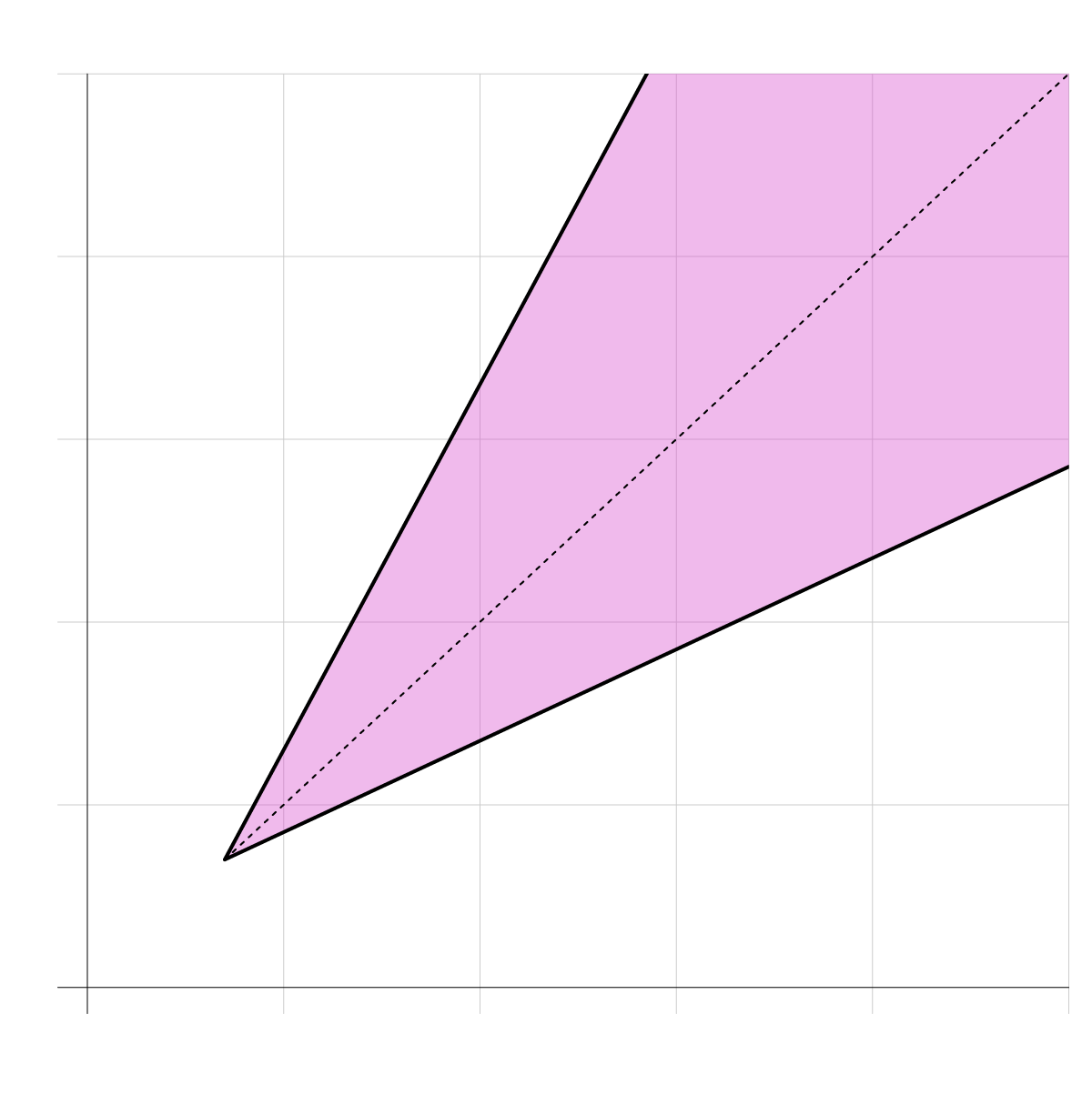
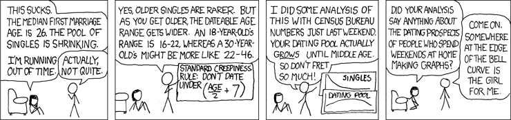
Thanks to the internet, we have a concrete dateable range given your age: the “half-your-age-plus-seven” rule. It’s on Wikipedia, so it’s basically law. Comic xkcd describes it as the standard creepiness rule:
So as you get older, your dating pool’s age range increases, as shown in the chart below:
Huh, that’s interesting. So if we account for the range and actual demographics counted by the U.S. Census Bureau, I wonder when your dating pool peaks. Does the peak change between different groups?
In the charts that follow I look for the ages at which your dating pool is the largest, based on demographics and the standard creepiness rule (which only applies to those 14 and older).
So there you go. Peak dating age. Thanks, xkcd for another enlightening lesson in life.
The difference in dating pool for men and women surprised me the most. However, it makes sense. Men die earlier, so while the available age range increases, the population available decreases. In contrast, women live longer, which means for those looking for single women, the age range increases and the population decreases slower.
This method is not without its caveats though. Aside from the validity of the standard creepiness rule, there are limitations to the data, which comes from the Census Bureau’s five-year American Community Survey 2016. The survey does not ask sexual orientation, so there is no way to see how that would shift the distributions.
Also, age is only available as whole numbers, so I could not count on a continuous scale. That’s why the curves are jagged. I thought about averaging counts for the odd-numbered ages but then felt like I wouldn’t be showing the data correctly. So I went with what the data provides.
More Data On Marriage and Relationships
For more on the topic, see also:
Notes
- The data comes from the 5-Year American Community Survey from 2016. I downloaded the data through IPUMS.
- I analyzed and processed the data in R. I visualized the data with a combination of R, Adobe Illustrator, and D3.js.
- I used Scrollama for the scroll format.