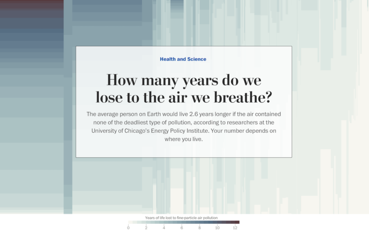
Researchers at the University of Chicago’s Energy Policy Institute estimated the number of years lost and the number of people affected due to particulate matter in the air. They estimated per country. The Washington Post used a mosaic plot, aka a Marimekko chart, to show the differences.
The width of each column represents total population for a country. The sections in each columns represent the number of people who will lose a certain number of years. Color represents average years of life lost.
These charts are often a bit confusing at first glance, but the scrolling format used here provides some guidance.

 Visualize This: The FlowingData Guide to Design, Visualization, and Statistics (2nd Edition)