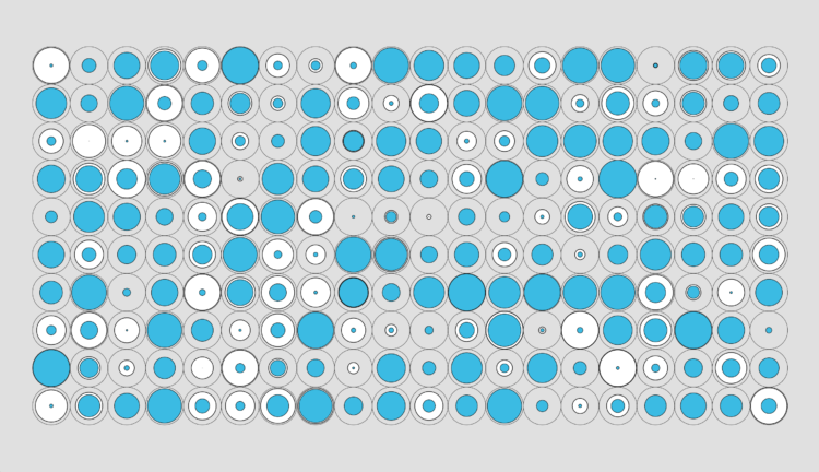
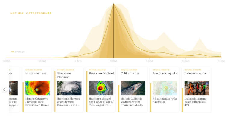
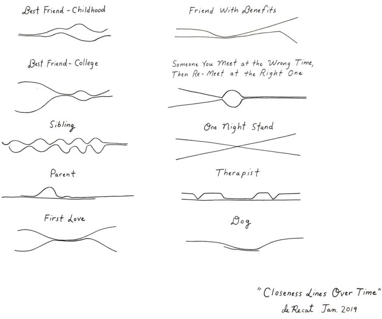
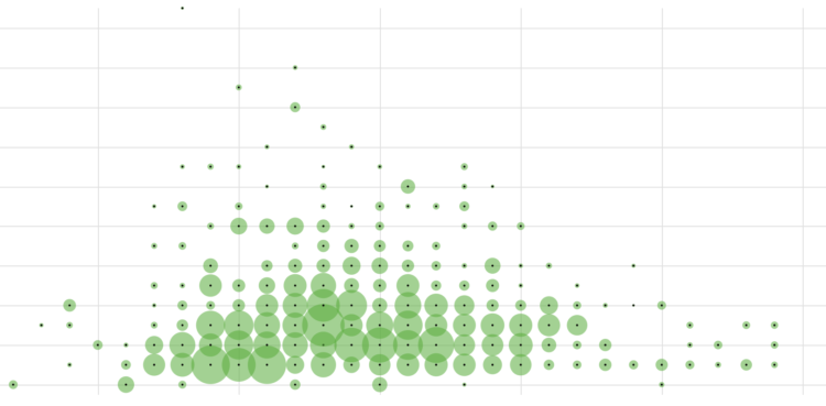
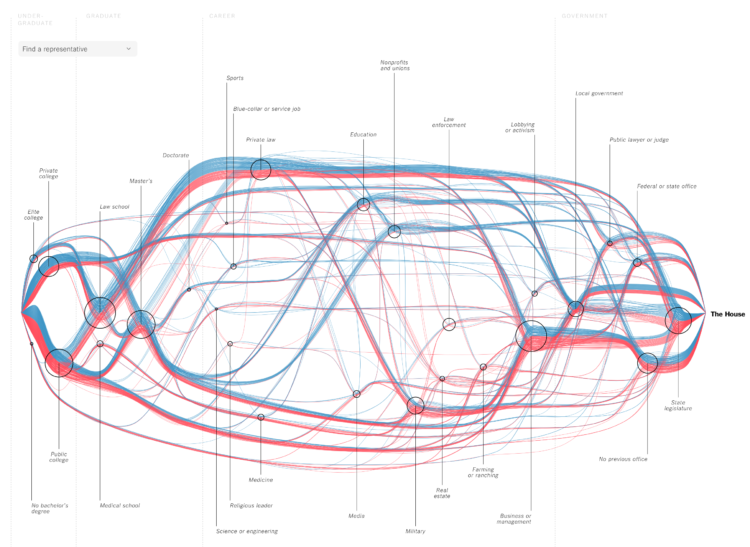
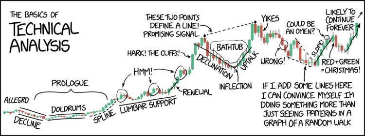
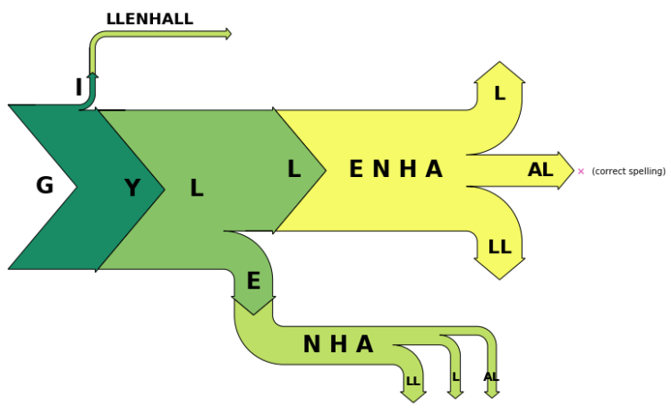
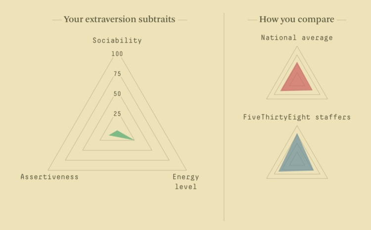
I heard you like maps. Jim Vallandingham put together a collection of maps that show multiple variables, for inspiration and perusal.
-
Disney is set to buy 21st Century Fox for $52.4 billion. I honestly don’t have the mental capacity or imagination to comprehend such a large sum, much less figure out how such a deal works. At least Youyou Zhou, reporting for Quartz, provides breakdowns of market share for the two companies, which makes things a bit more understandable. If the deal goes through, Disney is going to be (an even bigger) behemoth.
-
Introducing yourself to R as an Excel user can be tricky, especially when you don’t have much programming experience. It requires that you switch from one mental model of the data that exists in an interactive spreadsheet to one that exists in vectors and lists. Steph de Silva provides a translation of these data structures for Excel users.
-
Research group Euphrates experimented with lines and a ballet dancer’s movements in Ballet Rotoscope:
By the way, rotoscoping is an old technique used by animators to capture movement. Pictures or video are taken and lines are traced for use in different contexts. [via @Rainmaker1973]
-
Doug Mills, reporting for The New York Times:
Echoing his days as a real estate developer with the flair of a groundbreaking, Mr. Trump used an oversize pair of scissors to cut a ribbon his staff had set up in front of two piles of paper, representing government regulations in 1960 (20,000 pages, he said), and today — a pile that was about six feet tall (said to be 185,000 pages).
Interpret as you like.
-
Statistician Kristian Lum described her experiences with harassment as a graduate student at stat conferences. She held back on talking about it for many of the same reasons others have, but then there was a shift and she began warning colleagues.
I started doing this because I heard that S (for the second time to my knowledge) had taken advantage of a junior person who had had too much to drink. This time, his act had been witnessed first-hand by several professors at the conference. Since then, I have heard one professor who witnessed the incident openly lament that he’ll have to find a way to delicately advise his female students on “how not to get raped by S” so as not to lose promising students.
What the hell? Unacceptable.
-
As everyone has already checked out for the rest of the year, I’m going to mess around with R to the tune of The Twelve Days of Christmas and maybe throw down a few tips. You’re welcome.
Read More -
Democrat Doug Jones won in the senate race against Republican Roy More last night. The Washington Post provides how different demographic groups voted, based on a poll “conducted by Edison Research for the National Election Pool, The Washington Post and other media organizations.”
-
Enrico Bertini, a professor at New York University, delves into the less flashy but equally important branch of visualization: analysis. Much of what Enrico describes applies to the other branches too, so it’s worth the full read:
One aspect of data visualization I have been discovering over the years is that when we talk about data visualization we often think that the choice of which graphical representation to use is the most important one to make. However, deciding what to visualize is often equally, if not more, important, than deciding how to visualize it. Take this simple example. Sometime a graph provides better answers to a question when the information is expressed in terms of percentages than absolute values. I think it would be extremely helpful if we could better understand and characterize the role data transformation plays in visualization. My impression is that we tend to overemphasize graphical perception when content is what really makes a difference in many cases.
Getting to that what often requires iteration between the analysis and presentation facets of visualization. I spend about the same time on the analysis side as on presentation, and that’s only because I’m more fluent with my analysis tools. I don’t have to spend a lot of time reading documentation. The amount of production during the analysis phase is definitely much higher.
-
Michael Wines, reporting for The New York Times:
“The politicization of the census would erode what is already fragile trust and confidence in the integrity of the count,” said Vanita Gupta, the president of the Leadership Conference on Civil and Human Rights, which has worked for years on census issues.
The Trump administration’s heated rhetoric on immigration, race and the trustworthiness of government is fueling fears that minorities, legal and undocumented immigrants and others — from asylum-seekers to victims of the opioid crisis — will be even harder to locate and count. The 2010 census actually overcounted non-Hispanic whites by 0.8 percent and undercounted African-Americans by 2.1 percent and Hispanics by 1.5 percent.
For context, the overcount and undercount numbers aren’t statistically different from that of the 2000 Census. The Census has always had to account for some groups reporting more than others.
But much of this comes from a general distrust of government — more so among some than others — and that trust level isn’t exactly on the rise these days. With that, in tandem with an administration not above swaying the numbers, the upcoming census could get messy. As the census approaches, I hope everyone assumes their right to be counted in this country.
-
Data for police shootings is usually the subset that only includes fatalities. Vice News made requests nationwide to get data on people who were shot but not killed by police. To accompany their story, Vice News made the data and code available for download:
Ultimately, we obtained some data from 47 departments — with 4,099 incidents in all. Departments in New York’s Suffolk and Nassau Counties didn’t provide us with any data. Maryland’s Montgomery County Police Department gave us only partial incident-level information and no total number of police shootings, so we excluded them from the analysis.
We put all this information together to analyze trends across the departments and to compare them with one another — the first time this has ever been done for both fatal and nonfatal shootings.
Get the data and look for yourself.
-
NASA. Data. Good.
Tracking the aerosols carried on the winds let scientists see the currents in our atmosphere. This visualization follows sea salt, dust, and smoke from July 31 to November 1, 2017, to reveal how these particles are transported across the map.
The first thing that is noticeable is how far the particles can travel. Smoke from fires in the Pacific Northwest gets caught in a weather pattern and pulled all the way across the US and over to Europe. Hurricanes form off the coast of Africa and travel across the Atlantic to make landfall in the United States. Dust from the Sahara is blown into the Gulf of Mexico. To understand the impacts of aerosols, scientists need to study the process as a global system.
-
Emily Badger and Kevin Quealy, reporting for the Upshot, highlights research from Sean Reardon, a professor of poverty and inequality in education. Reardon’s research suggests that the relationships between income and standardized test scores should be reevaluated.
This new data shows that many do overcome them. It also suggests that states that rate schools and select which ones to reward or shutter based on average test scores are using the wrong metric, Mr. Reardon argues. And so are parents who rely on publicly available test scores to identify what they believe are the best school districts — and so the best places to live.
“Most people think there’s some signal in that,” Mr. Reardon said of average test scores. “But it’s a pretty bad signal.”
The interactive charts in the article let you peek at how school districts in your area compare to each other and nationally.
-
Members Only
We went over how to make a state grid map. Instead of using actual borders and geography, state-level data is placed in a grid layout that roughly represents the United States.
We went over making small multiples, which allows you to make comparisons across various groups or categories in a limited amount of space.
When you combine the two, you get: small multiples arranged in a grid layout. This method grew in popularity over the past couple of years.
-
There’s another essay on Distill by Shan Carter and Michael Nielsen. They describe and demonstrate how one might use artificial intelligence to augment human intelligence.
Our essay begins with a survey of recent technical work hinting at artificial intelligence augmentation, including work on generative interfaces – that is, interfaces which can be used to explore and visualize generative machine learning models. Such interfaces develop a kind of cartography of generative models, ways for humans to explore and make meaning from those models, and to incorporate what those models “know” into their creative work.
Because, you know, it’s not all about machines taking over the world.
-
Alec Wilkinson, reporting for The New Yorker, profiled Thomas Hargrove, who is deep into finding serial killers algorithmically and through public data:
Thomas Hargrove is a homicide archivist. For the past seven years, he has been collecting municipal records of murders, and he now has the largest catalogue of killings in the country—751,785 murders carried out since 1976, which is roughly twenty-seven thousand more than appear in F.B.I. files. States are supposed to report murders to the Department of Justice, but some report inaccurately, or fail to report altogether, and Hargrove has sued some of these states to obtain their records. Using computer code he wrote, he searches his archive for statistical anomalies among the more ordinary murders resulting from lovers’ triangles, gang fights, robberies, or brawls. Each year, about five thousand people kill someone and don’t get caught, and a percentage of these men and women have undoubtedly killed more than once. Hargrove intends to find them with his code, which he sometimes calls a serial-killer detector.
Find out more and download data from Hargrove’s nonprofit the Murder Accountability Project.
-
Lena Groeger, Ryann Grochowski Jones and Abrahm Lustgarten, reporting for ProPublica with a searchable map of sites in need of bomb cleanup:
The military spends more than a billion dollars a year to clean up sites its operations have contaminated with toxic waste and explosives. These sites exist in every state in the country. Some are located near schools, residential neighborhoods, rivers and lakes. A full map of these sites has never been made public – until now. Enter your address to see the hazardous sites near you, or select a state.
Oh. Yay.
-
-
Remember the artist Tatsuo Horiuchi who uses Microsoft Excel to paint scenery? Four years later, he’s still at it. Watch below.
Horiuchi is my favorite example of someone who shows that the tool is secondary to what you want to make. Spend less time debating about what software you should use to visualize your data, and spend more time deciding what you want to show.
-
Data can provide you with important information, but when the collection process is flawed, there’s not much you can do. Ken Schwencke, reporting for ProPublica, researched the tiered system that the FBI relies on to gather hate crime data for the United States:
Under a federal law passed in 1990, the FBI is required to track and tabulate crimes in which there was “manifest evidence of prejudice” against a host of protected groups, including homosexuals, regardless of differences in how state laws define who’s protected. The FBI, in turn, relies on local law enforcement agencies to collect and submit this data, but can’t compel them to do so.
Right there. There are no standards or set definitions of a hate crime. Some local agencies participate. Many don’t. Those who participate might only collect partial information.
This data that dates back to 1990 is still in the anecdote phase.