• Membership
  • Newsletter
  • Projects
  • Learning
  • About
  • Member Login
  • Data Underload  /  mortality

    Shifting Causes of Death

    The most common causes of death changed over the years. They vary across sex and age group. This animation shows the details of these changes.

    Read More
  • Coral-like cities to show road networks

    October 1, 2018

    Topic

    Data Art  /  coral, traffic

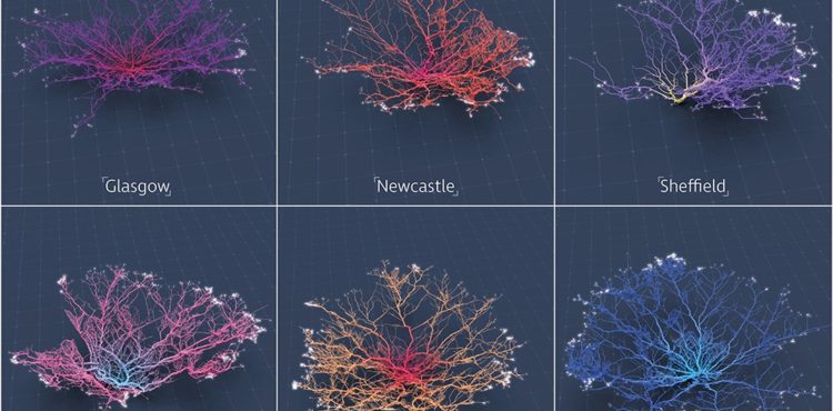
    Craig Taylor from Ito World used a coral metaphor to visualize road networks in major cities around the world:

    For the past six months I have been fascinated by the concept of making city networks look like living corals. The varying patterns of urban forms are inherently dictated by their road network; a complex, seemingly organic connection of links moving people across their city. Like branches of coral they have a pattern and a function, I chose to expose this pattern and manipulate it to become something far more conceptual. However, whilst being incredibly beautiful they are derived from various geo-spatial analysis of drive-times catchments making them somewhat informative as well.

    Pretty.

  • The Markup is a new journalism venture to examine technology through data

    September 28, 2018

    Topic

    News  /  data journalism, technology

    Founded by Sue Gardner, the former head of the Wikimedia Foundation and Julia Angwin and Jeff Larson, journalists formerly for ProPublica, The Markup will aim to use data to help non-experts better understand everyday technologies that often go unchecked.

    When Angwin and Larson worked together at ProPublica, their data-driven investigations included exposing discriminatory advertising practices at Facebook, bias in software that is used in criminal sentencing and algorithms that result in unfair car insurance pricing. They also uncovered evidence of domestic surveillance practices in the Snowden archives and revealed technology vulnerabilities at the President’s Mar-A-Lago country club.

    “I’m excited to build a team with deep expertise that can really scale up and advance the work Jeff and I began at ProPublica,” Angwin said. “We see The Markup as a new kind of news organization, staffed with journalists who know how to investigate the uses of new technologies and make their effects understandable to non-experts.”

    “People know that these new technologies are important and want to better understand their societal effects. We will help them do that,” said Larson. “The Markup will hold the powerful to account, raise the cost of bad behavior, and spur reforms.”

    The venture is primarily backed by a $20 million donation from Craigslist founder Craig Newmark and $2 million from the Knight Foundation. Amazing.

    Looking forward to this.

  • Constructing charts and graphs

    September 28, 2018

    Topic

    Statistical Visualization  /  components, Jeffrey Heer, lunch talk

    [arve url=”https://www.youtube.com/watch?v=ouIFSDQwkQM” /]

    Jeffrey Heer, a computer science professor at the University of Washington, provides an overview of building charts for analysis and exploration. It’s an iterative process between acquisition, cleaning, integration, visualization, modeling, presentation, and dissemination. [via @albertocairo]

  • Summer rain levels compared to the norms

    September 27, 2018

    Topic

    Maps  /  rain, Washington Post, weather

    Tim Meko and Aaron Steckelberg for The Washington Post compared this summer’s rains with the average. The combination of mapping as terrain and color-encoding provides an interesting foam-looking aesthetic.

  • Members Only

    Practicing with a Visualization Toolbox, Tools and Additional Resources Roundup – September 2018

    September 27, 2018

    Topic

    The Process  /  roundup, tools

    If you’re trying to learn how to work with data, make time to fiddle with the toys in your growing toolbox. Otherwise, you just have a bunch of bookmarks and no new skills.

  • Morph, an open-source tool for data-driven art without code

    September 26, 2018

    Topic

    Data Art  /  generative art, Google

    Morph, by Datavized in collaboration with the Google News Initiative, is a tool to generate abstract images from data:

    Morph exists to engage users in the creative expression of data without having to code. Generative art based algorithms turn data into a visual representation and the user can affect how their data interacts with the final visual via the algorithm. The algorithms themselves are not fixed; the user can randomly mutate, evolve and generate new algorithms creating new visuals, encouraging the sense of creative exploration and discovery.

    Just upload your data, select some options to map variables to visual encodings (or have the app pick random ones for you), and see what you get. Be sure to try the “evolve” option at the end, which shows a bunch of variations of your generated image.

    The results are pretty abstract, so I’m not sure if it has practical uses in the traditional data settings, but it’s fun to play with. And maybe it could be useful to quickly flip through visual encodings.

  • Data Underload  /  alcohol, risk

    One Drink Per Day, Your Chances of Developing an Alcohol-Related Condition

    While a drink a day might increase your risk of experiencing an alcohol-related condition, the change is low in absolute numbers.

    Read More
  • Timeline of Earth

    September 23, 2018

    Topic

    Infographics  /  Earth, timeline

    Here’s a fun piece by Andy Bergmann that shows the timeline of Earth. It’s a long-ish, straightforward scroller that vertically spaces significant events during the history of the planet. You start with the formation of Earth 4.6 billion years ago and work your way up to present day.

  • The rise and plummet of the name Heather

    September 21, 2018

    Topic

    Statistics  /  Heather, names, Quartz

    Hey, no one told me that baby name analysis was back in fashion. Dan Kopf for Quartz, using data from the Social Security Administration, describes the downfall of the name Heather. It exhibited the sharpest decline of all names since 1880.

    Talking to Laura Wattenberg:

    Wattenberg says the rise and fall of Heather is exemplary of the faddish nature of American names. “When fashion is ready for a name, even a tiny spark can make it take off,” she says. “Heather climbed gradually into popularity through the 1950s and ’60s, then took its biggest leap in 1969, a year that featured a popular Disney TV movie called Guns in the Heather. A whole generation of Heathers followed, at which point Heather became a ‘mom name’ and young parents pulled away.”

  • xkcd: Curve-fitting messages

    September 20, 2018

    Topic

    Infographics  /  curves, humor, xkcd

    xkcd tells it like it is.

  • Members Only

    Chart Components and Working On Your Graphics Piece-wise

    September 20, 2018

    Topic

    The Process  /  components

    Break the visualization into its basic pieces to make it easier to make, edit, and reuse.

  • How to Make a Tiled Bar Chart with D3.js

    Show individual data points by splitting bars into smaller cells.

  • Judging connectedness of American communities, based on Facebook friendships

    September 20, 2018

    Topic

    Maps  /  communities, connections, facebook, Upshot

    We talk about geographic bubbles a lot these days. Some areas are isolated, in their own bubble. Other areas seem more connected. Emily Badger and Quoctrung Bui for The Upshot looked at this geographic connectedness through the lens of Facebook friendships.

    In the millions of ties on Facebook that connect relatives, co-workers, classmates and friends, Americans are far more likely to know people nearby than in distant communities that share their politics or mirror their demographics. The dominant picture in data analyzed by economists at Facebook, Harvard, Princeton and New York University is not that like-minded places are linked; rather, people in counties close to one another are.

    There are two main parts to the piece. The first one is a county map that you can mouse over to see the likelihood of friendship with those in other counties. The second part imagines a country split up into regions based on Facebook connections. Be sure to catch them both.

  • Watch rising river levels after Hurricane Florence

    September 19, 2018

    Topic

    Maps  /  hurricane, New York Times, water, weather

    Hurricane Florence brought a lot of rain, which in turn made river levels rise. The New York Times animated the rise over a five-day period. The height of the bars represents the rise of the river level, as compared to levels on Thursday.

    I like the visual metaphor of bars going up with river levels. I’m not sure the sudden rise and falls in such short periods of time would appear as surprising.

  • Data Underload  /  cuisine, food, ingredient

    Cuisine Ingredients

    What are the ingredients that make each cuisine? I looked at 40,000 recipes spanning 20 cuisines and 6,714 ingredients to see what makes food taste different.

    Read More
  • Changing size analogies and the trends of everyday things

    September 18, 2018

    Topic

    Statistics  /  language, n-gram, size

    When you try to describe the size of something but don’t have an exact measurement, you probably compare it to an everyday object that others can relate to. Using the Google Books Ngram dataset, Colin Morris looked for how such comparisons changed over the past few centuries.

    I especially like the bits of history to explain why some words fell into and out of fashion.

  • Endangered species that could fit in a train car

    September 17, 2018

    Topic

    Infographics  /  animals, endangered, Guardian, scale

    There are endangered species where the remaining few in the world could fit on a single car train. Mona Chalabi for The Guardian imagined such a scenario.

    Usually when we talk about scale and putting numbers into perspective, it’s about imagining the large ones. What does a million look like? A billion? Chalabi’s illustrations take it the other direction.

  • 3-D view inside Typhoon Mangkhut

    September 17, 2018

    Topic

    Maps  /  3-d, New York Times, typhoon, weather

    Typhoon Mangkhut went through the northern end of the Phillipines a few days ago. At least 25 people died. The New York Times provides a scrolling 3-dimensional view using data collected by NASA satellites.

  • My chat with Data Stories

    September 14, 2018

    Topic

    Site News  /  Data Stories

    I talked with Moritz and Enrico on Data Stories, my favorite visualization podcast. They’ve been providing a healthy balance of practice and research since 2012.

    I don’t dare listen to myself, but based on the show notes we talked about FlowingData over the years, some of the changes in visualization, and answered listener questions. You can listen here.

  • Page 137 of 392
  • <
  • 1
  • ...
  • 134
  • 135
  • 136
  • 137
  • 138
  • 139
  • ...
  • 392
  • >

Analyze, visualize, and communicate data usefully, beyond the defaults.

Become a member →

Recently for Members

May 15, 2025
Step Chart, Enhanced

May 8, 2025
When the data is not what it seems

May 1, 2025
Finding the Right Charts

April 24, 2025
Visualization Tools, Datasets, and Resources – April 2025 Roundup

April 17, 2025
Breaking Out of Chart Software Defaults

Get the Book

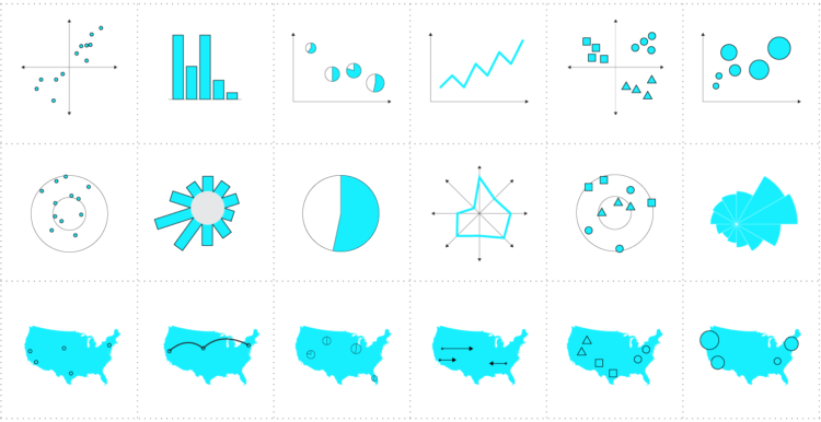
Visualize This: The FlowingData Guide to Design, Visualization, and Statistics

Available now.

Order: Amazon / Bookshop

Browse by Chart Type See All →

Bar Chart Area Chart Slope Chart Stacked Area Chart Radar Chart Horizon Graph Cartogram Dot Map Variable Width Bar Chart Unit Chart

Browse By Topic

  • Visualization

    Seeing data

  • Maps

    Seeing geographic data

  • Infographics

    Explaining data

  • Networks

    Connecting data

  • Statistics

    Analyzing data

  • Software

    Working with data

  • Sources

    Getting data

  • Design

    Making data readable

Made by FlowingData

  • The Process

  • Data Underload

  • Chart Everything

  • Guides

  • Books

  • Shop

  • About
  • Contact
  • Newsletter
  • LinkedIn
  • Instagram
  • Bluesky
  • RSS
Copyright © 2007-Present FlowingData. All rights reserved.