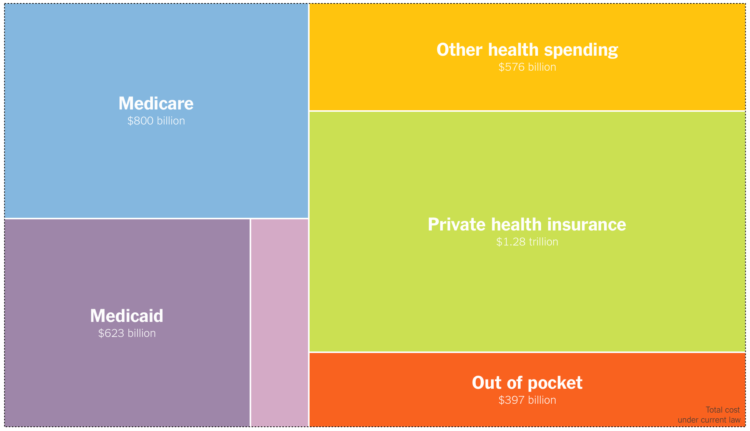
• Membership
  • Newsletter
  • Projects
  • Learning
  • About
  • Member Login
  • Falling ticket prices for longer flights

    December 10, 2018

    Topic

    Infographics  /  Economist, flights, pricing

    Based on data from Expedia, this is an interesting one from The Economist. Using polar coordinates, they used angle to represent percentage change in ticket prices and the radius to represent the distance of a flight.

    Too bad they couldn’t get more data from Expedia. I would’ve liked to see the price changes for more flights, especially shorter ones to use as a point of comparison.

  • Cohort and age effects

    December 7, 2018

    Topic

    Statistics  /  causation, humor, xkcd

    I’m just gonna put this xkcd comic right here.

  • Population mountains

    December 7, 2018

    Topic

    Maps  /  3-d, population, Pudding

    You’ve seen the maps of population density. You’ve seen the jokes. But you haven’t seen population at high granularity in a 3-D view. Matt Daniels for The Pudding used a mountain metaphor to show the peaks and valleys of population around the world.

    You get more out of the data in this view than you would the overhead, which tends to obscure the variation in large cities. Although if you must, Daniels also provides the typical view to reference.

  • Reduced privacy risk in exchange for accuracy in the Census count

    December 6, 2018

    Topic

    Statistics  /  census, privacy, uncertainty, Upshot

    Mark Hansen for The Upshot describes the search for balance between individual privacy and an accurate 2020 Census count. It turns out to not be that difficult to reconstruct person-level data from publicly available aggregates:

    On the face of it, finding a reconstruction that satisfies all of the constraints from all the tables the bureau produces seems impossible. But Mr. Abowd says the problem gets easier when you notice that these tables are full of zeros. Each zero indicates a combination of variables — values for one or more of block, sex, age, race and ethnicity — for which no one exists in the census. We might find, for example, that there is no one below voting age living on a particular block. We can then ignore any reconstructions that include people under 18 living there. This greatly reduces the set of viable reconstructions and makes the problem solvable with off-the-shelf software.

    To combat this, the Census is looking into injecting more uncertainty into their published data. The challenge is figuring out how much uncertainty is too much and what level of privacy is enough.

  • Members Only

    Visualization the Medium, the Amorphous Blobby

    December 6, 2018

    Topic

    The Process  /  film, medium

    A couple of famous directors were defending animated films as a medium rather than a genre of film meant for kids. I got to thinking about the parallels to visualization.

  • Heatmap shows deaths by age in different countries

    December 5, 2018

    Topic

    Statistical Visualization  /  age, mortality

    This interactive heatmap by Jonas Schöley shows mortality rates by age. Just use the dropdown menu to see the data for various countries. You can also compare male and female populations and countries.

    As you might expect, you can see mortality rates decrease steadily, especially in the younger ages. Spikes or abrupt color changes might indicate war or disease. [via @maartenzam]

  • How to Make an Interactive Map of Geographic Paths

    With latitude and longitude coordinates, there are a number of ways to map geographic data using D3.js and Leaflet.

  • Same facts but different stories, an illustration

    December 4, 2018

    Topic

    Infographics  /  point of view

    Multiple people can look at the same dataset and come out the other end with very different interpretations. [via @SteveStuWill]

  • Blockchain mapping

    December 4, 2018

    Topic

    Data Sharing  /  blockchain, GPS

    Shannon Mattern for The Atlantic on how blockchain might be useful in mapping and as a replacement for GPS:

    Crypto-cartographers hope to use it for spatial verification—confirming that things are where they say they are, when they claim to be there. How might this be useful? Well, you could know precisely when an Amazon delivery drone drops a package on your doorstep, at which point the charge would post to your account. No more unscrupulous delivery drivers, and no more contested charges for packages lost in transit. Or when opening a new bank account, you could virtually confirm your permanent address by physically being there during a particular verification period, rather than providing copies of your utility bills. You could also submit a photo of your flooded basement or smashed windshield to your insurance company, supplementing your claim with time- and location-verified documentation. Or, as you pass by your local family-owned coffee shop, the owner could “airdrop” some Bitcoin coupons to your phone, and you could stop by to cash in before the offer expires a half hour later.

    Oh good.

  • A visualization book using only hand-drawn illustrations

    December 3, 2018

    Topic

    Design  /  book, hand-drawn, illustration

    RJ Andrews has a visualization design book coming out in January called Info We Trust. He hand-drew about 300 graphics for the book. One of the reasons:

    I decided very early that Info We Trust would not use any existing images, mine or others. Found examples work fine for certain books. They are also convenient, the work is already done! But found images bring baggage too. You might choose an existing work to highlight one aspect of its design. But the reader will see other facets too.

    I’m intrigued. On the upside, you get a consistent visual flow. A focused point of view. On the downside: the possibility of a view that is too focused. I have a feeling there will be more upside than downside. [Amazon pre-order]

  • Defining visualization literacy

    November 30, 2018

    Topic

    Visualization  /  literacy, research

    Michael Correll on the use of “visualization literacy” in research:

    If people (and, by some definitions, many or even most people) are chart illiterates, then we may feel tempted to write those groups off. We may prioritize the design of visualizations to help the creators of, say, machine learning models, from whom we can presume a sufficient level of visual and statistical literacy, rather than the populations who may be impacted by these models (sometimes unjustly). If what we mean by “visualization literacy” is narrow enough, or rare enough, then we’re already setting ourselves mental upper bounds for the number of people we’ll impact with our work.

    This was an interesting perspective. I’m used to listening to or reading from people on the presentation side of visualization, in which case it’s your job to raise literacy. You should imagine what others are thinking and explain any points of possible confusion with annotation and intuitive visual encodings.

    Don’t ever use “people won’t understand it” as a crutch.

  • Teaching kids data visualization

    November 29, 2018

    Topic

    Statistical Visualization  /  kids, teaching

    Jonathan Schwabish gave his fourth-grade son’s class a lesson on data visualization. He wrote about his experience:

    I’d love to see a way to make data visualization education a broader part of the curriculum, both on its own and linked with their math and other classes. Imagine adding different shapes to maps in their Social Studies classes to encode data or using waterfall charts in their math classes to visually demonstrate a simple mathematical equation or developing simple network diagrams in science class. The combination of the scientific approach to data visualization and the creativity it sparks could serve as a great way to help students learn.

    Maybe I should introduce Schwabish’s Match It Game to the Yau household. My five-year-old has been asking why I keep “doing data.”

  • Members Only

    Data Tools and Resources Roundup, November 2018

    November 29, 2018

    Topic

    The Process  /  roundup

    Throughout the month I collect new tools for data and visualization and additional resources on designing data graphics. Here’s the new stuff for November.

  • Lessons from posting a fake map about pies

    November 28, 2018

    Topic

    Mistaken Data  /  fake, humor, viral

    Brian Brettschneider made a joke map randomly designating the favorite pies of certain areas. While intended as a joke and a parody of past “favorite” maps, some people took it too seriously — like Senator Ted Cruz. Brettschneider describes the lessons he learned:

    Maps hold a special standing among the public. We tend to place very high value in maps as holders of accurate information. If it’s in a map, it must be true, right? If I had tweeted a joke list of favorite pies by region, it would be very quickly ignored. Since it was in map form, it had an air of authenticity. This matters. As cartographers, we need to be cognizant of the power that maps have.

    I had a similar experience years ago with Data Underload. These days I use the project as a catch-all for my own analyses, but I started it as a comic-ish chart series that I used to communicate anecdotes, opinions, and random stuff based on no actual data.

    The form confused people at times, especially for those unfamiliar with the series, because it looked so much like charts based on real data. It was like reading a sarcastic comment online from someone you don’t know and trying to guess if it’s serious or not.

    So now I keep the real-looking charts for real data unless it’s super obvious. Sometimes your choices on form can lead to unintended interpretations — like a joke taken as serious commentary.

  • Data Underload  /  dating, marriage

    Peak Non-Creepy Dating Pool

    Based on the “half-your-age-plus-seven” rule, the range of people you can date expands with age. Combine that with population counts and demographics, and you can find when your non-creepy dating pool peaks.

    Read More
  • Skewed mental map of the world’s geography

    November 26, 2018

    Topic

    Maps  /  cartography, mental

    The maps that we imagine as we think about locations around the world often don’t match up with reality. Betsy Mason for National Geographic explains the discrepancy. On the misalignment of Europe:

    Europe is also often placed much farther south on mental maps than it really is, appearing directly across the Atlantic from the contiguous United States. But it actually lines up better with Canada: Paris is further north than Montreal, Barcelona is at a similar latitude as Chicago, and Venice lines up with Portland, Oregon.

    …and the world as we knew it was never the same again.

  • Years of life lost due to breathing bad air

    November 21, 2018

    Topic

    Infographics  /  environment, mortality, pollution, Washington Post

    Researchers at the University of Chicago’s Energy Policy Institute estimated the number of years lost and the number of people affected due to particulate matter in the air. They estimated per country. The Washington Post used a mosaic plot, aka a Marimekko chart, to show the differences.

    The width of each column represents total population for a country. The sections in each columns represent the number of people who will lose a certain number of years. Color represents average years of life lost.

    These charts are often a bit confusing at first glance, but the scrolling format used here provides some guidance.

  • Members Only

    Tools I Am Thankful for That Make Data Work Easier

    November 21, 2018

    Topic

    The Process  /  Thanksgiving

    In the spirit of the holidays, here are the tools I am most thankful for. Without them, work would be much more tedious and painful.

  • City road maps made into solvable mazes

    November 20, 2018

    Topic

    Data Art  /  maze, roads

    Michelle Chandra uses street data as a base for solvable mazes:

    I draw each maze map by hand using the real street data of cities. In keeping with the fun nature of my art, I choose iconic city landmarks for the start and end of each maze – landmarks like the Golden Gate Bridge, Coney Island, or the Santa Monica Pier. All my maze maps are tested with friends and family to make sure they are, well, challenging to solve!

    Grab a screen print here. Each one comes with an extra sheet to solve for yourself.

  • Color distribution in campaign logos

    November 19, 2018

    Topic

    Infographics  /  color, election, Washington Post

    In news graphics, blue typically represents Democrat and red represents Republican. However, the definition isn’t so clear-cut by actual party usage. Chris Alcantara for The Washington Post broke it down in 900 campaign logos used during the recent midterms. Each strip represents a logo.

  • Page 133 of 392
  • <
  • 1
  • ...
  • 130
  • 131
  • 132
  • 133
  • 134
  • 135
  • ...
  • 392
  • >

Analyze, visualize, and communicate data usefully, beyond the defaults.

Become a member →

Recently for Members

May 8, 2025
When the data is not what it seems

May 1, 2025
Finding the Right Charts

April 24, 2025
Visualization Tools, Datasets, and Resources – April 2025 Roundup

April 17, 2025
Breaking Out of Chart Software Defaults

April 15, 2025
Line Chart with Decorative Neon Accents

Browse by Chart Type See All →

Streamgraph Timeline Frequency Trails Treemap Donut Chart Density Plot Strip Plot Dot Plot Bar Chart Race Line Map

Browse By Topic

  • Visualization

    Seeing data

  • Maps

    Seeing geographic data

  • Infographics

    Explaining data

  • Networks

    Connecting data

  • Statistics

    Analyzing data

  • Software

    Working with data

  • Sources

    Getting data

  • Design

    Making data readable

Get the Book

Visualize This: The FlowingData Guide to Design, Visualization, and Statistics

Available now.

Order: Amazon / Bookshop

Made by FlowingData

  • The Process

  • Data Underload

  • Chart Everything

  • Guides

  • Books

  • Shop

  • About
  • Contact
  • Newsletter
  • LinkedIn
  • Instagram
  • Bluesky
  • RSS
Copyright © 2007-Present FlowingData. All rights reserved.