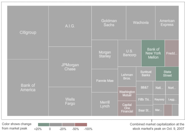
From Karl Russel and Shan Carter of The New York Times is this animated tree map to show the shrinking, and eventual partial regrowth, in market value of this country’s largest financial groups.
The market peak was in October 9, 2007. With the exception of a few months since then, most companies decreased in market capitalization. They then hit a low in March 9, 2009, and have slowly regaining what they lost.
At the peak, the value of the 29 firms was $1.87 trillion. As of September 11 of this year, their total value was at $947 billion. Clearly, there is still quite a way to go before they’re back to where they began.
[via infosthetics]
 Visualize This: The FlowingData Guide to Design, Visualization, and Statistics (2nd Edition)
I really like what they’ve done with this one.
As you can see in the “first frame” of the animation, the “traditional” Squarified algorithm usually places the nodes with higher values in the top-left corner.
That’s important if you want to find some “order” between nodes, so you can quickly answer the question: Which is the node with the highest value?
But in this visualization this requirement is less important than maintaining the nodes’ position.
If the “traditional” Squarified algorithm was re-run in each frame the nodes would change their position and it would be very difficult to track the evolution of one firm in particular.
Adding the position constraint in this case was a great idea in my opinion.
I left a comment on infosthetic.com about this same graphics. I have to say that people are focusing too much on the technical execution of the interactive rather than its actual usefulness.
I will say it again, a simple bar chart will be better than this treemap because of the following reason.
This graphics shows you that the financial industry is shrinking over time, no big surprise here. But can you see how JPMorgan is doing over time? I didn’t find that very easy to do.
You can achieve that with a simple barchart of the initial amount for each institution drawn as a bar. As the time changes, the bars change their sizes, but the initial amounts stay grayed out so you can use them as references.
You can have another bar to present the industry as a whole and see how it shrinks with time.
Don’t get me wrong, I like most of what the Times produces. I worked with Shan and Karl before and they are amazing graphic editors. But this graphics can be presented in a more accessible way.
Cheers,
or to go even simpler: a time series for all 39 with lines that highlight when you roll over…
I am almost with you on this. The only small problem that you may face is that a time series with 39 lines will be hard to see. Unless you separate all of them out and have a time series for each of the bank, which may make the graphics very big.
Cheers,
True. I was thinking something along the lines of Amanda’s Barry Bonds graphic:
http://www.nytimes.com/ref/sports/20070731_BONDS_GRAPHIC.html
I think that, couple with a slider might work since the market values are pretty different and won’t be completely clustered in the middle.
I like that idea :) Deal. Let’s do it to prove that the Times is sometime wrong ;)
deal!
Hmm, some how my comments don’t appear on this post anymore? I think i might have flooded the blog :)
uh i seem them. do you not see your comments?
Oh I see them now. I must have some caching issues.
Pingback: Planner Reads » Blog Archive » Watch the Giants of Finance Shrink… Then Grow