The New York Times used a programmatic approach to estimate the number of pages taken down so far since Friday. Ethan Singer reporting:
On Friday, The Times downloaded the list of the most visited government domains in the U.S. and began compiling the complete list of pages available on each one using each site’s sitemap, a file that outlines the structure of a website and is typically used by search engines to keep track of what’s on the internet. (Some sites, including state.gov and weather.gov, were not included in our analysis because we were unable to identify a complete list of web pages on their sites, or for other technical reasons.) In all, we were able to identify more than seven million pages across more than 150 sites.
We then repeated this process several times Friday night and on Saturday, and compared our new list of websites with those we originally found.
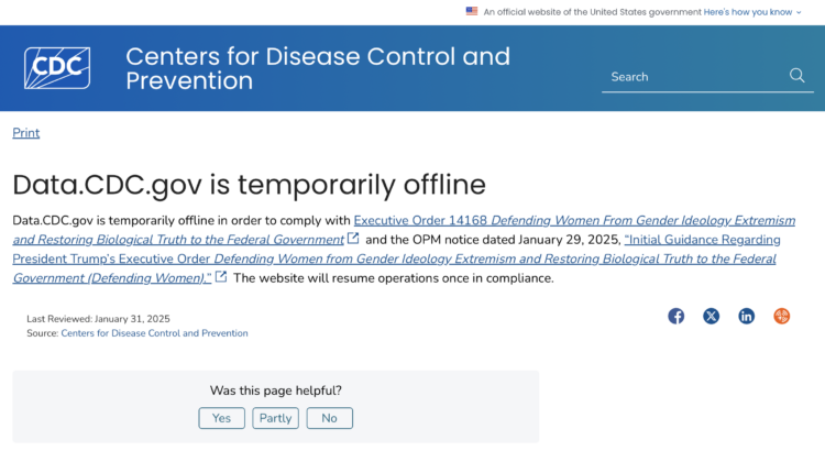
About 3,000 pages from the Centers for Disease Control and Prevention, 3,000 from the Census Bureau, and 1,000 from the Office of Justice Programs make up the bulk of takedown.


 Visualize This: The FlowingData Guide to Design, Visualization, and Statistics (2nd Edition)


