
Every month I collect visualization tools and resources that you can use for or improve your work. Here’s the good stuff for August 2019.
Every month I collect visualization tools and resources that you can use for or improve your work. Here’s the good stuff for August 2019.
Emily Robinson recently took up Pokémon on Nintendo Switch:
I recently started playing Pokémon again – “Pokémon Let’s Go Eevee” on the Nintendo Switch to be specific. In the classic Pokémon games, you have a team of 6 Pokémon that you use to battle against other trainers. In battles, type match-ups are very important, as some types of moves are “super effective” against other types. For example, fire moves are super effective against grass Pokémon, which means they do double the damage they normally would. If you can set your team up so that you’re always optimally matched, you’re going to have a much easier time.
So, she took the natural next step for a data scientist: assemble an optimized team in R.
We use some names mostly for boys and some mostly for girls, but then there is a small percentage that, over time, switched from one gender to another. Which names made the biggest switch?
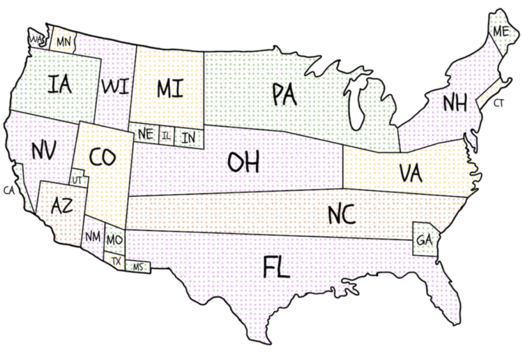
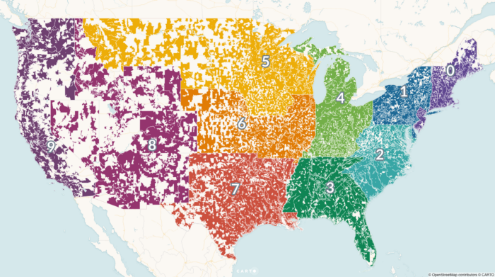
Presidential candidates campaign harder in some states more than others. National Popular Vote made cartograms for the 2012 and 2016 elections showing the states where general election candidates held events. Above is the one for 2016. [via kottke]
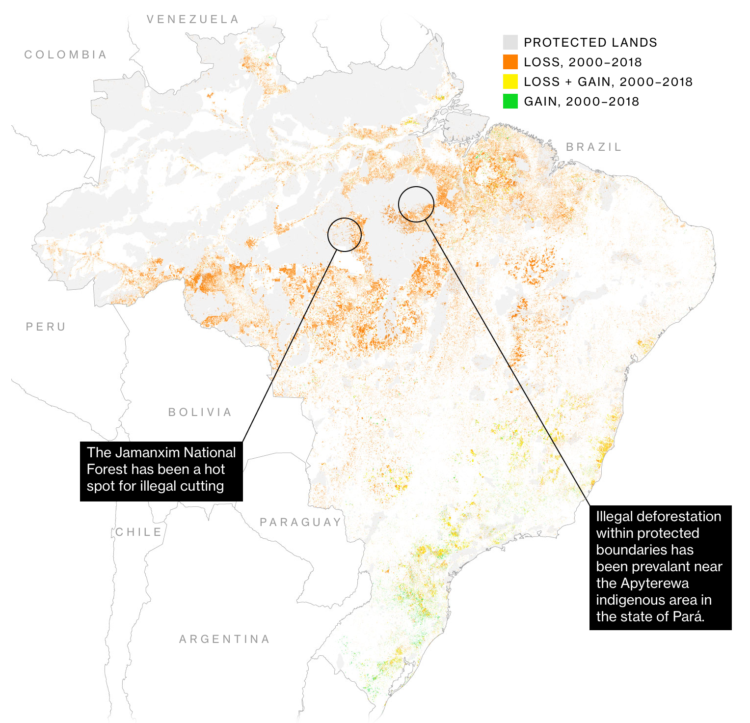
For Bloomberg, Mira Rojanasakul and Tatiana Freitas discuss why the Amazon rainforest is on fire:
Commodities are key drivers behind the increased pace of deforestation. An analysis of tree loss from 2001 to 2015 shows that most of the Amazon was lost to commodity-driven deforestation—or “long-term, permanent conversion of forest and shrubland to a non-forest land use such as agriculture, mining or energy infrastructure.”
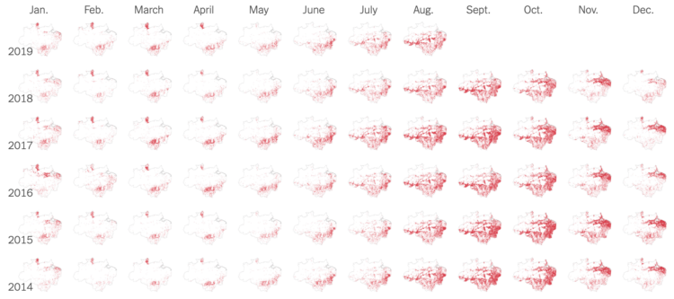
The New York Times goes with monthly small multiples to show detected fires in the Amazon rain forest. Data comes from NASA satellites Terra and Aqua.
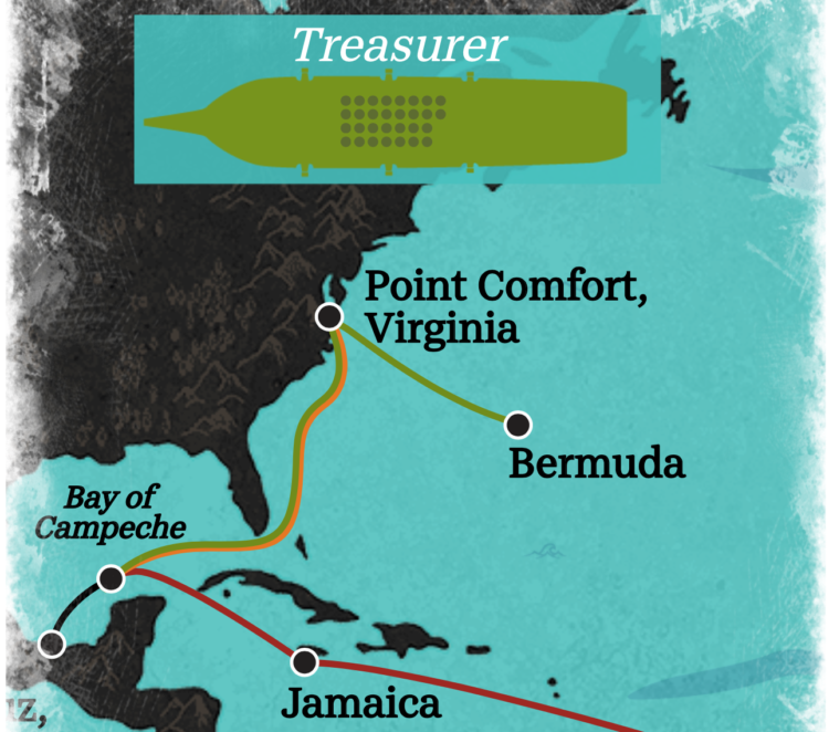
USA Today looks at some of the numbers on 17th century slavery in America. The format, with zooms in and out and shifts to different views, focuses both on scale and the individuals.
Practicality will make its self known whether you want to or not. So, try different visual forms and take it from there.
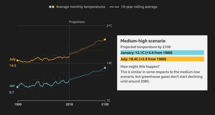
BBC News asks a straightforward question: How much warmer is your city? Enter your country and then your city. You get a time series along with projections. It reminds me of The New York Times piece from a few years ago, but the BBC one uses more recent data and covers major cities worldwide.
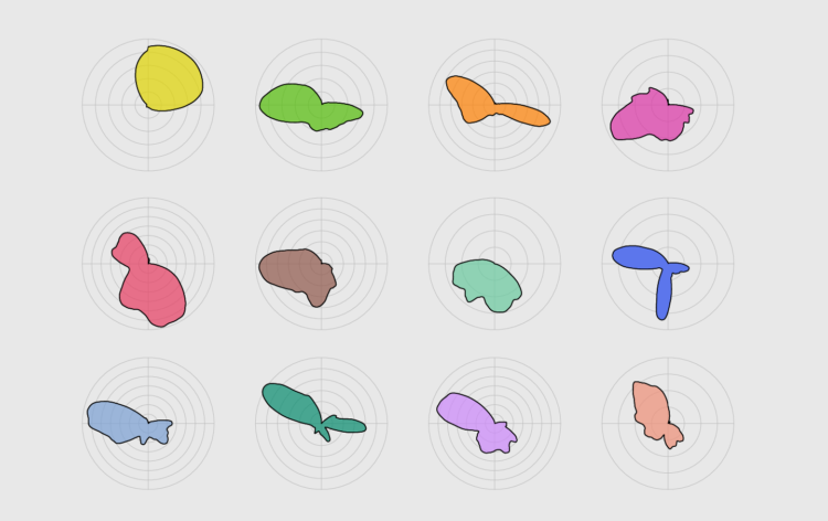
With cyclical data, a circular format might be useful. Combine that with a smooth density to reduce noise, and you got yourself a plot.
In survey data, there is usually an open-ended category for “not applicable” or “don’t know”. For Wired, Amit Katwala noticed an interesting subset of YouGov respondents who “didn’t know” things they should probably know:
But the thing that caught my eye when I came across the results on Twitter, and which quickly became an obsession, was the fourth option. Three per cent of Brits ‘don’t know’ whether they’ve tried surfing before. I was simultaneously baffled and enthralled.
Scrolling through the results of similar polls over subsequent days, weeks and months, I found a country that is deeply confused on a lot of seemingly straightforward issues. Two per cent of Brits don’t know whether they’ve lived in London before. Five per cent don’t know whether they’ve been attacked by a seagull or not. A staggering one in 20 residents of this fine isle don’t know whether or not they pick their nose.
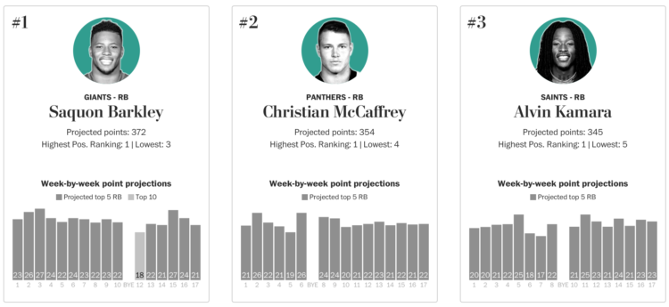
Football season is starting soon, which means many will participate in the age-old tradition of the fantasy football draft. For the Washington Post, Neil Greenberg and Reuben Fischer-Baum have your back:
Your fantasy football draft sets a season-long foundation for your team, but its ultimate result will be based on the weekly performance of your roster. That’s why The Washington Post is adding weekly point projections (using PPR scoring) to its draft rankings, based on a player’s role in his team’s offense and the difficulty of the matchup.
Look at all the players or pick a position and quickly get the rankings.
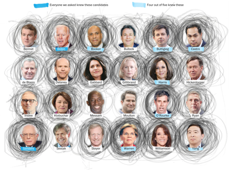
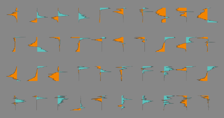
In a “radically unscientific survey” Kevin Uhrmacher and Kevin Schaul for The Washington Post asked 59 Iowa State Fair attendees if they could name Democratic candidates. Participants circled the ones they knew. Above are the results in aggregate.
I’m less interested in the results since I’m not so sure about the small sample, but the visual is fun. The scribble scrabble look is representative of the fuzzy dataset, and I wonder how this might apply to a larger dataset.
Cross this with that Quartz piece on drawing circles, split political leanings, and you’ve got yourself a humdinger.
Vox and Matt Daniels delved into falsetto in pop music over the years. Is falsetto a big trend now compared to the rest of the history? The process of finding the answer, noisy data and all, was just as interesting as the answer itself.
This week, we talk annotation and how it can make your charts more readable and easier to understand.
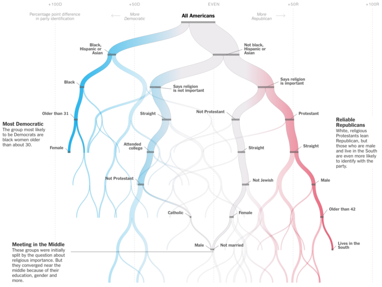
The New York Times is in a quizzy mood lately. Must be all the hot weather. Sahil Chinoy shows how certain demographics tend towards Democrat or Republican, with a hook that that lets you put in your own information. A decision tree updates as you go.
Reminds of the Amanda Cox decision tree classic from 2008.
Add a book to the humorous-charts-documenting-the-everyday genre. Am I Overthinking This? by Michelle Rial charts the everyday. I like how Rial uses everyday objects to show everyday data informally. [Amazon link]
Which sandwich do people not like the most? The winner: the Cheese and Tomato, if that even counts as an actual sandwich.

Dorota M. Skowron et al. made the first 3-D map of the galaxy. Sean Greene and Andrea Roberson reporting for the Los Angeles Times:
Astronomers have understood since the 1950s that the galaxy is curved, but until now, they’ve based that idea on models and indirect measurements.
Over a six-year period, the researchers took more than 100 images of the galaxy from their observatory in the Chilean Andes. In particular, they monitored 2,400 stars called classical Cepheids, a category of “young” supergiants less than 400 million years old.
For Carto, Matt Forrest explains why you shouldn’t use ZIP codes for spatial analysis:
The problem is that zip codes are not a good representation of real human behavior, and when used in data analysis, often mask real, underlying insights, and may ultimately lead to bad outcomes. To understand why this is, we first need to understand a little more about the zip code itself.
In a nutshell, ZIP Codes don’t represent geographic areas, so it doesn’t make sense to treat them like they are.
 Visualize This: The FlowingData Guide to Design, Visualization, and Statistics (2nd Edition)
New tools, refined process.


