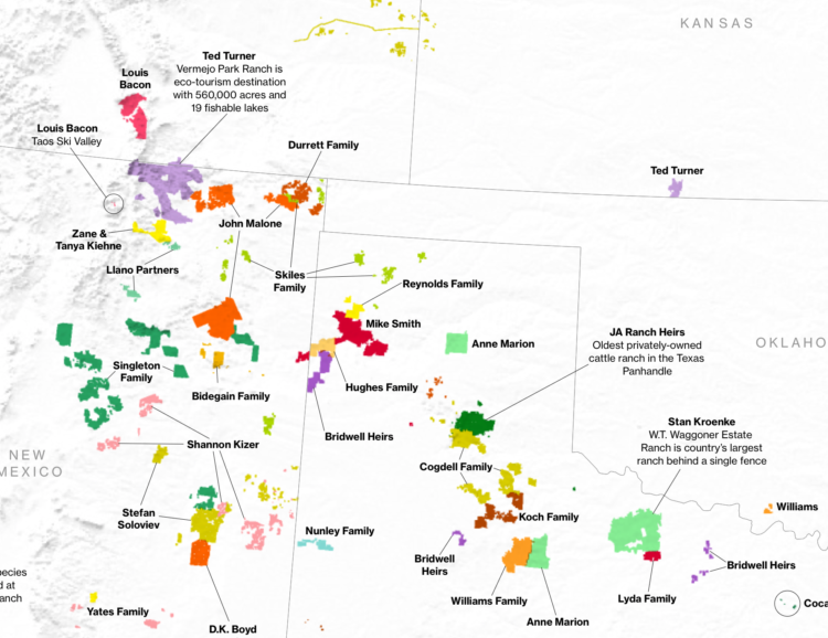
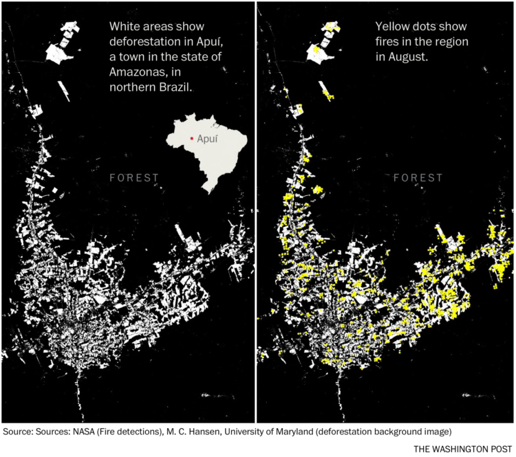
-
James Holzhauer is the new hotness on Jeopardy! with Daily Double hunting, big wagers, lightning clicks, and all-around trivia skills. For FiveThirtyEight, Oliver Roeder looks at how Holzhauer dominates:
Holzhauer has played this game like no one has ever played it before — large bets coupled with expert navigation of the game board. He has now played 14 games with his total winnings sitting above $1,000,000 and counting, and he is well on his way to surpassing the $2,520,700 won by the most famous “Jeopardy!” record-holder of all, Ken Jennings. One difference? It took Jennings 74 straight victorious shows to bring in that haul, and if he maintains his current pace, Holzhauer is on track to break that record in as few as 34.
So not only is he hunting for Daily Doubles (because we know where they usually are), but he builds a pot first so that he’ll have more to wager. And then, when the time comes, he has no problem putting the money on the line.
-
Here are all the playoff threes he’s made in his playoff career, plus some R code.
-
Caitlin Dewey for OneZero describes the case of the Fruit Belt neighborhood in Buffalo, New York, or “Medical Park” as it was incorrectly named in Google Maps:
Lott learned that the issue had been festering for years, and she wanted answers. The 2,300 residents in the Fruit Belt didn’t refer to the community as “Medical Park,” but Google Maps had done so since the late 2000s. Community members argued the designation was a calculated tweak in favor of gentrification, a digital rechristening that would be used to sell houses, market Airbnbs, and wrest the neighborhood’s future from the people who had made a home there for generations.
Lott didn’t know it at the time, but the misnomer also revealed a great deal about the invisible process major tech firms use to put neighborhoods on their maps — and how decisions based off arcane data sets can affect communities thousands of miles away.
-
Los Angeles Clippers commentator Ralph Lawler has a saying: “First to 100 wins. It’s the law.” The Los Angeles Times checked the numbers to see how true the statement is. It’s been true for over 90 percent of games over the years, but has become less true as pace and the three-point shot has changed dramatically in recent years. Now it’s more like first to 114.
-
How to Make a Moving Bubble Chart, Based on a Dataset
Ooo, bubbles… It’s not the most visually efficient method, but it’s one of the more visually satisfying ones.
-
I marked this article for later reading. It’s about Stephen Curry’s love of popcorn as a pre-game and half-time snack. Sounded amusing. Then I got to it and discovered that he scores every arena’s popcorn on a five-factor, five-point scale using a worksheet. Nice.
Give him the MVP on this factoid alone.
-
By now we’ve all seen the zoomed out thumbnail view of the Mueller Report. It gives you a quick look at the amount of the report redacted, but that’s about it. So, Axios tagged every paragraph with events, topics, people, and places to make things easier to find and jump to.
-
Generative models can seem like a magic box where you plug in observed data, turn some dials, and see what the computer spits out. SpaceSheet is a simple spreadsheet interface to explore and experiment for a clearer view of the spaces between. Even if you’re not into this research area, it’s fun to click and drag things around to see what happens.
-
The redacted version (pdf) of the Mueller report was released today. Here’s the thumbnailed view for a sense of the redactions.
Read More -
This week’s issue is public.
Hi,
Warning: This week’s issue talks about sexual harassment at DataCamp.
Read More -
Feeding off the words of John Tukey, Roger Peng proposes a search for better questions in analysis:
The goal in this picture is to get to the upper right corner, where you have a high quality question and very strong evidence. In my experience, most people assume that they are starting in the bottom right corner, where the quality of the question is at its highest. In that case, the only thing left to do is to choose the optimal procedure so that you can squeeze as much information out of your data. The reality is that we almost always start in the bottom left corner, with a vague and poorly defined question and a similarly vague sense of what procedure to use. In that case, what’s a data scientist to do?
Story of my life.
-
Notre-Dame in Paris, France was on fire. The New York Times describes what happened in a detailed yet concise information graphic. Made in only a day, a 3-D model provides the imagery, and rotation and zooming highlight the relevant points.
-
For The New York Times, Sahil Chinoy on privacy and how easy it is now to automate surveillance through public video feeds:
To demonstrate how easy it is to track people without their knowledge, we collected public images of people who worked near Bryant Park (available on their employers’ websites, for the most part) and ran one day of footage through Amazon’s commercial facial recognition service. Our system detected 2,750 faces from a nine-hour period (not necessarily unique people, since a person could be captured in multiple frames). It returned several possible identifications, including one frame matched to a head shot of Richard Madonna, a professor at the SUNY College of Optometry, with an 89 percent similarity score. The total cost: about $60.
A part of me finds this creepy. The other part wants to try out the system.
-
What percentage of households fall into lower-, middle-, and upper-income levels when you adjust for household size?
-
For The Upshot, Josh Katz, Kevin Quealy, and Margot Sanger-Katz, consulted economists to ask what the cost of Medicare for all might look like:
The proposals themselves are vague on crucial points. More broadly, any Medicare for all system would be influenced by the decisions and actions of parties concerned — patients, health care providers and political actors — in complex, hard-to-predict ways. But seeing the range of responses, and the things that all the experts agree on, can give us some ideas about what Medicare for all could mean for the country’s budget and economy.
The treemap shows the categories of spending, and the overall size of the treemap changes based on the total cost. Blast from the past.
-
The meaning of “middle-income” changes a lot depending on where you live and your household size.
-
Members Only
-
As many know (I hope), what we see on social media often doesn’t mirror real life. It’s a filtered and algorithmically-driven point of view. This grows problematic when people make decisions based solely on what they see through their feeds. For The Upshot, Nate Cohn and Kevin Quealy look at the contrasts between the filtered view and the real life view and how it factors into voting.
-
A few years back, The Washington Post illustrated every death in Game of Thrones. With the new season on the way, the death count is up and the graphics updated.