Every month I collect links to new tools, datasets, and visualization resources. Here’s the good stuff for December 2019 and the last roundup for the decade.

As I do every year, I picked my ten favorite visualization projects. Here they are in no particular order.
Every month I collect links to new tools, datasets, and visualization resources. Here’s the good stuff for December 2019 and the last roundup for the decade.
Our brains are pretty good at finding patterns, but it has some blindspots and then we get confused. The Illusion of the Year contest targets those blindspots. This year’s winner shows a rotating pattern that seems to switch axes depending on where you look.
Standardized ratings are a challenge, because they often try to encapsulate many variables into a single variable. On the upside, a single score is quick and easy to see, but on the downside, variance goes into hiding and people/things that don’t fit a defined standard get dinged.
Vox looks at these challenges in the context of online school ratings.
By way of the Child Abuse Prevention and Treatment Act, ProPublica and The Boston Globe requested records from each state. They compiled the many documents into a single dataset:
In each record, CAPTA requires states to list the age and gender of the child, and information about a household’s prior contact with welfare services. The information is supposed to help government agencies prevent child abuse, neglect and death, but reporting across states is so inconsistent that comparisons and trends are impossible to identify. ProPublica is releasing the data we’ve collected as a minimum count of child fatality records in the United States. Researchers and journalists can download the full records with summaries at the ProPublica Data Store.
Unfortunately, not all state agencies are compliant, but it’s a start.
Also, Jessica Huseman of ProPublica discussed some of the emotional challenges of working with such sensitive data.
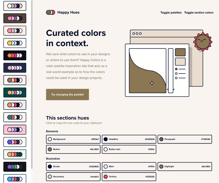
Color scheme selections are nice and all, but they’re even better when viewed in context. It’s part of ColorBrewer’s charm, in the context of maps. Happy Hues offers color schemes in the context of a web page. A combination of this plus Viz Palette would be killer.
Layout multiple charts in a single view. Then adjust the scales appropriately for maximum comparability and a unified graphic.
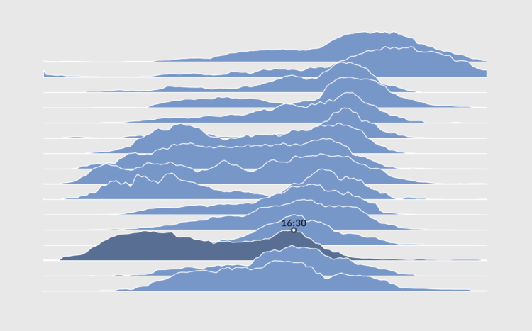
Layering time series data or distributions with this method can change the feel and aesthetic versus a multi-line chart or small multiples. In some cases, frequency trails let you show more in less space.
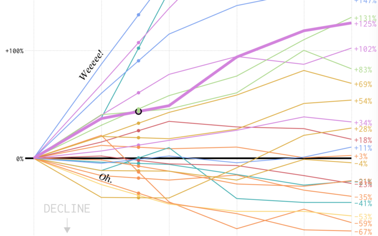
We looked at shifts in job distribution over the past several decades, but it was difficult to see by how much each occupation group changed individually. This chart makes the changes more obvious.
Datawrapper, a focused web tool that makes online charts easier to put together and share, changed their pricing structure. There used to be a couple of paid tiers for individuals and small teams, but now you get more for free. And even though it’s free:
- We won’t sell your data. Some companies make the user into the product, but this is not our business model. All data you upload to Datawrapper is treated as confidential and only belongs to your account.
- We won’t track your readers. Your embedded charts will not contain any code that tracks you or your readers. We’ve never done that, and will continue to not do that, regardless of your plan.
- Your charts are private. You decide when it’s time to share your charts with the world. Until you hit “Publish”, your charts are visible only to you and your team.
- Published charts will stay online indefinitely. We will never delete or disable any of your Datawrapper visualizations that you embedded somewhere. We stand by our pledge to keep all our users’ charts online.
They continue to impress.
It wasn’t that long ago when online charting tools felt buggy and overly limited. But Datawrapper is laying some strong groundwork (and Flourish continues to build up their offerings). Instead of a one-size-fits-all, we’re seeing an application focus, which allows for more specific tools.
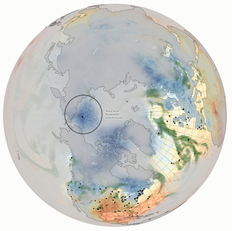
For Reuters, Feilding Cage describes a weather time machine project by NOAA that uses old shipping logs to build climate models for the 19th century:
In the 19th and early 20th centuries, millions of weather observations were carefully made in the logbooks of ships sailing through largely uncharted waters. Written in pen and ink, the logs recorded barometric pressure, air temperature, ice conditions and other variables. Today, volunteers from a project called Old Weather are transcribing these observations, which are fed into a huge dataset at the National Oceanic and Atmospheric Administration. This “weather time machine,” as NOAA puts it, can estimate what the weather was for every day back to 1836, improving our understanding of extreme weather events and the impacts of climate change.
Consider my mind blown.
I wonder what researchers will extract from our current data streams a century from now.
Nevermind. I don’t want to know.
The dataisbeautiful subreddit announced a moratorium on the ever popular bar chart race. The frequency of submissions that used the method got out of hand and spam made it all the less savory. Still, the method holds value.
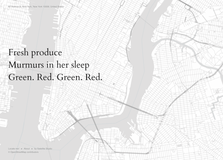
Satellite Studio made a map thing that generates haikus based on OpenStreetMap data and your location. From the announcement:
[W]e automated making haikus about places. Looking at every aspect of the surroundings of a point, we can generate a poem about any place in the world. The result is sometimes fun, often weird, most of the time pretty terrible. Also probably horrifying for haiku purists (sorry).
This is pretty great. It’s neat how the poems generate on the fly.
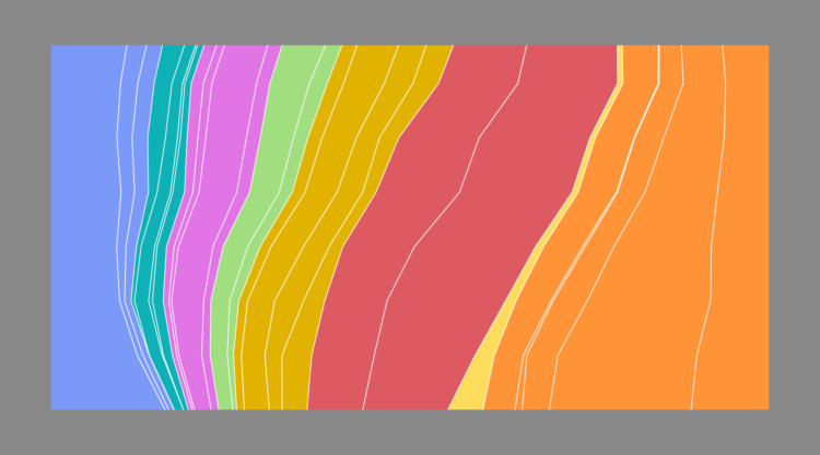
In the 1950s, almost half of all employed people were either in farming or manufacturing. As you can imagine, work changed a bit over the years.
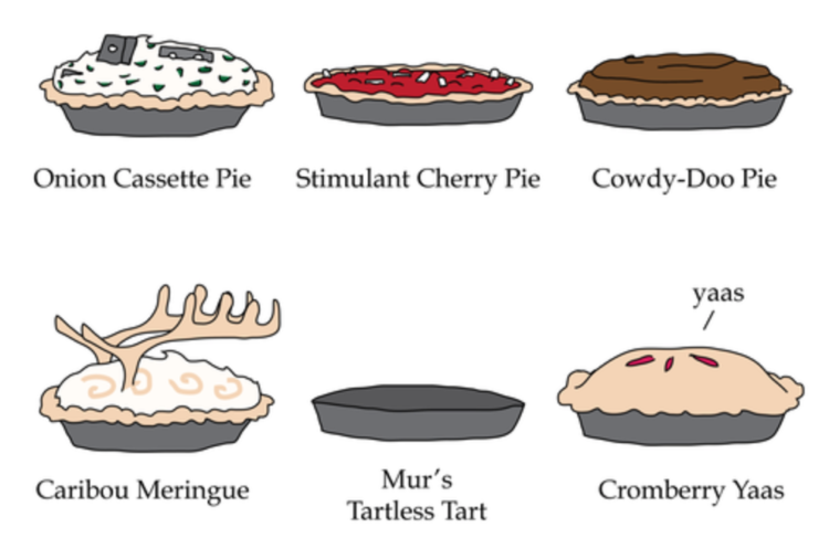
Janelle Shane applied her know-how with artificial intelligence to generate new types of pies that the world has never seen:
People wonder about what it would be like if a super-intelligent AI decided to place all of humanity in a realistic simulation. I wonder what it would be like if the simulation were built by today’s AI instead – whose computing power is somewhere around the level of an earthworm’s.
Specifically, what would the pies be like?
Mmmm, pie with cassette tapes.
In this video, Dominic Walliman attempts to illustrate and explain all of the known things in the universe.
There’s also a poster version.
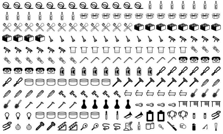
Many things get stuck in people’s bodies. This is the percentage breakdown for the most common objects that end up in the emergency room.
Every month I collect new visualization tools, datasets, and resources. Here is the good stuff for November.
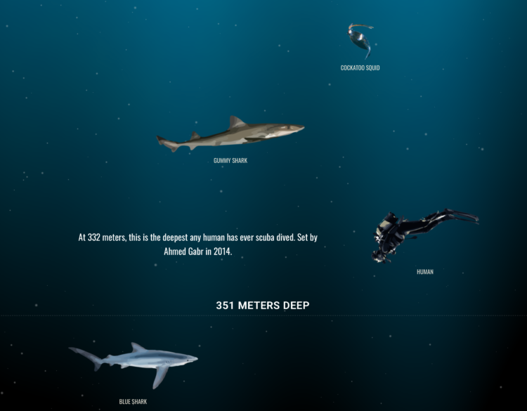
The oceans are deep. But how deep and what’s down there? Neal Agarwal provides this piece, The Deep Sea, that scales the depths of the ocean to your browser window. Scroll, scroll, and then scroll some more to see what sea life (and other things) reside at various depths.
Agarwal’s Size of Space piece from last month explores the size of space in a similar vein. It’s equally fun.
This is the internet I signed up for.
High air pollution can lead to serious health risks, but you can’t usually see particulate matter floating in the air around you. So we have no base for comparison and only an abstract sense of what’s bad and okay. The New York Times tries to make the pollution more visible.
They lead with moving particles across your screen at a density that matches approximately to what the Environmental Protection Agency defines as “good” air quality. Then the number of particles increases to peak air pollution in your area this year. Then the density increases again for the really bad areas around the world.
So you get a baseline, a relatable point with geography, and then a point of perspective.
Be sure to check out the piece on your phone (only on updated iPhones?) to get the augmented reality view. Whoa.
 Visualize This: The FlowingData Guide to Design, Visualization, and Statistics (2nd Edition)
New tools, refined process.


