Geographer Tim Wallace likes to look at old maps, and is particularly fond of the weird and forgotten types:
So, I slowly amassed a more complete list. And here it is. Most of these map types are silly or unusual, not forgotten. Many of them are even deliberately taken out of context to highlight their wackiness and how easily maps can be misread (I sure misread them all the time!).
It’s fun poking around the Internet Archive and HathiTrust, blowing the digital dust off of a volume with 0 views and having a look. You never know what you’ll find. Maybe a forgotten map type?
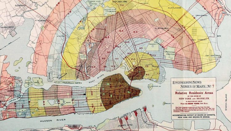
The above is the long forgotten but everlasting Gobstopper zone map.


 Visualize This: The FlowingData Guide to Design, Visualization, and Statistics (2nd Edition)


