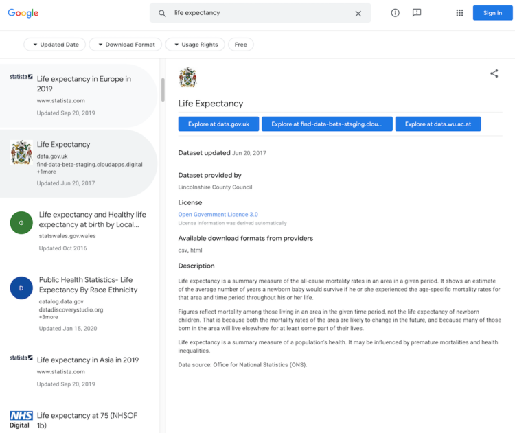
Millions of plastic bottles are purchased every day around the world. What does that look like? Simon Scarr and Marco Hernandez for Reuters virtually piled the estimated number of bottles purchased in an hour, day, month, and up to the past 10 years. They used the Eiffel Tower for scale. The above is just one day’s worth.
-
For The Washington Post, Sergio Peçanha and Tim Wallace use maps to show why we need to adjust the common view of the Amazon up in flames. It’s about the fires on the fringes.
-
I’ve always been a quiet person who prefers to observe and slowly think things through. At Eyeo this year, I talked about how these tendencies led to FlowingData.
[arve url=”https://vimeo.com/354276730″ /]
Be sure to check out the other talks. There’s a lot of inspiration and information to absorb.
-
It seems like no matter what I do, I cannot sleep through the night. Will it ever let up? According to the data, the answer is no and it will only get worse.
-
Members Only
-
D3.js can do a lot of things, which provides valuable flexibility to construct the visualization that you want. However, that flexibility can also intimidate newcomers. Amelia Wattenberger provides a bird’s-eye view of the library to help make it easier to get started and gain a better understanding of what the library can do. Even if you’re already familiar with D3.js, it can serve as a useful reference.
-
Hannah Fry, for The New Yorker, describes the puzzle of Statistics to analyze general patterns used to make decisions for individuals:
There is so much that, on an individual level, we don’t know: why some people can smoke and avoid lung cancer; why one identical twin will remain healthy while the other develops a disease like A.L.S.; why some otherwise similar children flourish at school while others flounder. Despite the grand promises of Big Data, uncertainty remains so abundant that specific human lives remain boundlessly unpredictable. Perhaps the most successful prediction engine of the Big Data era, at least in financial terms, is the Amazon recommendation algorithm. It’s a gigantic statistical machine worth a huge sum to the company. Also, it’s wrong most of the time.
Be sure to read this one. I especially liked the examples used to explain statistical concepts that sometimes feel mechanical in stat 101.
-
It must be uncertainty month and nobody told me. For Scientific American, Jessica Hullman briefly describes her research in uncertainty visualization with a gallery of options from worst to best.
-
For The New York Times, Alberto Cairo and Tala Schlossberg explain the cone of uncertainty we often see in the news when a hurricane approaches. People often misinterpret the graphic:
The cone graphic is deceptively simple. That becomes a liability if people believe they’re out of harm’s way when they aren’t. As with many charts, it’s risky to assume we can interpret a hurricane map correctly with just a glance. Graphics like these need to be read closely and carefully. Only then can we grasp what they’re really saying.
Depict uncertainty more clearly, and people will understand the probabilities and confidence intervals more clearly.
-
For the NASA Earth Observatory, Adam Voiland describes about two decades of fires:
The animation above shows the locations of actively burning fires on a monthly basis for nearly two decades. The maps are based on observations from the Moderate Resolution Imaging Spectroradiometer (MODIS) on NASA’s Terra satellite. The colors are based on a count of the number (not size) of fires observed within a 1,000-square-kilometer area. White pixels show the high end of the count—as many as 30 fires in a 1,000-square-kilometer area per day. Orange pixels show as many as 10 fires, while red areas show as few as 1 fire per day.
There are a lot of fires, but a bit surprising given the news lately, the total area burned each year is decreasing.
-
Salaries are higher in big cities, but it also cost to live more in such places. So, Indeed adjusted salaries for cost of living to find where you get the most for your buck:
When we adjust for cost of living, the highest-salary metros look totally different. Among the 185 US metropolitan areas with at least 250,000 people, adjusted salaries are highest in Brownsville-Harlingen, TX, Fort Smith, AR-OK, and Huntington-Ashland, WV-KY-OH. All ten of the highest-salary metros are small and mid-size markets — none has more than a million people. Most are in the center of the country, and the only two in an expensive state — Visalia-Porterville, CA, and Modesto, CA — are in California’s Central Valley, worlds away from the state’s pricey coast.
Of course the caveat is that in some of these locations there’s not as many places or things to spend your stretched dollar on.
-
Members Only
-
Emily Robinson recently took up Pokémon on Nintendo Switch:
I recently started playing Pokémon again – “Pokémon Let’s Go Eevee” on the Nintendo Switch to be specific. In the classic Pokémon games, you have a team of 6 Pokémon that you use to battle against other trainers. In battles, type match-ups are very important, as some types of moves are “super effective” against other types. For example, fire moves are super effective against grass Pokémon, which means they do double the damage they normally would. If you can set your team up so that you’re always optimally matched, you’re going to have a much easier time.
So, she took the natural next step for a data scientist: assemble an optimized team in R.
-
We use some names mostly for boys and some mostly for girls, but then there is a small percentage that, over time, switched from one gender to another. Which names made the biggest switch?
-
Presidential candidates campaign harder in some states more than others. National Popular Vote made cartograms for the 2012 and 2016 elections showing the states where general election candidates held events. Above is the one for 2016. [via kottke]
-
For Bloomberg, Mira Rojanasakul and Tatiana Freitas discuss why the Amazon rainforest is on fire:
Commodities are key drivers behind the increased pace of deforestation. An analysis of tree loss from 2001 to 2015 shows that most of the Amazon was lost to commodity-driven deforestation—or “long-term, permanent conversion of forest and shrubland to a non-forest land use such as agriculture, mining or energy infrastructure.”
-
The New York Times goes with monthly small multiples to show detected fires in the Amazon rain forest. Data comes from NASA satellites Terra and Aqua.
-
USA Today looks at some of the numbers on 17th century slavery in America. The format, with zooms in and out and shifts to different views, focuses both on scale and the individuals.
-
Members Only
-
BBC News asks a straightforward question: How much warmer is your city? Enter your country and then your city. You get a time series along with projections. It reminds me of The New York Times piece from a few years ago, but the BBC one uses more recent data and covers major cities worldwide.