Best Directors Who Were Not White Men
Academy Award nominations were announced yesterday. They weren’t especially diverse, which of course isn’t a new thing. Below shows all of the nominations for Best Director, going back to the very first Academy Awards in 1928 and bringing us up to present.
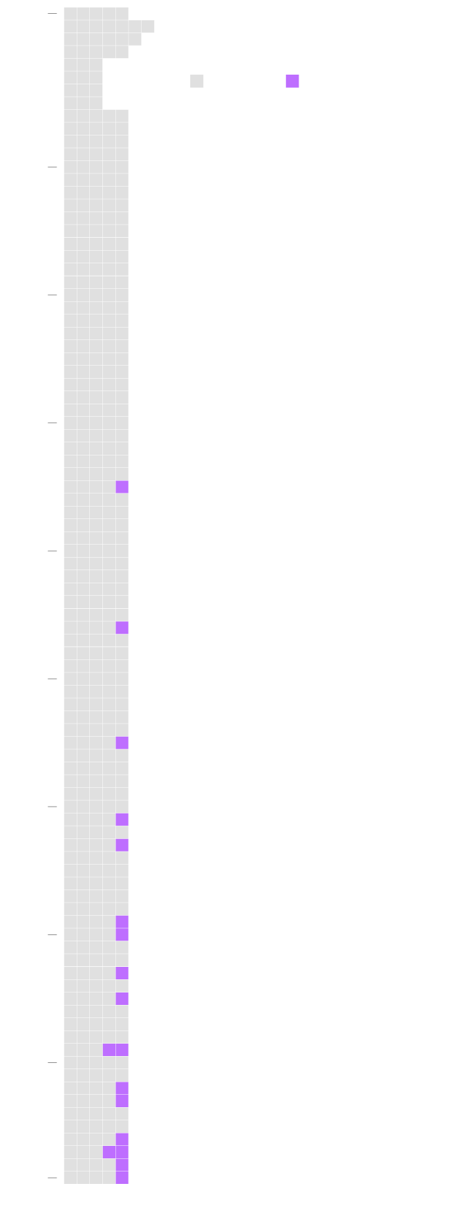
Academy Award Nominations for Best Director Who Were Not White or a Woman
1928
WHITE MAN
NOT WHITE MAN
From 1928, the year of the first Academy Awards, to 2019, there have been 455 nominations for Best Director. Of those, 18 of them went to non-white men. Only 5 of them were women.
1940
1950
1960
1965 – Hiroshi Teshigahara, Woman in the Dunes
1970
1976 – Lina Wertmüller, Seven Beauties
1980
1985 – Akira Kurosawa, Ran
1990
1991 – John Singleton, Boyz n the Hood
1993 – Jane Campion, The Piano
1999 – M. Night Shyamalan, The Sixth Sense
2000
2000 – Ang Lee, Crouching Tiger, Hidden Dragon
2003 – Sofia Coppola, Lost in Translation
2005 – Ang Lee, Brokeback Mountain
2009 – Kathryn Bigelow, The Hurt Locker
2009 – Lee Daniels, Precious
2010
2012 – Ang Lee, Life of Pi
2013 – Steve McQueen, 12 Years a Slave
2016 – Barry Jenkins, Moonlight
2017 – Greta Gerwig, Lady Bird
2017 – Jordan Peele, Get Out
2018 – Spike Lee, BlacKkKlansman
2019
2019 – Bong Joon-ho, Parasite
Source: Wikipedia; Made by: FlowingData
Chart Type Used

Become a member. Support an independent site. Get extra visualization goodness.
See What You Get