Guessing Names Based on What They Start With
I’m really bad at names. A lot of the time when I meet someone new, the name goes in one ear and out the other. If I manage to remember the name short-term, remembering long-term is still a toss-up in favor of forgetting.
But sometimes I can remember the first letter and then I can cycle the alphabet on the second letter to jog my memory.
I wonder: If I can remember the first letter or two, can I use name data from the Social Security Administration to make an educated guess about the full name?
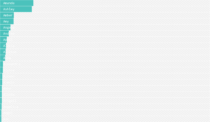
Put in your sex, the decade you were born, and start entering your name below. I’ll try to guess your full name before you’re done.
Oh, so that’s why sometimes people call me Nick (or why people often call Amelia the more common Amanda).
This is based on data from the Social Security Administration, up to 2018. It’s relatively comprehensive, but there are a few limitations. First, it’s data for the United States, so the numbers don’t really apply elsewhere. Second, the SSA doesn’t include names with fewer than five people in a year, so the chart doesn’t cover more unique names. Third, there were no Social Security Numbers before 1935, so the name counts are fuzzier for years before that.
But like I said, the data still has a wide range. I aggregated the annual data by decade and calculated percentages by dividing name counts by total number of Social Security Numbers provided.
Before you enter anything, the chart shows the most popular names for the given sex and decade. Then as you enter a name, the chart shows conditional probabilities. The more information you give it, the stronger the guess.
It’s a simplification of how we remember names I am sure, but it seems to do a decent job.
In reality, this is me all of the time:
But from now on, when I can’t remember someone’s name, I’ll make them slowly spell it out so that I can guess based on this data. It will be so awkward, yet so satisfying.
Notes
- This was inspired by Amelia McNamara’s curiosity as to why so many people call her Amanda.
- I used name data from the Social Security Administration, which is current up to 2018. But Social Security Numbers weren’t a thing until 1935, so the name data before that is more fuzzy.
- The SSA data, which is annual, doesn’t include names with fewer than five people. And to keep file size down, I limited the above names to those with at least 100 people in each decade.
- I used R for analysis and D3.js for the interactive.
Become a member. Support an independent site. Make great charts.
See What You GetFlowingData is made possible by supporting members. Since 2007, I, Nathan Yau, a real person, have been analyzing and visualizing data to help more people understand and appreciate it in their everyday lives.
If you liked this or want to make similar data things, please consider supporting this small corner of the internet. You get unlimited access to visualization courses, tutorials, and extra resources. Thanks. — Nathan
Chart Type Used
