How to Make Line Charts in Python, with Pandas and Matplotlib
The chart type can be used to show patterns over time and relationships between variables. This is a comprehensive introduction to making them using two common libraries.
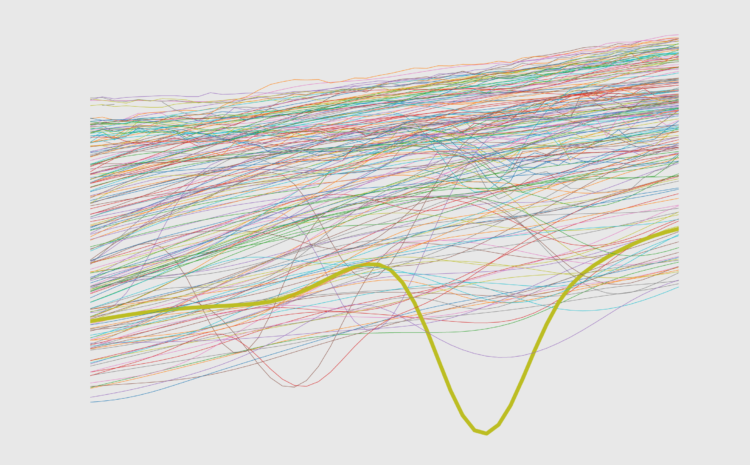
There are a number of charting libraries and tools for Python, but the basic, original built-in library is matplotlib. Many of the other Python data libraries that support charts (such as seaborn and pandas) call matplotlib functions “under the hood” and accept the same customization arguments and keywords. If you search for how to make a chart type in Python, chances are you will run into matplotlib code, so it’s a good idea to know a bit about it.
Because pandas is the default “data manipulation” library in Python, in this tutorial we’ll start from simple line chart displays with pandas, and then move on to customizing our charts with lower level matplotlib controls.
To access this full tutorial, you must be a member. (If you are already a member, log in here.)
Get instant access to this tutorial and hundreds more, plus courses, guides, and additional resources.
Membership
You will get unlimited access to step-by-step visualization courses and tutorials for insight and presentation — all while supporting an independent site. Files and data are included so that you can more easily apply what you learn in your own work.
Learn to make great charts that are beautiful and useful.
Members also receive a weekly newsletter, The Process. Keep up-to-date on visualization tools, the rules, and the guidelines and how they all work together in practice.
See samples of everything you gain access to:
About the Author
Lynn Cherny is a data science consultant currently living in Lyon, France. She has been a professor at a business school, a UX designer and manager, and a data analytics and visualization contractor. She has a Ph.D. from Stanford in Linguistics and hangs out on Twitter as @arnicas.