
Consider your audience. Yes. But at some point in the visualization creation process, you have to disregard all of the feature requests and design suggestions.
Consider your audience. Yes. But at some point in the visualization creation process, you have to disregard all of the feature requests and design suggestions.
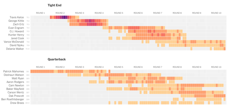
For The Upshot, Kevin Quealy used a heatmap to visualize fantasy football draft picks:
This variance is widest for quarterbacks, whose pick patterns are so distinct you don’t even need to read their names to know they’re a quarterback. Chiefs quarterback Patrick Mahomes, named the N.F.L.’s most valuable player last season, represents the most obvious example of this pattern, with a roughly equal likelihood of being drafted in any of the first 40 picks in the draft, including No. 1 over all.
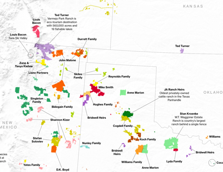
Bloomberg News mapped the land owned by the largest owners:
The 100 largest owners of private property in the U.S., newcomers and old-timers together, have 40 million acres, or approximately 2% of the country’s land mass, according to data from the Land Report and reporting by Bloomberg News. Ten years ago, the top 100 had fewer than 30 million acres.
It may not seem like much—all told, just about the size of Florida. But land is an often-overlooked repository of wealth, one of those quiet assets, such as artworks or trusts, that make up so much of the country’s unexamined riches as inequality widens.
Just one state’s worth of land? I mean, I guess that’s a lot.
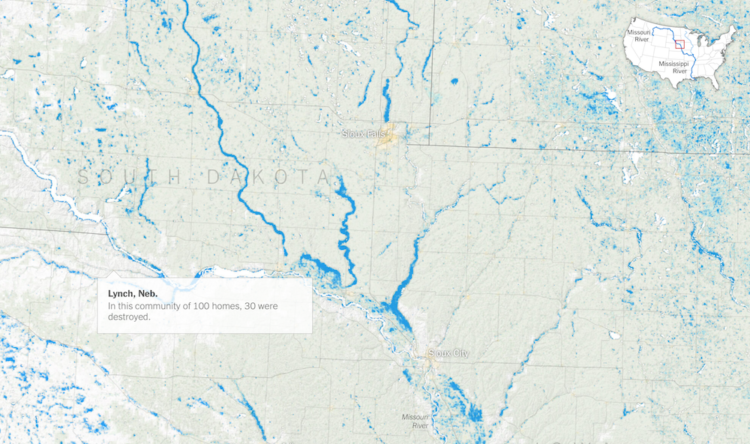
The New York Times mapped the slow, wide-reaching flood waters this year so far:
To measure the scope of the spring floods, The New York Times analyzed satellite data from the Joint Polar Satellite System using software, developed by government and academic researchers for flood detection, that is frequently used in disaster response.
The data covers the period from Jan. 15 to June 30 and shows an interconnected catastrophe along the Missouri, Mississippi and Arkansas Rivers, a system that drains more than 40 percent of the landmass of the continental United States.
Be sure to look at the piece on NYT. It tours you through the significant flooding areas as you scroll, which provides a step-by-step along with a sense of scale.
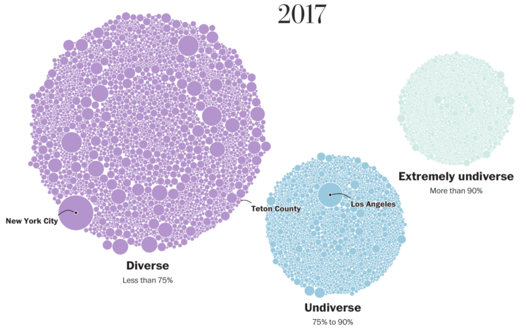
The Washington Post visualized 13,000 school districts to show the change in diversity between 1995 and 2017. Each bubble represents a district and the size represents number of students. The bubbles transition to diverse, undiverse, and extremely undiverse. It’s an important topic and worth the read.
But right now, all I can think about is that I need to up my moving bubble game.

From the teenage years to college to adulthood through retirement, sleep is all over the place at first but then converges towards consistency.

Something I made was on the front page of Reddit. Cool. The problem: thousands of people downvoted it. Here’s what I learned.
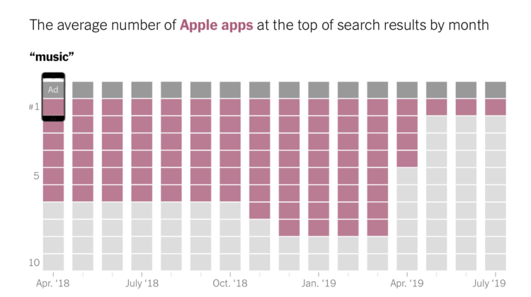
For The New York Times, Jack Nicas and Keith Collins stack up app rankings in the App Store. Apple’s apps appear to find their way to the top of searches, perhaps more often than you might expect.
I like how the graphics navigate through the stacked bars. It starts with a realistic view of scrolling through apps on an iPhone, and then zooms out on each section until you’re looking at the overall trends.
Mark Rober, who is having a good run of science and engineering videos on YouTube, posted a short note on how he embraces statistical uncertainty:
As humans we are really good at using hindsight bias to convince ourselves we are more in control of things than we really are. For example, if you give 1024 people a coin and give them 10 tries to get as many tails as possible, it’s a statistical certainty that one of them will flip 10 tails in a row (and some unlucky chap will get 10 heads in a row). And yet at that point the media will swoop in and analyze his wrist motion and dissect his training regime and he’ll write books about his life story and how it all prepared him for that moment of greatness. Pretty much all situations in life are a roll of the dice. You can/should do as much as possible to weight the dice but there is always a dice roll.
[…]
I always do everything I can to stack the dice in my favor but truly internalizing that some big part of what happens is out of my control gives me permission to just feel grateful for the experiences I’ve had and not beat myself up when things don’t go as I hoped. I can still feel happy about life even if the views aren’t what they used to be and at the same time I get to feel stoked for the person that will inevitably take my place… just hopefully later than sooner ;)
In regards to the press release that seemed to contradict the National Weather Service forecast, Craig N. McLean, chief scientist of NOAA:
During the course of the storm, as I am sure you are aware, there were routine and exceptional expert forecasts, the best possible, issued by the NWS Forecasters. These are remarkable colleagues of ours, who receive our products, use them well, and provide the benefit of their own experience in announcing accurate forecasts accompanied by the distinction of all credible scientists—they sign their work. As I’m sure you also know, there was a complex issue involving the President commenting on the path of the hurricane. The NWS Forecaster(s) corrected any public misunderstanding in an expert and timely way, as they should. There followed, last Friday, an unsigned press release from “NOAA” that inappropriately and incorrectly contradicted the NWS forecaster. My understanding is that this intervention to contradict the forecaster was not based on science but on external factors including reputation and appearance, or simply put, political.
It’s gross that such a letter was even necessary, but I’m glad McLean published it.

On the surface, driving a car might seem fairly straightforward. Follow the rules of the road, don’t crash, and watch out for others. So why not just let a computer do all of the work? The Washington Post provides an interactive simulator to put you in the passenger seat and see for yourself.

Millions of plastic bottles are purchased every day around the world. What does that look like? Simon Scarr and Marco Hernandez for Reuters virtually piled the estimated number of bottles purchased in an hour, day, month, and up to the past 10 years. They used the Eiffel Tower for scale. The above is just one day’s worth.
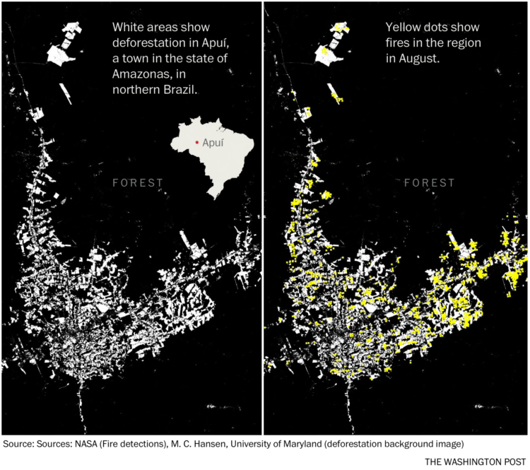
For The Washington Post, Sergio Peçanha and Tim Wallace use maps to show why we need to adjust the common view of the Amazon up in flames. It’s about the fires on the fringes.
I’ve always been a quiet person who prefers to observe and slowly think things through. At Eyeo this year, I talked about how these tendencies led to FlowingData.
[arve url=”https://vimeo.com/354276730″ /]
Be sure to check out the other talks. There’s a lot of inspiration and information to absorb.
It seems like no matter what I do, I cannot sleep through the night. Will it ever let up? According to the data, the answer is no and it will only get worse.
The blue and pink color scheme for boys and girls, respectively, used to be the norm. Now, not so much.
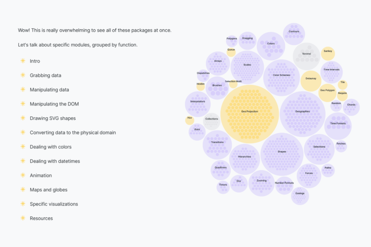
D3.js can do a lot of things, which provides valuable flexibility to construct the visualization that you want. However, that flexibility can also intimidate newcomers. Amelia Wattenberger provides a bird’s-eye view of the library to help make it easier to get started and gain a better understanding of what the library can do. Even if you’re already familiar with D3.js, it can serve as a useful reference.
Hannah Fry, for The New Yorker, describes the puzzle of Statistics to analyze general patterns used to make decisions for individuals:
There is so much that, on an individual level, we don’t know: why some people can smoke and avoid lung cancer; why one identical twin will remain healthy while the other develops a disease like A.L.S.; why some otherwise similar children flourish at school while others flounder. Despite the grand promises of Big Data, uncertainty remains so abundant that specific human lives remain boundlessly unpredictable. Perhaps the most successful prediction engine of the Big Data era, at least in financial terms, is the Amazon recommendation algorithm. It’s a gigantic statistical machine worth a huge sum to the company. Also, it’s wrong most of the time.
Be sure to read this one. I especially liked the examples used to explain statistical concepts that sometimes feel mechanical in stat 101.
It must be uncertainty month and nobody told me. For Scientific American, Jessica Hullman briefly describes her research in uncertainty visualization with a gallery of options from worst to best.
For The New York Times, Alberto Cairo and Tala Schlossberg explain the cone of uncertainty we often see in the news when a hurricane approaches. People often misinterpret the graphic:
The cone graphic is deceptively simple. That becomes a liability if people believe they’re out of harm’s way when they aren’t. As with many charts, it’s risky to assume we can interpret a hurricane map correctly with just a glance. Graphics like these need to be read closely and carefully. Only then can we grasp what they’re really saying.
Depict uncertainty more clearly, and people will understand the probabilities and confidence intervals more clearly.
 Visualize This: The FlowingData Guide to Design, Visualization, and Statistics
Available now.


