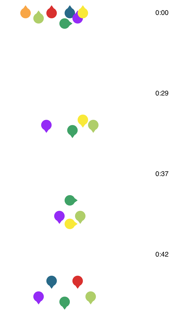
The New York Times illustrated what likely happened in the Ethiopian Airlines and Lion Air crashes. The walkthrough uses a picture of a plane, simple and clear annotation, and animation to help readers understand the dangers of a faulty sensor.
-
FiveThirtyEight uses forecasts to attach probabilities to politics and sports, and they get most of their attention before the events. After all, we don’t need a forecast after something happened. But forecasts aren’t useful if they don’t represent reality. So, FiveThirtyEight evaluated all of their projections.
-
Context makes data useful. Without it, it’s easy to get lost in numbers that mean little, but finding the context of data isn’t especially straightforward. Catherine D’Ignazio explains why it’s so hard and what data journalists (or anyone trying to understand data) can do about it:
First of all, data are typically collected by institutions for internal purposes and they’re not intended to be used by others. As veteran data reporter Tim Henderson, quoting Drew Sullivan, said to the NICAR community, “Data exists to serve the bureaucracy, not the journalist”. The naming, structure and organisation of most datasets are done from the perspective of the institution, not from the perspective of a journalist looking for a story. For example, one semester my students spent several weeks trying to figure out the difference between the columns ‘PROD.WASTE(8.1_THRU_8.7)’ and ‘8.8_ONE-TIME_RELEASE’ in a dataset tracking the release of toxic chemicals into to the environment by certain corporations. This is not an uncommon occurrence!
-
The Economist charted the divisions within political parties using Brexit votes as proxy. I’m here for the bubbles.
-
There is a lot of Census data. You can grab most of the recent aggregates through the American FactFinder or via FTP or some obscure Census page that hasn’t been updated in a decade. It’s, uh, not always the best experience. The Census Data Downloader from the Los Angeles Times data desk is a Python library that streamlines the download process, if just a little bit.
The main added value comes from a way to use existing definitions or make your own to download tables as CSV. That way you get readable headers instead of meaningless table codes.
-
Using estimates from a study on regional bias in tax audits, ProPublica mapped the likelihood of getting audited by the IRS. They then turn their attention to Humphreys County, Mississippi:
In a baffling twist of logic, the intense IRS focus on Humphreys County is actually because so many of its taxpayers are poor. More than half of the county’s taxpayers claim the earned income tax credit, a program designed to help boost low-income workers out of poverty. As we reported last year, the IRS audits EITC recipients at higher rates than all but the richest Americans, a response to pressure from congressional Republicans to root out incorrect payments of the credit.
-
Matt Hong used a stacked bar chart over time as the frame for a data comic about American time use. Each row represents a 2-hour window during the day, and each stack represents the percentage of Americans doing an activity: sleep, work, free, and other. The activity with the highest percentage gets a highlight.
As a fan of time use data, this is totally my jam. Also, the data comic space is underutilized.
-
Everyone’s story is a little different. Alyssa Fowers tracked her long-distance relationship in the context of the temperature between two locations and the travel to and from.
-
Speaking of relationship timelines, Chris Lewis used texting history with his girlfriend after the first swipe on Bumble as the backdrop of their own story. A few 21k messages later, they’re engaged and live together. [Thanks, Chris]
-
Sarah Leo, a visual journalist at The Economist, looked through the archives and found some charts that could use a re-design.
After a deep dive into our archive, I found several instructive examples. I grouped our crimes against data visualisation into three categories: charts that are (1) misleading, (2) confusing and (3) failing to make a point. For each, I suggest an improved version that requires a similar amount of space — an important consideration when drawing charts to be published in print.
Very nice. Archive lookups are often accompanied by “ooo, vintage, therefore good” but Leo takes it the other direction.
Found this tidbit interesting: “Until fairly recently, we were less comfortable with statistical software (like R) that allows more sophisticated visualisations.”
-
Members Only
-
Sometimes you really do need to get away. Escape, part search engine and part research project from students at the MIT Senseable City Laboratory in Singapore, shows you the cheapest flights out of any given city. Just put in a location, and you get color-coded connections to everywhere around the world.
-
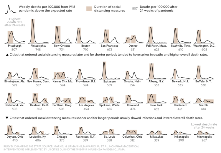
When one goes down, so does the other. If only there were a way to keep more people healthy.
-
Members Only
The bump chart is a line chart variant that focuses specifically on ranks over time instead of absolute values.
The advantage of the bump chart is that it’s unaffected by large differences in magnitudes, whereas a standard line chart might find itself with a bunch of lines clustered at the bottom, because of a high-value category. The bump chart instead spaces ranks evenly.
This tutorial starts with a standard time series dataset, and takes you through the steps to make the necessary adjustments.
-
Everyone’s relationship timeline is a little different. This animation plays out real-life paths to marriage.
-
The Stanford Open Policing Project just released a dataset for police traffic stops across the country:
Currently, a comprehensive, national repository detailing interactions between police and the public doesn’t exist. That’s why the Stanford Open Policing Project is collecting and standardizing data on vehicle and pedestrian stops from law enforcement departments across the country — and we’re making that information freely available. We’ve already gathered over 200 million records from dozens of state and local police departments across the country.
You can download the data as CSV or RDS, and there are fields for stop date, stop time, location, driver demographics, and reasons for the stop. As you might imagine, the data from various municipalities comes at varying degrees of detail and timespans. I imagine there’s a lot to learn here both from the data and from working with the data.
-
There’s less than a month until taxes are due. It’s the most wonderful time of year, isn’t it? As you probably know, there are some changes in deductions, limits, and refund amounts this year, but who the changes affect depends on many variables. For Bloomberg, Ben Steverman and Marie Patino, provide an easier-to-follow breakdown of common groups and variables, how the groups’ total taxes differ from last year, and how they contrast against each other.
-
Members Only
-
Other than calls from my wife, I can’t even remember the last call I received that wasn’t a robocall. Based on data from the Robocall Index and the American Community Survey, Sara Fischer for Axios provides this straightforward map of robocalls by state.
-
For FiveThirtyEight, William T. Adler and Ella Koeze describe how a metric called partisan bias is used to assess partisan gerrymandering. As you might imagine, it’s fuzzy.